If you’re looking for some design inspiration, you’ve come to the right place!
In this post, we’ll take a look at what makes a blog design good and then cover some of the [auto-list-number display=”total”] best blog design examples out there.
From simple blog designs to sleek and modern ones, there’s something for everyone on this list.
This guide will help you find the inspiration and ideas you need to help you create a blog that stands out from the crowd.
So get inspired and improve your own blog design today!
What Makes a Good Blog Design?
Before we look at the blog design examples, let us look at some basic principles of good blog web design.
Beginners make the mistake of thinking that a beautiful blog design is a combination of fancy colors, cool typography, and interesting widgets. But more often than not, these things only distract readers, clutter the design and reduce the readability of your blog.
Apart from being visually appealing, a good blog design should do the following three things correctly:
- Improve Readability
- Ease Navigation
- Optimize for Conversion
Let us look at how to achieve this:
1. Improve Readability
The best blog designs first focus on readability. Readability is the ease with which a text can be read and understood.
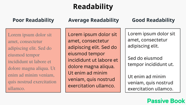
Many things help improve your blog’s readability:
- Use sans-serif fonts that are easy to read on the web.
- Use the typography golden ratio to decide the font size, line height, paragraph spacing, and content width.
- Use a limited color palette so readers can focus on the content without being distracted by colors or other visual elements.
- Use a background color (preferably white) to aid readability
- Choose a blog layout with minimal distractions to help the readers focus on your content instead of being distracted by the multiple things on the page.
- Have a lot of empty space (aka white space or negative space) around different elements of your blog to draw your readers’ attention to the content.
- Use headings and subheadings to break up your text.
- Use bulleted or numbered lists.
- Use images, infographics, and videos to break up your text.
2. Ease Navigation
Another important aspect of a good blog design is navigation. Navigation refers to the way users move around your website.
Good navigation should be easy to understand, intuitive and logical. The goal is to make it as easy as possible for your readers to find the information they are looking for on your site without overwhelming your visitors with too many options.
There are a few things you can do to make your blog more navigable:
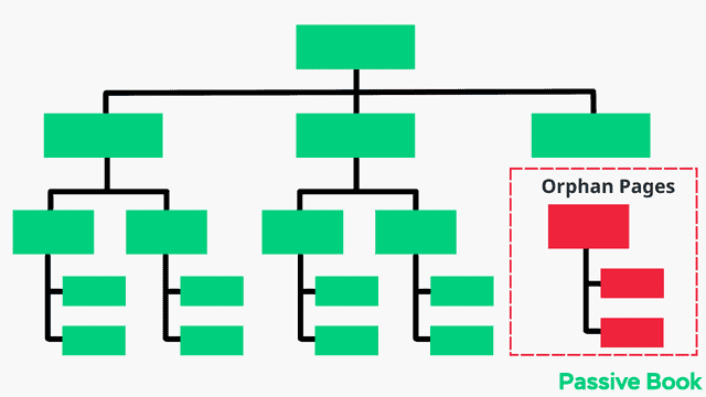
- Use navigation menus that logically link to different sections of your blog. Every blog page should be accessible from the homepage.
- Use clear and descriptive titles for your blog posts.
- Use clear and descriptive labels for your blog categories.
- Add a search bar so readers can easily search for specific topics on your site.
- Add a sidebar to help readers find what they are looking for.
- Use breadcrumbs to help readers keep track of their location on your site.
- Link to related content throughout your blog post to help readers find more information on the topic.
- Avoid orphan pages that cannot be found by navigating.
3. Optimize for Conversion
The goal of any blog is to convert readers into subscribers or customers.
A good design will help you achieve this goal by making it easy for your readers to take the desired action.
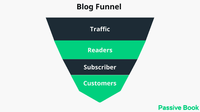
There are a few things you can do to optimize your blog for conversion:
- Add an opt-in form to your blog so readers can sign up for your email list.
- Include a call-to-action (CTA) in your blog posts.
- Include social media buttons on your blog so readers can share your content.
- Use pop-ups to promote special offers or deals.
- Use exit intent pop-ups to capture leads as they are leaving your site.
- Use a lead capture form on your contact page.
By following these tips, you can create a blog design that is both visually appealing, easy to read and navigate, and effective in driving conversions. Keep these principles in mind as you work on your own blog design and you’ll be sure to create a winning design.
[auto-list-number display=”total”] Best Blog Design Examples
Now that we have covered what makes a blog design good, let us look at some of the best blog design examples that apply all these design principles.
When you find examples of blog design that resonate with you, you will be able to model your blog around it.
[auto-list-number] Backlinko
Backlinko is a blog created by Brian Dean that focuses on SEO and marketing tips.
The blog layout is minimal with a focus on the content. Blog posts don’t have any sidebars and there are no distractions that take the reader’s focus away from the content.
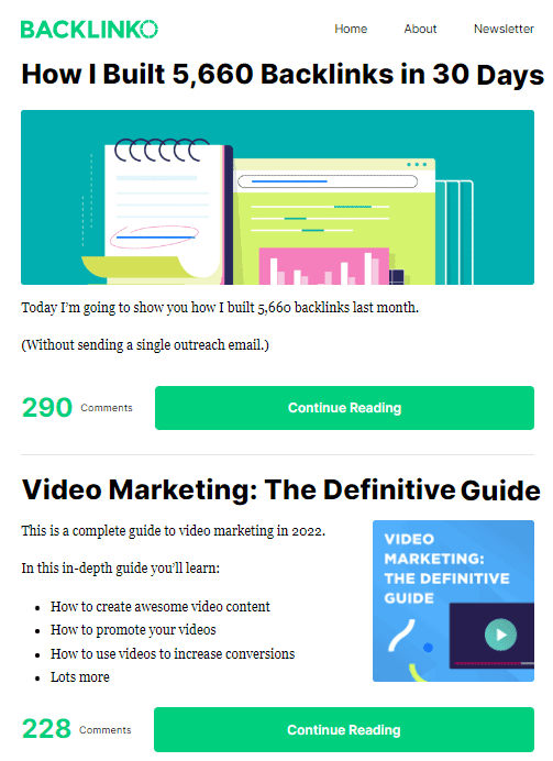
Backlinko is a class apart when it comes to readability. The sentences and paragraphs in each blog post are short and are written for skimmers.
If you ever read a post on Backlinko, you will easily find yourself scrolling down the consuming the long-form content.
Each blog post has a ton of graphics, charts, infographics, and screenshots. Some blog posts have over 100+ images in a single blog post.
Brian also embeds a lot of videos from his YouTube channel in his content. The images and videos help break up the text and consume the content.
He also hires a graphic designer to illustrate the blog post with original graphics. He not only breaks down his content into sections using headings and sub-headings but he also goes a step ahead by creating original graphics for each section header.
All this effort makes his blog posts fun and engaging to read even if it is super long. The rich design along with high-quality content makes people link to his content.
[auto-list-number] Zen Habits
Leo Babauta’s blog Zen Habits is one of the most popular blogs on the internet. The blog design is very minimalistic and it uses a lot of negative space. This is the most minimalistic blog on this list.
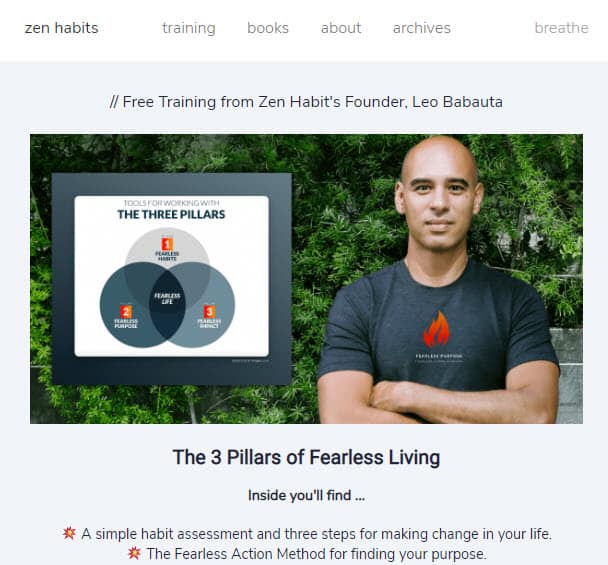
The blog has a very simple and clean design with a focus on the content. The blog is designed to be easily readable with big font sizes and plenty of white space.
If you thought you need to have a lot of images to have a successful blog, then Zen Habits is here to prove you wrong. Unlike Backlinko which has hundreds of images in each blog post, Zen Habits has no image in any of its blog posts.
There are no sidebars on the blog and all the navigation links are placed at the top of the page.
What makes Zen Habits design special is that blog is optimized for conversion despite being so minimalistic.
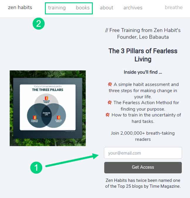
There is an opt-in form ❶ that provides a lead magnet below the header to collect emails from visitors.
There are links to paid courses and books on the menu. ❷
The footer has links to the paid training programs offered by Zen Habits.
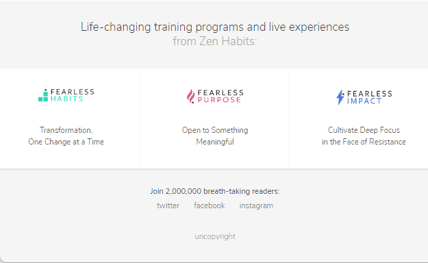
There are no social share buttons on any of the blog posts. The only presence of social is the links to social media profiles (Twitter & Facebook) in the footer.
[auto-list-number] Copyblogger
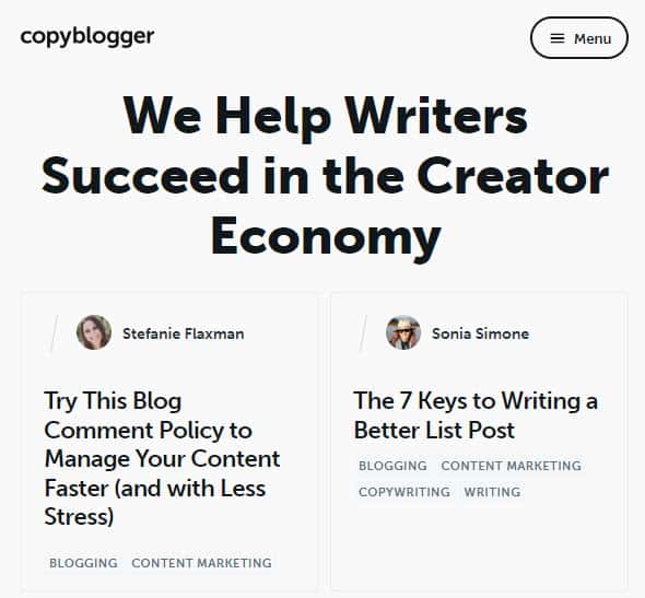
Copyblogger is a popular blog that covers topics related to content marketing, copywriting, and SEO.
This is another minimalistic blog design example but is not overly minimalistic like Zen Habits.
The blog post title and featured image ❶ appear above the body content and sidebar in Copyblogger.
The sidebar has an opt-in form ❷ and links to their paid programs and popular posts.
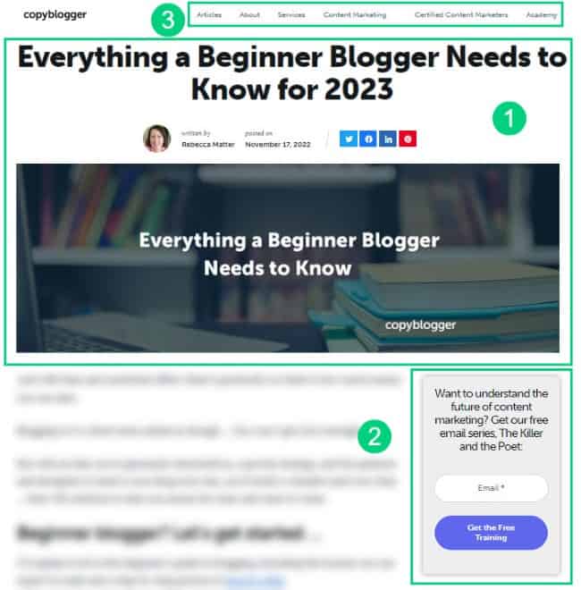
Copyblogger primarily uses two colors: black and white. To provide contrast and make their CTA buttons stand out, they have a third color which is a hue of purple. This third color is used only in their CTA buttons ❷.
There are also opt-in forms at the end of each blog post.
Apart from the featured image, the content itself has very few images. This is a balance between a blog like Backlinko which has a lot of images and Zen Habits which has no images.
The menu has links to the paid products, services, and different blog category pages ❸ to help visitors find the best content on various topics.
Copyblogger’s category page is something you can model after for your own blog if you have a lot of content and want to make it easier for visitors to find it.
[auto-list-number] Minimalist Baker
The Minimalist Baker is a food blog created by Dana Shultz. The blog features recipes that are simple with ten ingredients or less which take less than 30 minutes to prepare.
What makes the design of this blog so great is its simplicity. The color palette is limited to black, white, and a yellowish-orange hue. The fonts are also simple and easy to read.
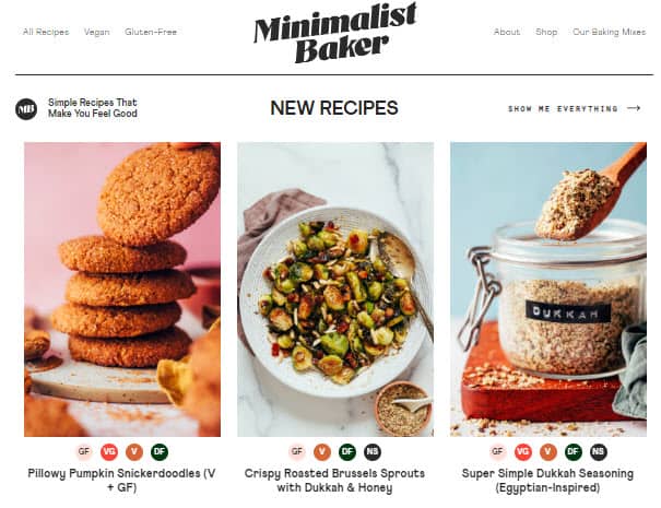
There is a lot of negative white space around different elements which makes the content easy to consume. The use of headings and subheadings also helps to break up the text and make it easier to scan.
All blog posts have stunning food photography that makes all the recipes stand out.
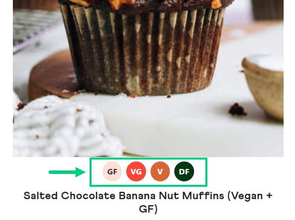
Minimalist Baker makes navigation extremely easy. The recipes on the site are organized into categories which makes it easy for readers to find what they are looking for. The recipes are also indexed as gluten-free, dairy-free, vegan, and no sugar to make it easier to filter through recipes.
The header has the logo in the middle and the navigation on either side of the page. The menu also includes a search bar and social media buttons to help readers find social media profiles.

[auto-list-number] Hacker Noon
Hacker Noon is a popular blog for tech professionals. The website publishes articles written by independent writers and stories from companies like Google, Amazon, Microsoft, etc.
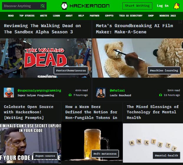
What makes the blog design of Hacker Noon different from other blogs in this list is the colors are inverted.
The blog has white text on a dark background. This design also known as night mode or dark theme is extremely popular among the hacker and technology community which is probably why Hacker Noon uses it.
The dark mode is easier on the eyes when reading at night or in a room with low light.
However, the traditional dark text on a light background is used almost universally because it has the highest readability and is easier on the eyes during the daytime or in rooms with artificial light. This is one of the reasons why books and newspapers are printed on white paper with black text.
You should stick to the traditional color scheme of dark text on a light background unless you are in a niche like Hacker Noon.
If you want to introduce a dark mode for your blog, then a better option would be to do it like the next website on this list.
[auto-list-number] Pregnant Chicken
Pregnant Chicken is a pregnancy and parenting blog created by LisaORourke. The website has articles on everything from trying to conceive to pregnancy, to parenting hacks.
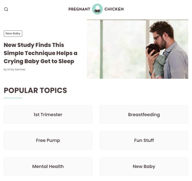
The website has a minimalist design with a lot of white space.
Pregnant Chicken has a traditional color scheme of dark text on a light background. However, they also have an optional dark mode ❶ that can be turned on with a switch in the menu.
This is a better option than having a fixed color scheme like Hacker Noon because the audience can choose to switch based on their preference.

Another good thing about the blog’s design is its navigation ❷. All the content in the blog is neatly categorized into the different stages of pregnancy and it is available in the main menu.
The blog goes even deeper and has the option to view posts on various topics.
[auto-list-number] Nom Nom Paleo
Nom Nom Paleo is a food blog created by Michelle Tam. The recipes on the blog focus on healthy, whole foods that are paleo-friendly.
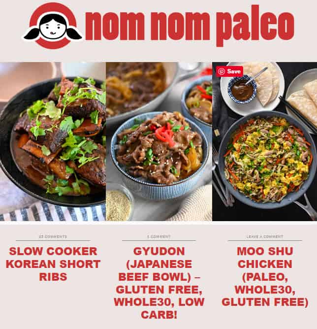
So far we have seen blogs that are predominately on a white background. We saw examples of Hacker Noon which uses a dark theme which is white text on a black background.
But the background need not always be black and white. An example of this is Nom Nom Paleo. The blog uses Carousel Pink as the background color.
Although white background has maximum readability, finance newspapers like The Economic Times and The Financial Times, still use this color for their background.
[auto-list-number] Reiki Rays
Reiki Rays is a website about Reiki healing and feature articles on energy healing, meditation, chakras, etc.
What is interesting about Reiki Rays is their choice of primary color. Their main brand color is a shade of purple. They use this shade of purple in their logo, menu items, and footer.

It may seem like the color purple has been chosen at random. But the color has been chosen to take into consideration color psychology.
Color psychology is the study of how color affects emotions and behavior. Different colors evoke different feelings and can be used to influence people’s moods and actions.
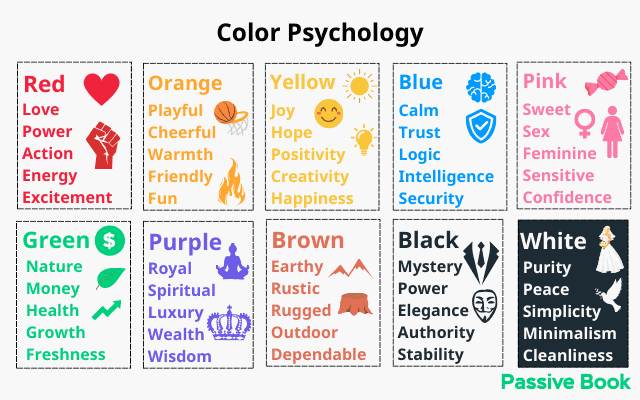
For example green represents money but it is also the color of nature and the environment. Red is the color of love and romance.
Purple is used by Reiki Rays because it is the color associated with spirituality. The crown chakra is color purple.
You can pick any color you like for your brand. But if you want to evoke a certain emotion that resonates with your audience, then you should consider using color psychology.
There is a color for every emotion and niche. Use color psychology to guide your choice of color.
If you have a personal finance blog, it’s better to use the color green as your main color. Green can also be used for gardening blogs. We use the color green in Passive Book because our blog helps people make money.
[auto-list-number] Medium
Medium is a popular blogging platform where people can write and share their stories. It is sort of like YouTube but for blog articles. Medium makes money by charging readers a monthly subscription fee to read articles published on their platform. They share a portion of their earnings with their writers.
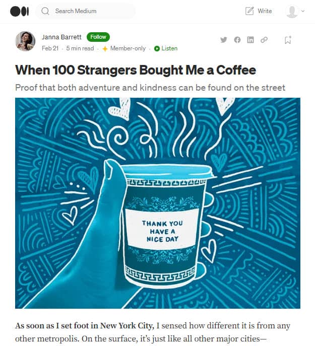
What makes the design of Medium special is its typography. Medium has invested a lot of time and resources into optimizing the typography for maximum readability. It is one of the reasons why people stay on the site and consume so much content.
The design of Medium is very simple. It has a white background with black text. There is ample white space between the different elements that make the content stand out.
The font size is 20px which makes it easy to read. The content width is under 780px which means the eyes have to move less horizontally to read the content.
To make sure your blog’s typography is both beautiful and highly readable the following typography elements should complement each other:
- Font Face
- Font Size
- Content Width
- Line Height
- Paragraph Spacing
You can use the Golden Ratio Typography (GRT) Calculator to help you find the perfect font size, content width, line height, and paragraph spacing for any given font.
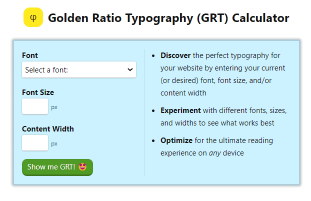
After you select the font, specify just the font size and leave the content width blank. GRT Calculator will provide recommendations for all elements including the content width. Use a font size between 18 px to 20 px.
[auto-list-number] Security.org
Security.org is a website that provides information about online security and identity theft.
What makes Security.org’s blog design special is the silo structure.
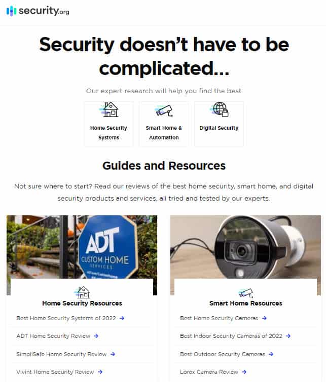
The home page has three main sections of the website:
- Home Security Systems
- Smart Home & Automation
- Digital Security
If you click into a particular silo, you will read an article on the topic. But you will also find the navigation for the sub-silo.
This type of silo blog structure is not only great for readers to navigate through the website and find what they are looking for but it is also great for SEO. Google loves this type of internal linking silo structure and ranks these websites really high in search engines.
[auto-list-number] Tech Crunch
Tech Crunch is a website that covers the latest technology news.
Usually, you will find a blog’s main navigation bar on the top. However, Tech Crunch has their main navigation on the left sidebar.
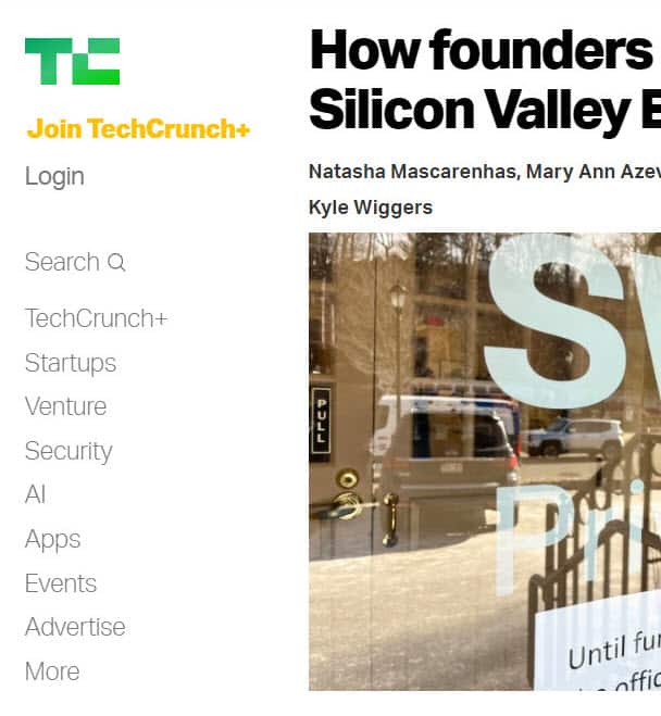
On the mobile screen, the left sidebar collapses into a hamburger icon.
There are very few elements on the page and the focus is completely on the content. The home page has a featured article and then a list of articles in chronological order.
The articles also have a huge featured image below the article title.
[auto-list-number] The Motley Fool
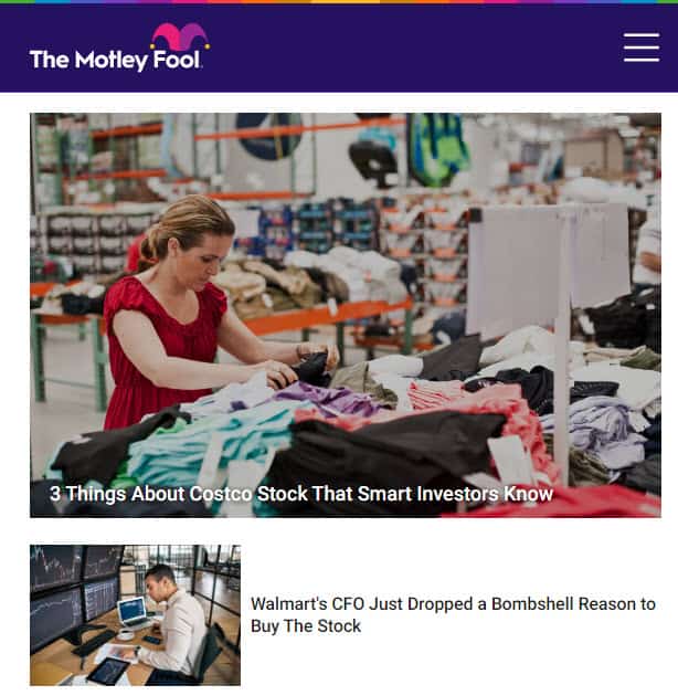
The Motley Fool is a website that provides investment and stock advice.
This is a blog designed for conversions. Each blog post is part of a funnel that leads readers to their paid offer.
At the end of each blog post is a call to action that offers a free lead magnet of top stocks for beginners.
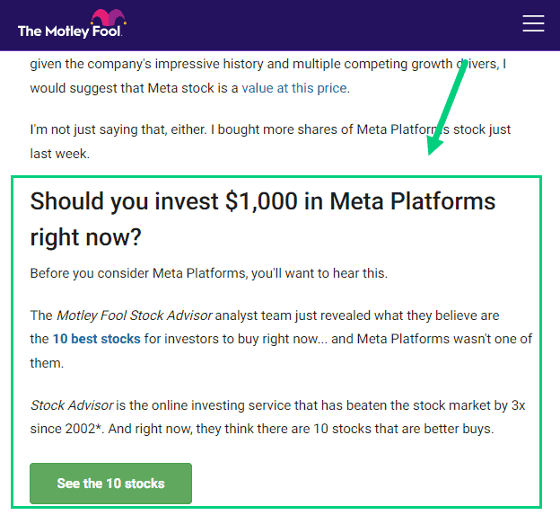
When a subscriber gives their email in return for the free lead magnet, they receive emails that convert them into paying customers.
You can optimize your blog posts for conversion by adding a CTA box at the end of each article offering them a free lead magnet.
[auto-list-number] Hooked to Books
This is a book blog that has book reviews and reading gadget reviews. They also sell printable bookmarks and checklists.
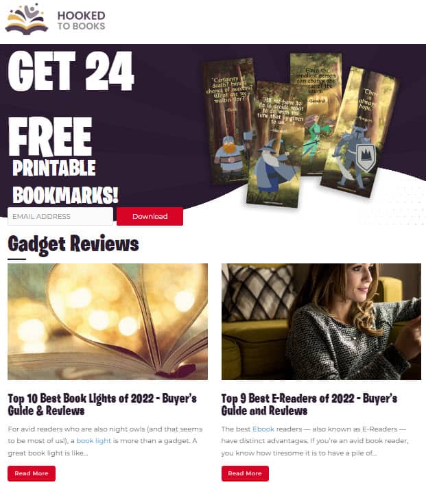
The blog makes its navigation extremely easy by using dropdown menus.
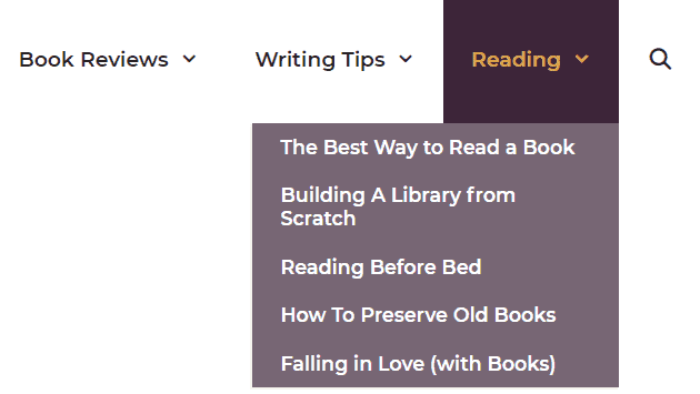
The top menu items expand to different categories and sub-categories when hovered. Visitors can quickly jump into a particular section that is of interest to them from anywhere on the website.
The menu also has a search button to make it easy for the users of the site to find specific content.
The dropdown menus work on mobile devices as well. The menu collapses into a hamburger icon that can be clicked and expanded to view different content.
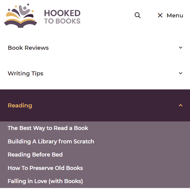
If you want to build a deep navigation menu on your website, then this is a blog to emulate.
[auto-list-number] Make It & Love It
Make It & Love It is a blog about creative DIY projects and crafts by Ashley Johnston.
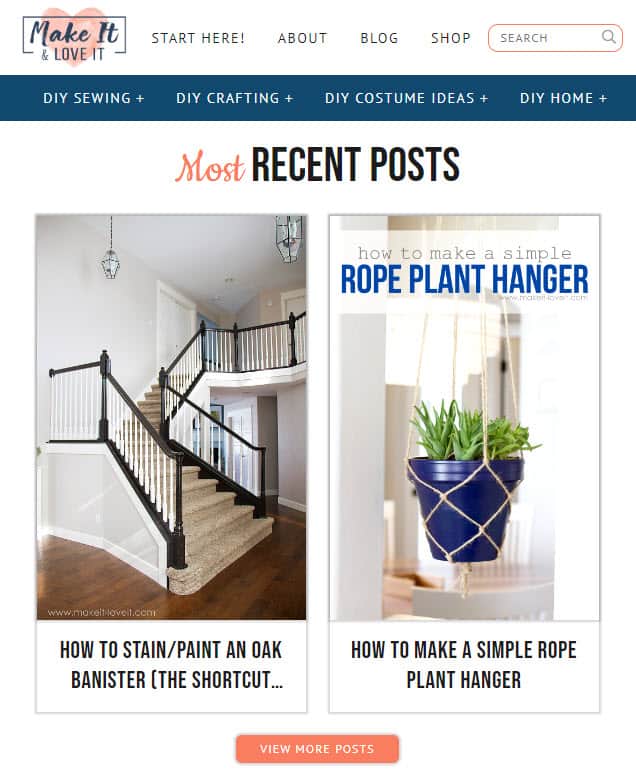
This blog has two separate menus. The first menu has the logo, search bar, social media links, and main navigation.
There is also a second menu that links to different blog post categories. Similar to the previous example, this second menu has a dropdown for different subcategories in the blog.

The mobile version of the blog has these two menus colored differently appearing one below the other.
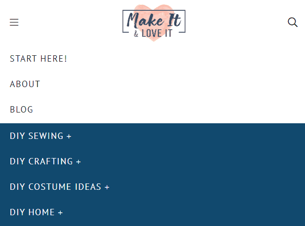
There are a few instances when you may want to use a second menu on your blog.
One instance would be if you have a lot of categories and sub-categories. This would help organize your blog content and make it easy for readers to find what they are looking for.
Another instance would be if you have a separate category of menu items like shop, login, contact, about, etc.
Having two menus will help you categorize the different menu items separately.
But remember less is more when it comes to blog design. So stick to one simple menu without any drop-downs if you can help it.
[auto-list-number] P.S – I Made This
Erica Domesek is the founder and creative director of P.S. – I made this, a craft and DIY blog.
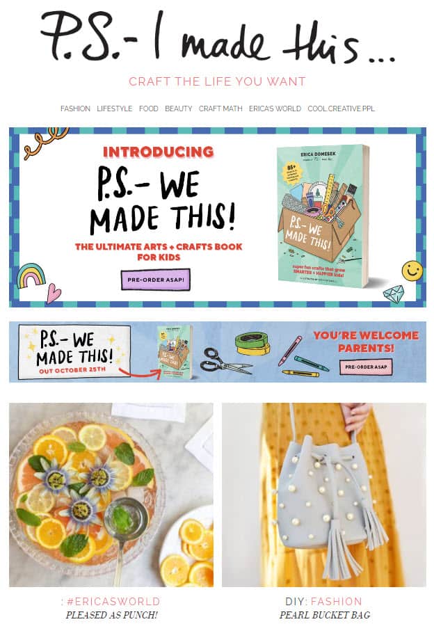
Many bloggers obsess about having a beautiful header designed by a graphic designer.
However, you don’t have to complicate your header’s design and you can keep it extremely simple.
All you need is your blog’s name and optionally your tagline. P.S. – I Made This is an example of a blog that keeps its blog design extremely simple yet elegant.
[auto-list-number] Style Caster
StyleCaster is a website about fashion, beauty, and style.
Similar to P.S. – I Made This, Style Caster uses a simple blog header which is just the name of their blog.
But unlike P.S. – I Made This there is no tagline.
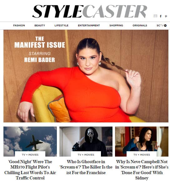
When you scroll down, the menu becomes sticky. A sticky menu is a menu that remains at the top of the page even when you scroll down. This allows users to quickly navigate to different parts of the website without having to scroll back up.
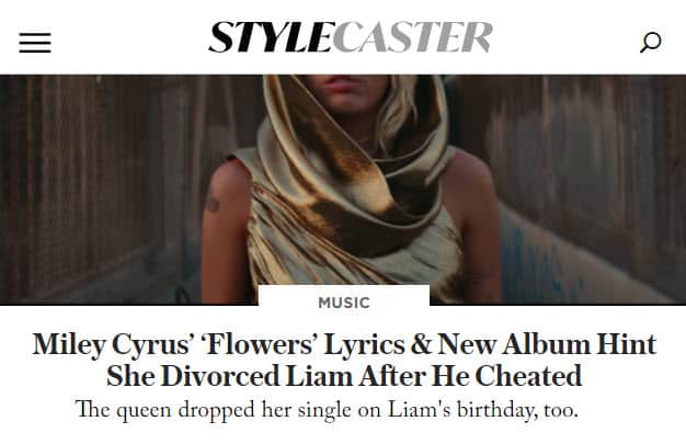
You can employ the use of a sticky menu if you have a rich menu navigation that will keep your visitors on your site.
[auto-list-number] Jeff Goins
Jeff Goins is a professional blogger, author, and speaker. He writes about art, business, and creativity on his blog.
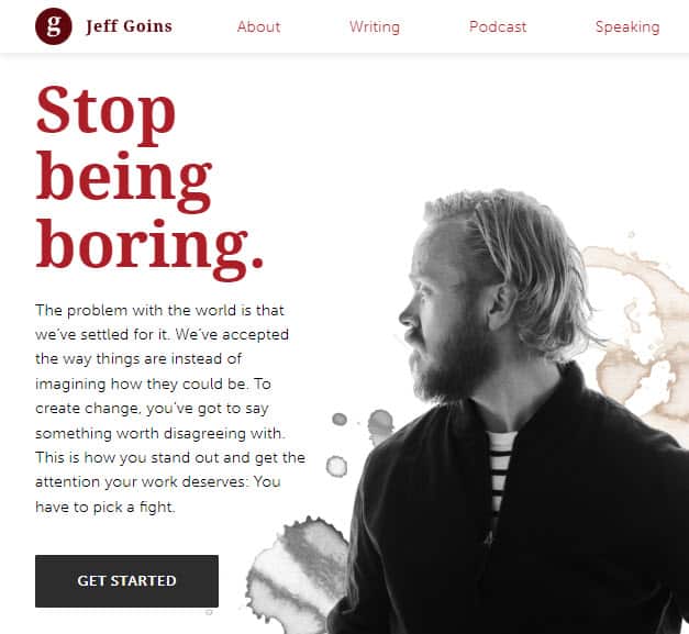
The best thing about his blog’s design is the home page. The home page links to different important sections in his blog.
There is an About section that provides a quick background about Jeff.
There are links to his latest podcast episodes.
You will also find an opt-in form to become an email subscriber.
You have the option to work with him for coaching, editing, or ghostwriting services.
There is a section with links to his different books which you can purchase on Amazon.
You will find testimonials he received from other influencers in the space.
Finally, you will have articles from his blog.
This is a great example of the different elements or sections you can have on your home page.
[auto-list-number] Trello Blog
Trello is a project management tool that helps you organize and keep track of your work. They also have a blog that educates people on how to use their software for different use cases.
The Trello blog is a great example of how to use the imagery in your blog design.
Every article on their blog has a featured image which is an illustration of their blog post in their brand color.
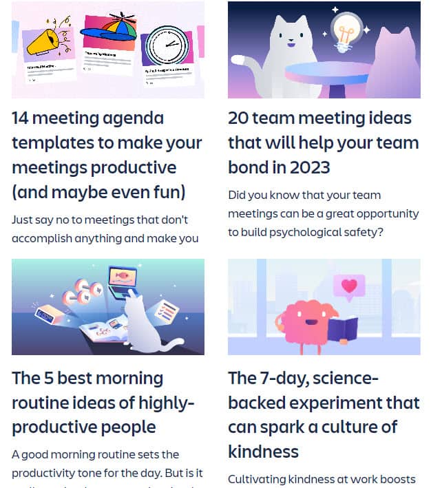
This makes the articles more visually appealing and adds extra personality to the content.
You will need to hire a designer on Fiverr or Upwork to do something like this.
[auto-list-number] Remodelaholic
Remodelaholic is a blog about home remodeling and design.
The most unique aspect of their blog is the way they showcase different parts of their blog on the home page.
The home page has different sections for interior design, DIY, and recipes.
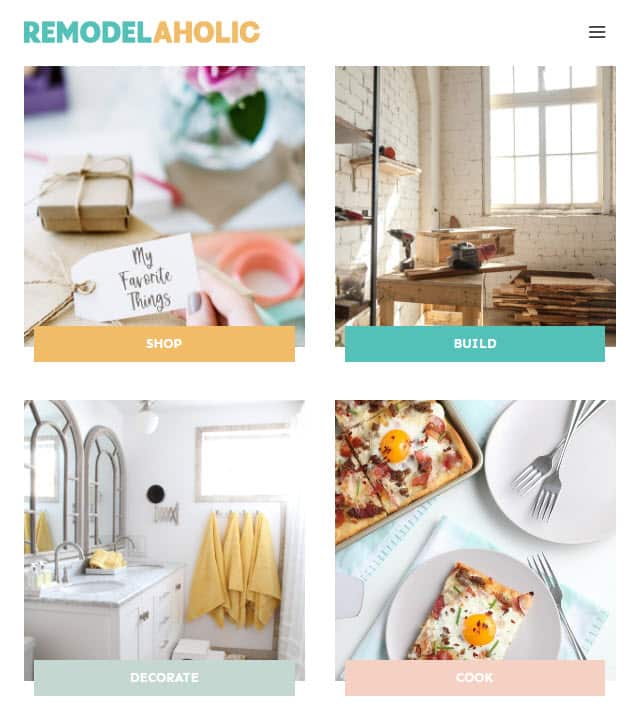
Each section has unique iconography for different sub-categories. For example, the DIY Furniture section has icons for different types of furniture that the blogs help you create.
Clicking on a particular project like say Dining Tables will display all the blogs in that particular category.
This is a great way to organize all the content. Every blog post on the entire website will be a maximum of two clicks away from the home page.
[auto-list-number] A Beautiful Mess
A Beautiful Mess is a lifestyle blog founded by sisters Elsie Larson and Emma Chapman.
The blog doesn’t have a custom home page like the Remodelaholic. Instead, they display their latest blog posts in chronological order on their home page.
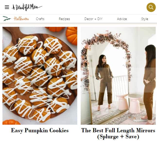
This is a good option if you have a new blog without a lot of blog posts. This is what traditional blog home pages looked like. However, for large blogs, this type of navigation will typically bury the older content.
The blog uses its menu navigation to link to different post categories like crafts, recipes, and décor. So this helps users navigate the content.
[auto-list-number] Lean Green Bean
Lean Green Bean is a healthy food blog by Lindsay Livingston.
The home page of the blog uses a grid blog layout to showcase her latest blog posts.
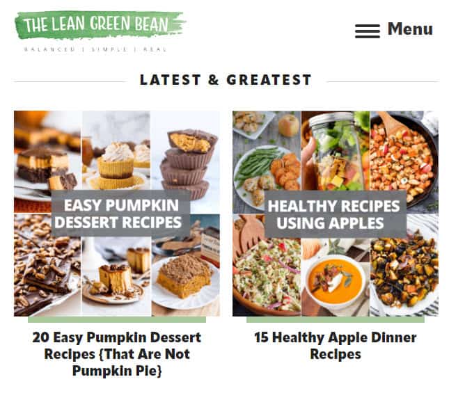
Hovering over each image reveals the title of the post and the date it was published on.
This is a great way to organize your content if you want to show a lot of blog posts on your home page.
The blog also has a recipe index which is a great way to organize all her recipes in one place.
The recipe index is organized by course, type of dish, and main ingredient.
[auto-list-number] The Right Hair Style
The Right Hair Style is a blog about hairstyles and hair care.
A unique feature of the blog design is the right sidebar which has links to different post categories.
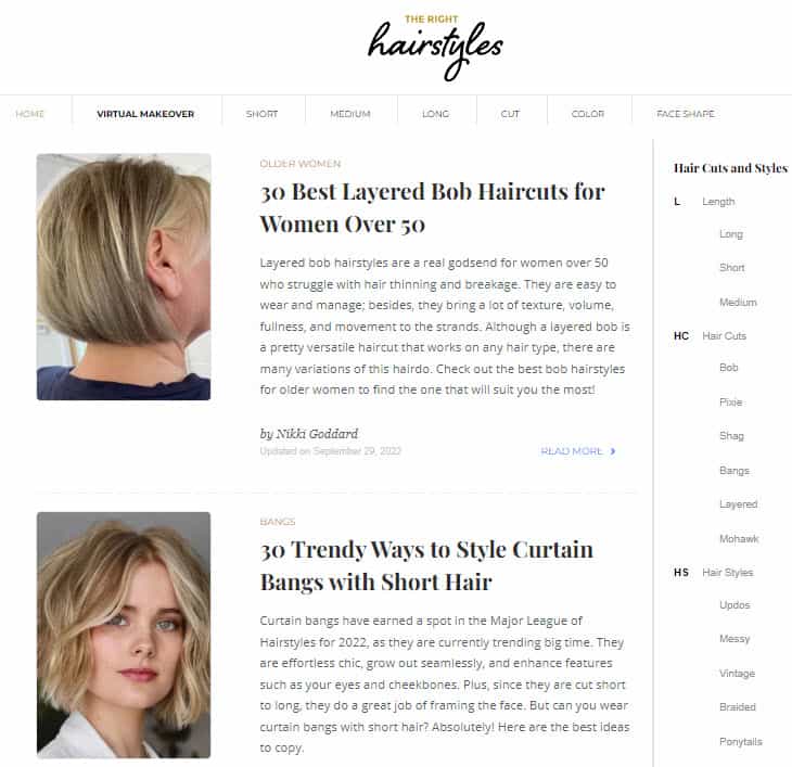
Visitors can quickly find blog posts that are of interest to them and once they are done reading a particular post, they can find additional blog posts in the same or other post categories.
[auto-list-number] Money Crashers
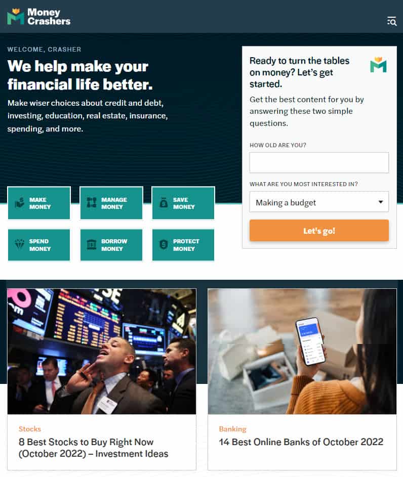
Money Crashers is a personal finance blog that helps people save money and make wise financial decisions.
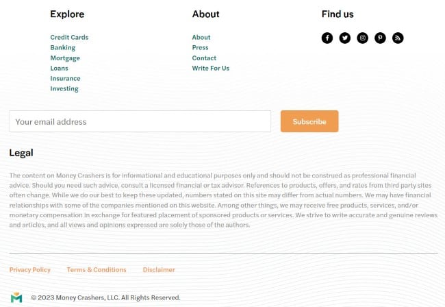
They have a large footer that links to different category pages and legal pages.
They also have a huge disclaimer in the footer. It is recommended you add a similar disclaimer if you are selling affiliate products, making earning claims, or providing legal or medical advice.
[auto-list-number] Modern Daily Knitting
This is a blog about knitting by Ann Shayne and Kay Gardiner.
The blog uses a floral white background instead of pure white.
Typically links are blue. But this blog has used its primary brand color which is orange for its links. You can use your primary brand color for your links instead of the color blue as long as you don’t use the primary color anywhere else like color headings or menus.
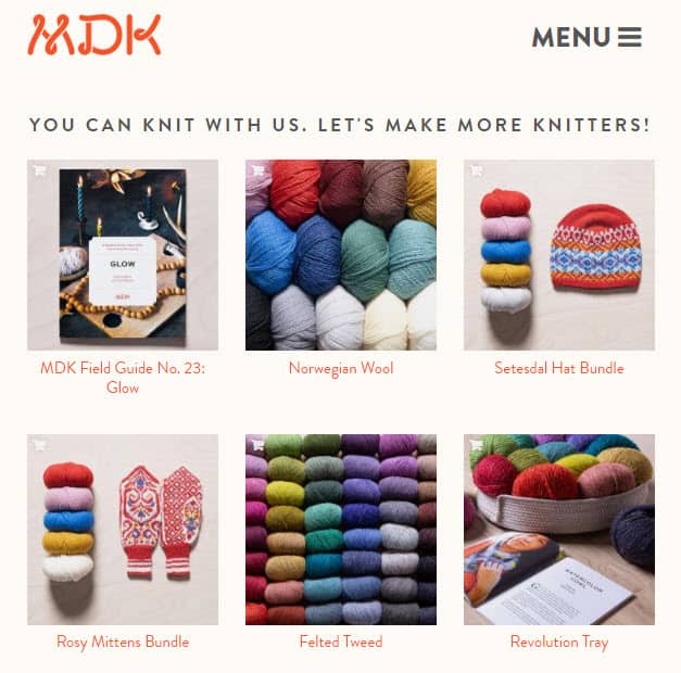
Another unique feature of this blog is its header. The menu is split into two and appears on either side of the blog logo.
[auto-list-number] Springs Homes
Springs Homes is a real estate blog that offers real estate agent services in Colorado Springs.
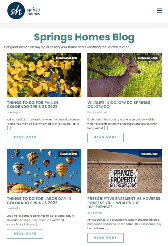
Since they are a physical business their footer has the address, phone number, and email address apart from the legal pages.
It is also good practice to place the blog’s logo and tagline in the footer along with the social media pages.

[auto-list-number] Mommy On Purpose
Mommy On Purpose is a mom blog by Jennifer Dougherty.
The blog has a very simple design with a content area and a sidebar.
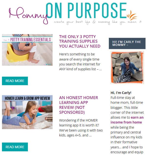
The blog has a simple footer that has legal pages, recent posts, and social media profile links.
It is recommended you have simple footers like this on your landing page so that it doesn’t distract users preventing them from converting.

[auto-list-number] Piano Dreamers
Piano Dreamers is a blog about playing the piano.

Many blogs make it easy to navigate and find different blog posts. But Piano Dreamers take it a step further and makes it easy to navigate single blog posts.
They do this by including a floating table of contents that appears when you scroll down the page. You will be able to click on the different headings and subheadings to jump to different parts of the blog articles.
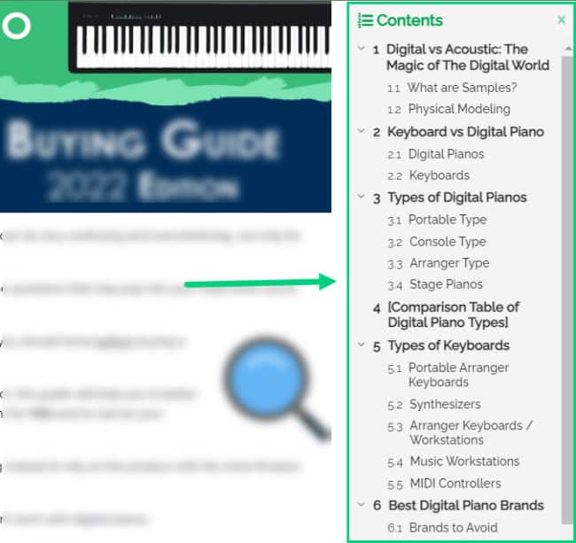
This is an extremely handy feature if you write long blog posts.
[auto-list-number] Hub Spot Blog
HubSpot is a marketing software company. The HubSpot blog provides tips and advice on inbound marketing.
One of the important things that Hub Spot does really well is feature snippet boxes. Hub Spot provides short answers to questions people ask on Google.
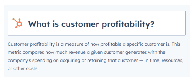
This helps text from their article show up as featured blog posts in Google.
Another blog design element in Hub Spot is the reading progress bar. It indicates how much of the article is left for the user to read.

[auto-list-number] AskMen
AskMen is a blog that provides dating and relationship advice for men. It also has articles on various lifestyle topics, such as fitness and style.
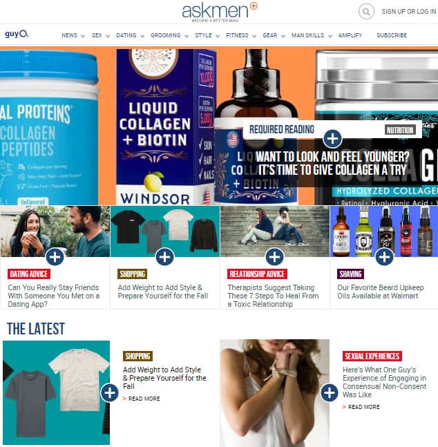
The blog improves readability by having white for its content area ❶ and a grey color ❷ for its margins.
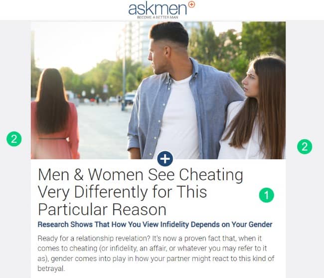
This helps readers focus their eyes on the content better and increases readability. Using a different color for the background will improve its readability.
[auto-list-number] Nomadic Matt
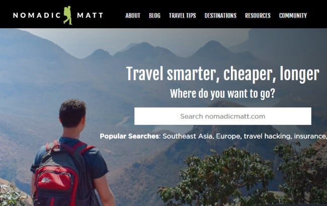
Nomadic Matt is a travel blog with a very clean design. The focus is on content with ample white space.
One distinct feature of the blog is the search bar on the home page that asks the user for the destination where they want to go. The description makes it a bit different from a conventional search bar but it works the same way to help users find content on the blog.
What Next?
In this post, we shared some of the best blog design examples that we’ve come across.
We hope this guide helped you design a blog that is not only visually appealing but also readable, easy to navigate, and optimized for conversion.
Which blog’s design is your favorite?
Let us know in the comments section below.
Share this post with your friends & followers:
