Are you looking for the best blog font? Do you ever feel like your blog posts could be more readable if only you had better blog fonts and typography?
If the typography and font are difficult to read, your readers may lose interest quickly.
In this post, we’ll share 39 best fonts and typography options for high readability.
Use these recommendations to choose the right font for your blog and to make your blog posts more engaging and enjoyable for your readers.
What is a blog font?
A blog font is the style and size of the characters used in the text content of a blog. Characters can include letters, numbers, punctuation marks, and symbols. The appearance of a block of text can be changed by changing the font. The best blog fonts are easy to read.
Why are fonts important?
The font you use on your blog can affect how easy it is for people to read your content. If the font is too small, has low contrast, or is in a difficult-to-read style, readers may have difficulty understanding your content. This will make your blog visitors disengaged and they will quickly leave your blog.
On the other hand, if the font is easy to read, has good contrast, and is in a style that is comfortable to read, readers will be more likely to stick around and read your content.
Fonts like color can also elicit certain emotions. Font psychology is the study of how fonts can be used to affect a person’s mood or emotions. Certain fonts can be used to create a feeling of tradition, luxury, and respectability while others may create a feeling of clarity and forward-thinking.
What makes a good font?
The two main elements of a good font are legibility and availability.
Legibility
Your font should be clear and legible. The best fonts will make it easy for readers to differentiate the characters.
In some font styles the following words are confused with each other even among people with no dyslexia and visual impairments:
- clear / dear
- turn / tum
- CS5 / CSS
- 105 / IOS
- 5AM / SAM
- Z2 / 22
- LJ, LI, Ll / U
- ce / oe
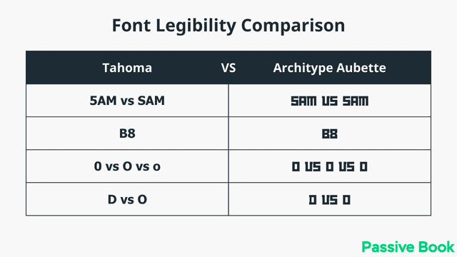
If you add visual impairments or increase the reader’s age to over 45, then the range of characters that can be confused increases:
- i / j
- B / 8
- D / O, 0, o
- 0 / O o
- k / R
- a / o
- F / f
- r / v / Y
- g / q
For people with dyslexia, similar-shaped letters and characters, short ascenders and descenders are all more difficult to read. Choosing the right font is important for a readable blog. Your font selection should also have high contrast for mobile devices.
Availability
The best fonts are not only easy to read but are also available to most of your audience. Not all fonts are available to all users.
There are two types of fonts web fonts and web-safe fonts.
A web-safe font is any font that is supported by most major browsers and operating systems. When you use a web-safe font, your visitor’s browser won’t have to download the font from your server. So web-safe fonts will typically lead to faster page load times.
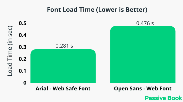
There are a limited number of web-safe fonts, and most of them are common fonts that are installed on many devices. The most common web-safe fonts are Arial, Georgia, Tahoma, Helvetica, Times New Roman, Verdana, Trebuchet MS, Calibri, and Courier New.
There are also web fonts like Google Fonts. Google Fonts offers a free library of fonts that can be used on the web. Any font in the Google Fonts library can be used on your blog, and the user’s browser will automatically download the font file from your server when they visit your blog. This means that even if a user doesn’t have the font installed on their device, they will still be able to see the text in the correct font.
If you use a font that is not supported by the user’s operating system, then they will see something else than what you want them to see.
If you choose to use custom fonts like Google Fonts hosted on your own server or a third-party server, it can slow down your website. So, switching to web-safe fonts can speed up your website. We will cover some of the best Google fonts in this list.
Although most English websites use a free font there are several paid fonts available for other languages. Fonts may not be available for free in your language. Sometimes free fonts lack the same quality as paid fonts in other languages. In these cases, you might want to purchase a paid font.
5 Types of Fonts
There are five different types of fonts: serif, sans-serif, slab-serif, script, and monospace.
1. Serif
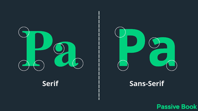
Serif font will have small lines or strokes attached to the ends of the main strokes in a letter. The word “serif” comes from the Latin word “sera,” which means “rope.” The small lines or strokes are called “serifs.”
These fonts are best used as display fonts. They are also great for use in print. Serif fonts have been used for printed text since the 15th century. They are easy to read in long blocks of text, such as in a book or newspaper.
Serif fonts are popular with blogs that are looking to be perceived as elegant and sophisticated because of their classic style. Blog logos that use serifs show a personality of tradition, respectability, and reliability.
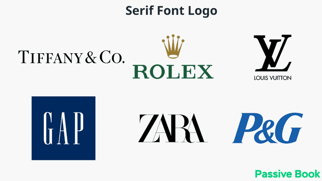
Serif fonts are typically used by fashion and makeup bloggers. Blogs in the academic, editorial, and financial fields also favor serif fonts.
Some popular serif fonts are:
- Georgia
- Times New Roman
- Garamond
- Bookman
- Cambria
2. Sans-Serif
Sans serif font does not have the small lines or strokes attached to the ends of the main strokes in a letter. The word “sans” comes from the French word meaning “without.”
Sans serif fonts are more popular than serif fonts because they are easier to read on a computer or mobile screen.
Sans-serif fonts can be perceived as modern, clean & simple. They work well for blogs that want to appear young, fresh, and current because of their modern style. Sans-serif fonts show a personality of clarity, minimalism, and forward-thinking. Blogs that choose this font focus on sensibility and practicality instead of trying hard to be sophisticated.
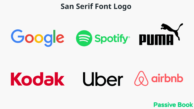
Most websites and blogs use Sans-Serif fonts. They are common among lifestyle, food, travel, and DIY bloggers. Sans-serif fonts are also popular with technology and startup blogs.
Some popular sans-serif fonts are:
- Helvetica
- Arial
- Verdana
- Tahoma
- Trebuchet MS
- Gill Sans
- Myriad Pro
3. Slab-Serif
Slab-serif fonts are similar to serif fonts, but the small lines or geometric strokes attached to the ends of the main strokes in a letter are thicker and have right angles.
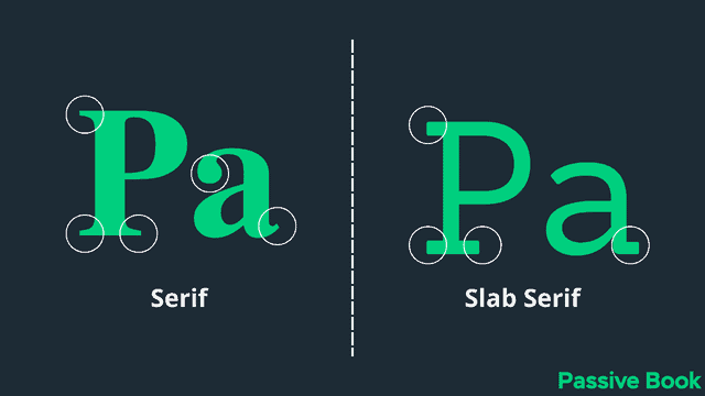
Slab-serif fonts can be perceived as strong, stable, and masculine. They work well for blogs that want to show a personality of authority and power.
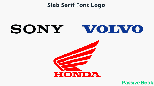
Slab-serif fonts are typically used by business, news, and sports blogs.
Some popular slab-serif fonts are:
- Rockwell
- Courier New
- Archer
4. Script Fonts
Script fonts are based on the handwritten letters of the alphabet. They can be either connected or disconnected in a handwriting font. They are more commonly used as decorative fonts.
Generally, it is recommended you use these fonts sparingly because they have poor readability. However, you can use it to make a nice blog logo.
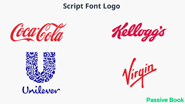
Script fonts are popular with blogs that want to be perceived as feminine, romantic, personal, elegant, and friendly. Blog logos that use script fonts show a personality of warmth and approachability.
Some popular script fonts are:
- Lobster
- Pacifico
- Snap ITC
5. Monospace Fonts
Monospace fonts are fonts where every character is the same width. They can be used to create tables or code snippets on a blog.
Monospace fonts are typically used by developers and designers to show code snippets on their blogs.
<?php
$color = "red";
echo "My car is " . $color . "<br>";
echo "My house is " . $COLOR . "<br>";
echo "My boat is " . $coLOR . "<br>";
?>
Some popular monospace fonts are:
- Courier New
- Lucida Console
- Consolas
Font Pairing
Font pairing is the process of choosing two or more fonts that work well together. When choosing fonts, you need to consider things like contrast, readability, and the overall tone of your text.
You can use just one font for both your headings and body text. However, some bloggers do font pairing where they combine font families. Some websites combine three fonts together.
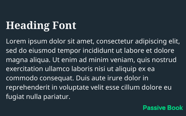
Here are some tips for font pairing:
- Use a sans-serif font as the main font for body text and a serif font for headings. These fonts can work together.
- Use a script font for decorative elements.
- Use a monospace font for code blocks.
- Make sure there is enough contrast between the fonts.
- Avoid using more than two fonts.
Here in Passive Book, we don’t do font pairing. We just use one font on our entire website for both body text and headings.
Finding Fonts You Like
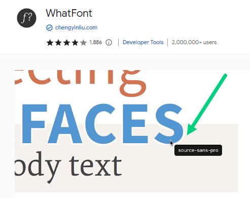
Sometimes you will like a font used by another website and will want to use it on your own. You can find the fonts that are used by websites and blogs that you enjoy reading using a handy Chrome extension called WhatFont. Just enable the extension and click on the font you see on the screen to find the font type used. When you find something you like use those fonts for your blog. You can look at your competitor’s font choice.
39 Best Blog Fonts & Typography
Now that we have gone over the types of fonts and what makes a good font, let’s take a look at some of the best blog fonts you can use in your blog. For each font, we will cover the font type, font pairing, and whether it is web-safe. You will find an appropriate font to use for your blog in this list.
1. Helvetica
- Web Safe: Yes
- Type: sans-serif
- Font Pairing: Helvetica Neue, Lucida Grande, Georgia, and Arial
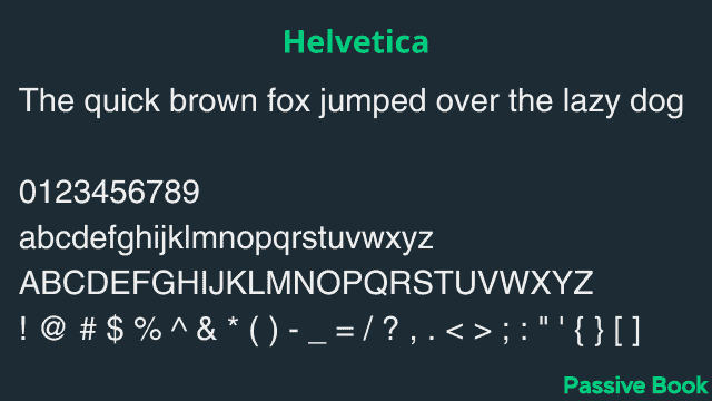
Helvetica is a sans-serif font that was created in the 19th century. Helvetica is a versatile font that uses clean lines and shapes that makes it ideal for both body text and headlines. It is one of the most popular fonts and has been used by many companies, such as Apple, American Airlines, and FedEx.
2. Arial
- Web Safe: Yes
- Type: sans-serif
- Font Pairing: Helvetica Neue, Lucida Grande, and Georgia
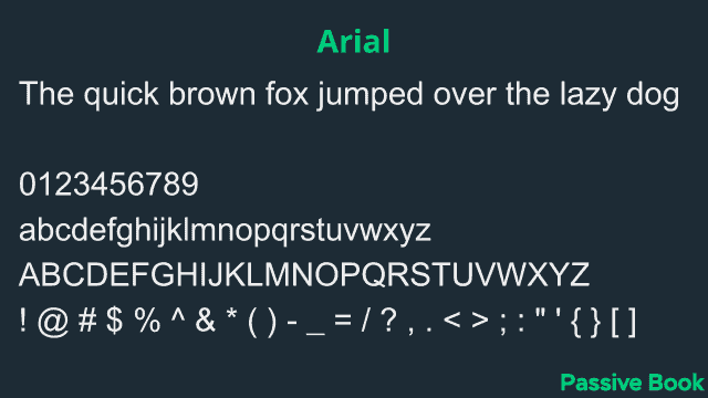
Arial is a sans-serif font that was created in 1982. It is very similar to Helvetica but has a slightly different character width. Arial is commonly used as a default font on many devices and applications. For example, Google Docs uses Arial as its default font.
3. Verdana
- Web Safe: Yes
- Type: sans-serif
- Font Pairing: Georgia, Lucida Grande, Tahoma, Arial, and Helvetica Neue
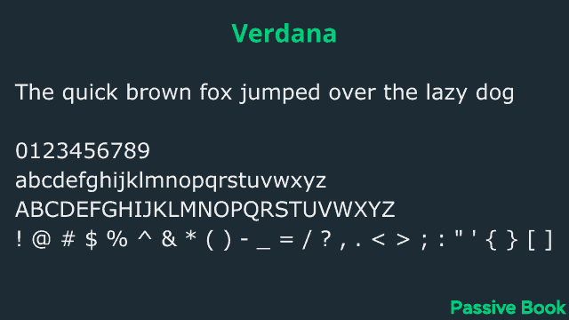
Verdana is a sans-serif font that was created in 1996. It was designed specifically for low-resolution screens. Veranda is a popular font for blogs because it is very readable. You can use it in both paragraphs and headlines.
4. Tahoma
- Web Safe: Yes
- Type: sans-serif
- Font Pairing: Georgia, Lucida Grande, Tahoma, Arial, and Helvetica Neue
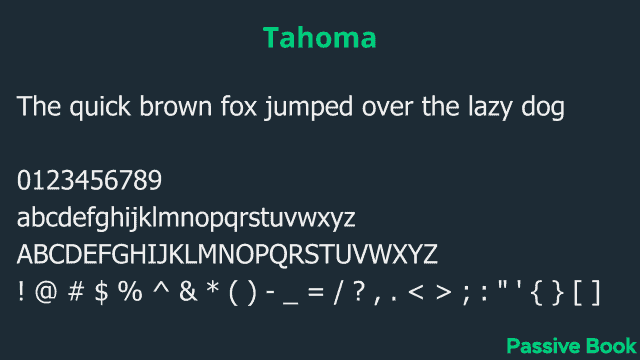
Tahoma is a sans-serif typeface that is widely used on the web. Tahoma is also one of the most popular fonts on the web and can be easily used in both headings and body content. Tahoma is a great font for readability and has good legibility. It uses square dots for lowercase letters and periods. We use Tahoma in Passive Book.
5. Trebuchet MS
- Web Safe: Yes
- Type: sans-serif
- Font Pairing: Georgia, Lucida Grande, Tahoma, Arial, and Helvetica Neue
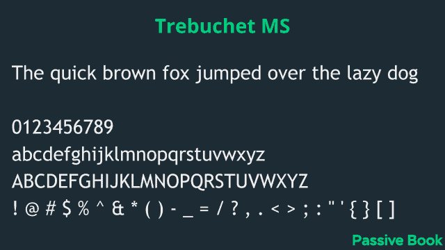
Trebuchet MS is a sans-serif typeface developed by Microsoft that is widely used on the web. Trebuchet MS is a good choice for body text because it is easy to read and has a neutral style that can be used for a variety of purposes. The letters are slimmer than other sans-serif fonts making it a good option for paragraph and body text.
6. Georgia
- Web Safe: Yes
- Type: serif
- Font Pairing: Helvetica Neue, Arial, Lucida Grande, Open Sans, and Lato
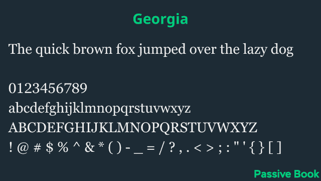
Georgia is a serif font designed by Matthew Carter in 1989. It is based on the design of Times New Roman but with a more modern look. Georgia is one of the most popular fonts for web pages and has been since its release. It is also one of the fonts used in the default installation of Windows XP and Windows Vista.
7. Garamond
- Web Safe: Yes
- Type: serif
- Font Pairing: Calisto MT
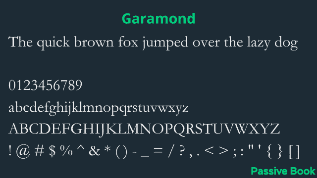
The font Garamond is a serif typeface that was designed in the 16th century by Claude Garamond. It is one of the most popular fonts used today and has been used for many important documents, such as the Declaration of Independence.
8. Calibri
- Web Safe: Yes
- Type: sans-serif
- Font Pairing: Segoe UI and Arial
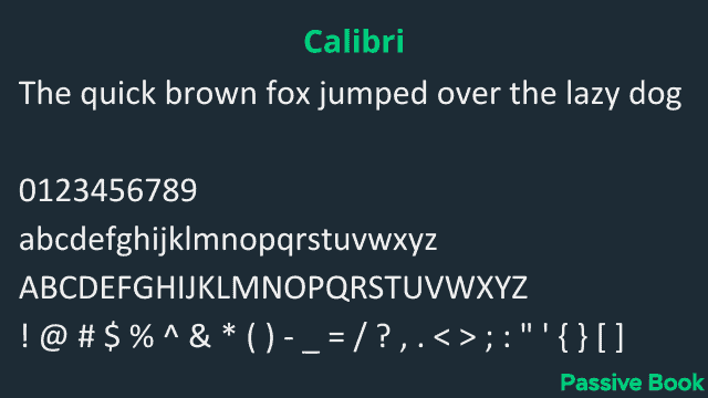
Calibri is a sans-serif font that was created by LucasFonts in 2001. It was designed to be used in body text and has a very clean and legible design. Many people find Calibri to be one of the most readable fonts available, making it a popular choice for both online and print media.
9. Century Gothic
- Web Safe: Yes
- Type: sans-serif
- Font Pairing: Baskerville
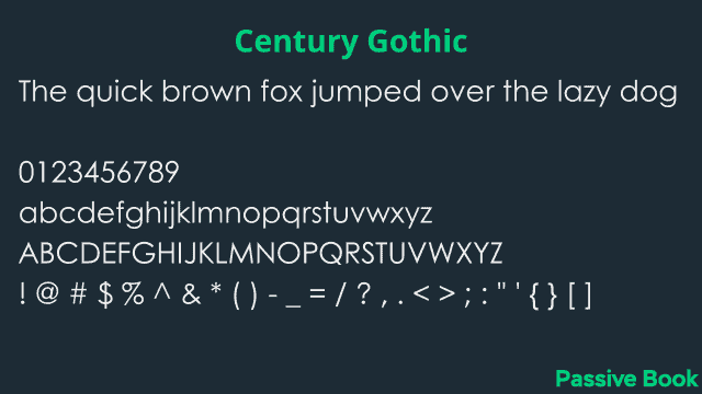
Century Gothic is a sans-serif font that was designed by Morris Fuller Benton in the early 20th century. It is one of the most popular fonts on the internet and is often used in headings and titles. Century Gothic is known for its high readability and is a good choice for body text.
10. Segoe-UI
- Web Safe: Yes
- Type: sans-serif
- Font Pairing: Arial, Lucida Grande, and Helvetica Neue
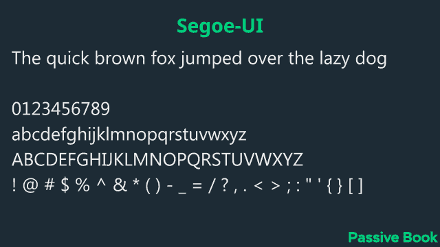
Segoe UI is a sans-serif font designed by Steve Matteson and commissioned by Microsoft. It is used in many of Microsoft’s products, including Windows Vista, Office 2007, and the Xbox 360 dashboard. Segoe UI is very legible on screens and has a corporate feel to it.
11. Courier New
- Web Safe: Yes
- Type: slab-serif
- Font Pairing: Helvetica and Lucida Grande
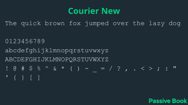
Courier New is a slab-serif font that was designed for typewriters. It has a very clean and modern look. If you have a developer blog it can be used for your code blocks.
12. Baskerville
- Web Safe: Yes
- Type: serif
- Font Pairing: Lucida Grande, Helvetica Neue, Open Sans, and Georgia
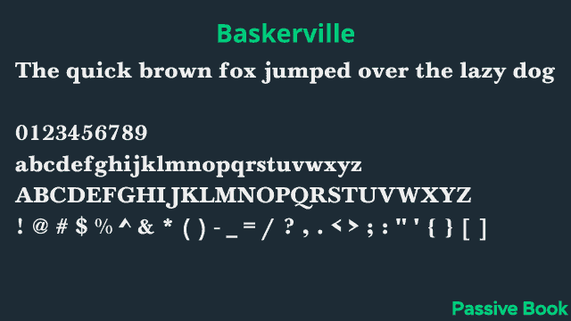
Baskerville is a serif font that was designed in the 18th century by John Baskerville. It is one of the most popular fonts used today and is considered to be one of the most legible fonts available.
13. Calisto MT
- Web Safe: Yes
- Type: serif
- Font Pairing: Oswald and Garamond
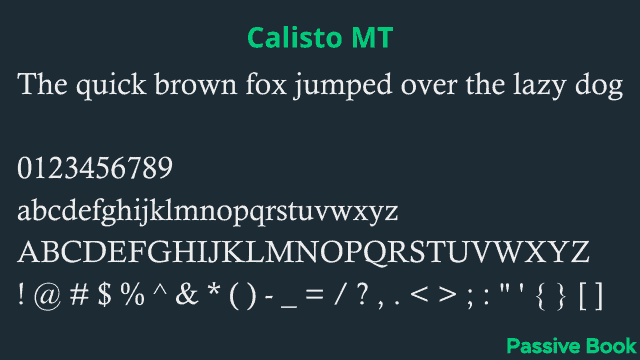
Calisto MT is a serif font that is designed for body text. It has a very clean and legible design that makes it perfect for use on the web. The font is available in both regular and bold weights, making it a great choice for headings and other large text blocks.
14. Cambria
- Web Safe: Yes
- Type: serif
- Font Pairing: Georgia
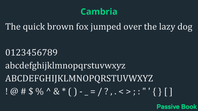
The Cambria font is a serif font that is designed for legibility. It is a good choice for body text because it is easy to read and has a neutral style that will not clash with other fonts.
15. Lucida Grande
- Web Safe: Yes
- Type: serif
- Font Pairing: Georgia, Lucida Sans
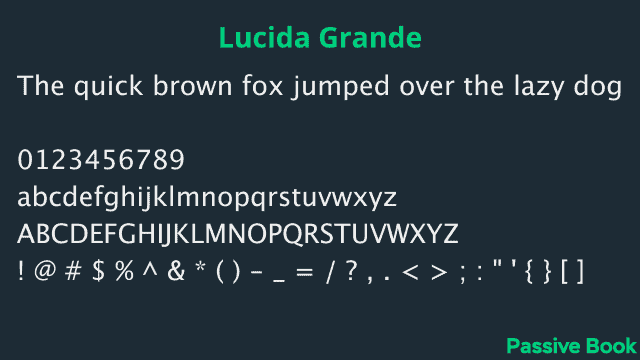
Lucida Bright is a serif font that was designed by Charles Bigelow and Kris Holmes in 1985. It is a very legible font that is perfect for use in body text. The letters have a slight curve to them which makes them more visually appealing and easy to read.
16. Helvetica Neue
- Web Safe: Yes
- Type: sans-serif
- Font Pairing: Lucida Grande, Georgia, Helvetica, and Open Sans.
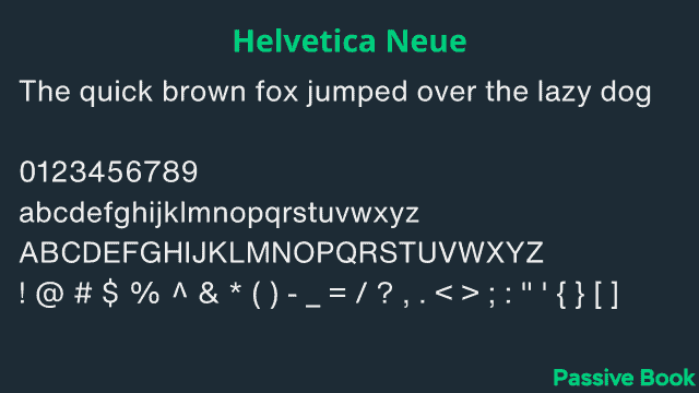
Lucida Sans is a sans-serif font designed by Charles Bigelow and Kris Holmes. It was created as a humanist sans-serif typeface, intended to be legible and easy to read on screens. Lucida Sans is also the default font on the Mac OS X operating system.
17. Roboto
- Web Safe: No
- Type: sans-serif
- Font Pairing: Roboto Slab, Open Sans, Lato, Playfair Display, and Montserrat
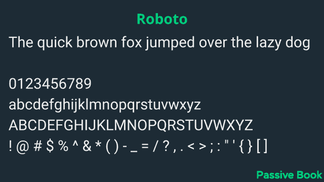
The font Roboto was created by Google in 2011. It is one of the best Google fonts for blogs. It is a sans-serif typeface that is designed for legibility on screens. Roboto has been used by Google across many of its products, including Android, Chrome OS, and YouTube which makes it an excellent choice for your blog. Roboto is the most popular Google font. However, it is not web-safe.
18. Open Sans
- Web Safe: No
- Type: sans-serif
- Font Pairing: Montserrat and Source Sans Pro
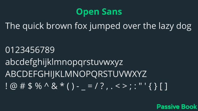
Open Sans is a sans-serif typeface designed by Steve Matteson and released in 2010. It is a humanist sans serif that is intended to be highly legible on screens. Open Sans was designed with an international audience in mind, supporting over 40 languages.
19. Lato
- Web Safe: No
- Type: sans-serif
- Font Pairing: Merriweather
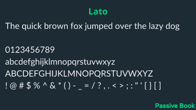
Lato is a sans-serif font designed by Łukasz Dziedzic in 2010. It was intended as a display typeface but is also suitable for body text. Lato has semi-rounded letters and features slightly calligraphic details. Its design draws inspiration from classical Roman proportions, which gives it both elegance and stability. This is another popular font on google fonts.
20. Montserrat
- Web Safe: No
- Type: sans-serif
- Font Pairing: Source Sans Pro and Fira Sans.
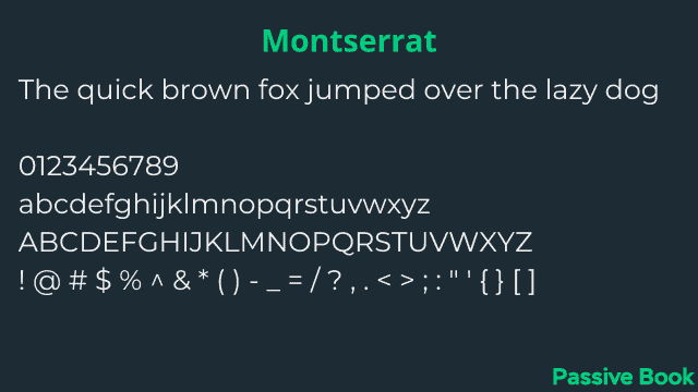
Montserrat is a sans-serif font that was designed by Jos Buivenga. It has a clean, modern look and is perfect for headlines, titles, and other large text blocks.
21. Roboto Condensed
- Web Safe: No
- Type: sans-serif
- Font Pairing: Roboto, Roboto Slab, Open Sans, Lato, Playfair Display, and Montserrat
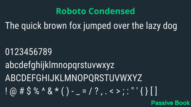
Roboto Condensed is a sans-serif font that was designed by Google in 2011. It is available for free on Google Fonts. Roboto Condensed is a versatile font that works well for both body text and headlines. The condensed version of the font gives it a modern and sleek look, making it perfect for high-readability blog posts.
22. Source Sans Pro
- Web Safe: No
- Type: sans-serif
- Font Pairing: Montserrat and Ubuntu
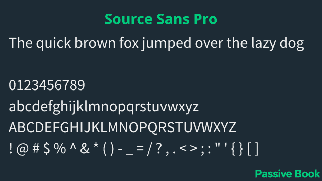
Source Sans Pro is a sans-serif font designed by Paul D. Hunt for Adobe Systems. It is an extremely versatile font that works well in both print and digital media. Source Sans Pro is especially good for headings, as it has a large x-height and tight letter spacing.
23. Oswald
- Web Safe: No
- Type: sans-serif
- Font Pairing: Arial, Roboto, Open Sans, Merriweather, and Quicksand.
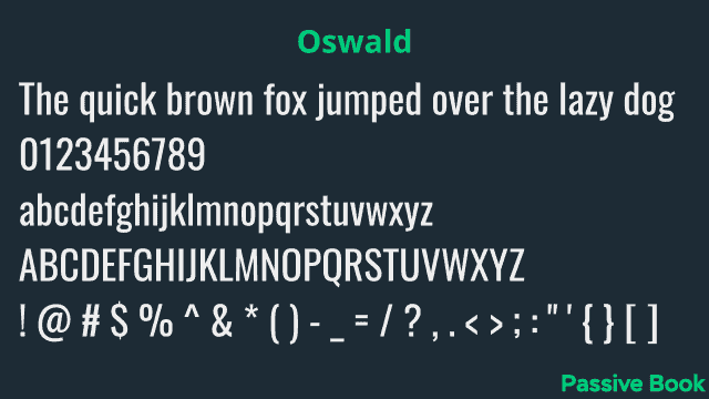
Oswald is a sans-serif font that was designed by Vernon Adams in 2013. It has a modern and sleek design, making it perfect for headlines, titles, and logos. Oswald is available in both web and desktop formats.
24. Roboto Mono
- Web Safe: No
- Type: serif
- Font Pairing: Roboto and Montserrat
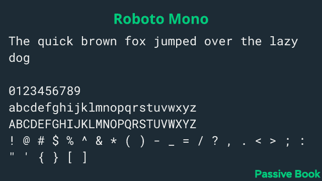
Roboto Mono is a sans-serif font designed by Christian Robertson and released in 2011. It was commissioned as the system font for Google’s Android operating system and has been used extensively throughout Google’s services. Roboto Mono is available in regular, italic, and bold weights.
25. Noto Sans
- Web Safe: No
- Type: sans-serif
- Font Pairing: Lato, Montserrat, and Roboto
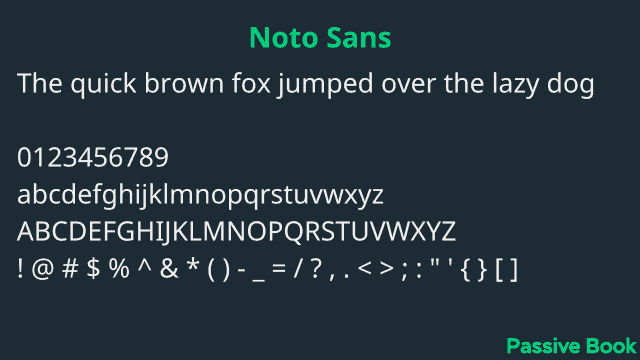
Noto Sans is a sans-serif font designed by Google. It is available in a wide range of weights and styles, making it perfect for both headings and body text. Its clean lines and open shapes make it highly readable, making it a great choice for any type of content.
26. Raleway
- Web Safe: No
- Type: sans-serif
- Font Pairing: Merriweather, Roboto, and Open Sans.
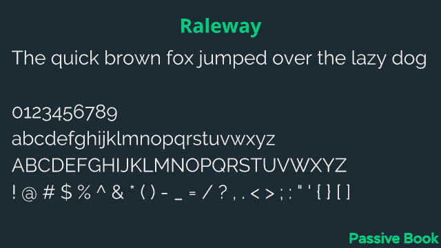
Raleway is a sans-serif font that is clean, elegant, and easy to read. It is perfect for body text and has a high legibility score. Raleway also looks great when used in headings and titles.
27. Ubuntu
- Web Safe: No
- Type: sans-serif
- Font Pairing: Lato and Merriweather
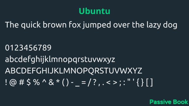
Ubuntu is a sans-serif font designed by Dalton Maag. It has a very clean and modern look, making it perfect for use in both web and print design. Ubuntu is available in both regular and bold weights, making it a great choice for headings and titles.
28. Nunito
- Web Safe: No
- Type: sans-serif
- Font Pairing: Open Sans, and Roboto
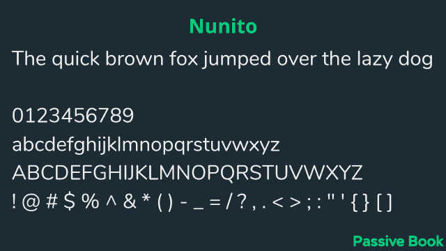
Nunito is a sans-serif font that was created by Vernon Adams. It’s a very versatile font that is perfect for both print and digital media. Nunito has a very clean and simple design, which makes it perfect for use in headings and titles. The letters are also slightly condensed, which gives them a modern look and feel.
29. Roboto Slab
- Web Safe: No
- Type: serif
- Font Pairing: Roboto, Open Sans, Lato, and Montserrat.
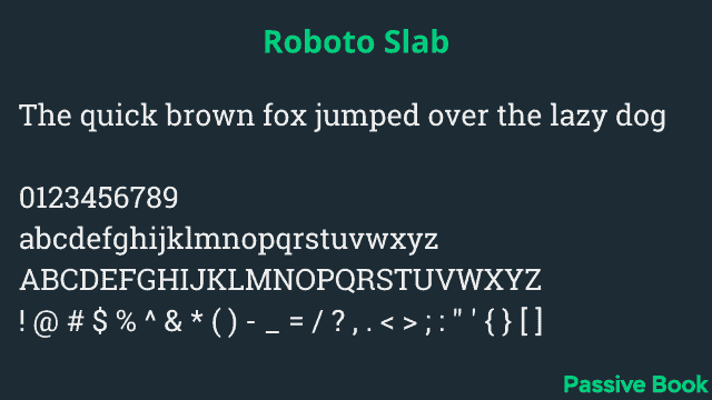
Roboto Slab is a typeface created by Google. It’s intended as a display typeface for headings and titles, Roboto Slab is based on the sans-serif Roboto font but with serifs added. Its letterforms are wider and more square than those of Roboto, with a much higher x-height.
30. PT Sans
- Web Safe: No
- Type: sans-serif
- Font Pairing: Poppins, Open Sans, and Source Sans Pro
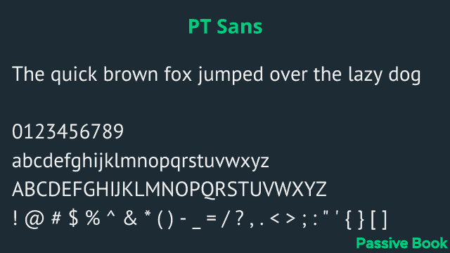
PT Sans is a sans-serif typeface designed by ParaType in 2004. The family includes 8 weights, from ExtraLight to Black, with matching italics. It was designed for legibility in small sizes and has a large x-height. PT Sans is licensed under the SIL Open Font License.
31. Merriweather
- Web Safe: No
- Type: serif
- Font Pairing: Roboto and Open Sans.
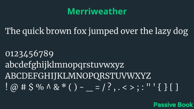
Merriweather is a sans-serif font designed by Eben Sorkin. It was created as a corporate font for the Weather Channel and has since been released for general use. Merriweather is characterized by its tall x-height, wide letterforms, and generous spacing. This makes it an extremely readable font, perfect for body text.
32. Playfair Display
- Web Safe: No
- Type: serif
- Font Pairing: Lato, Roboto, Open Sans, Montserrat, Poppins, and Georgia.
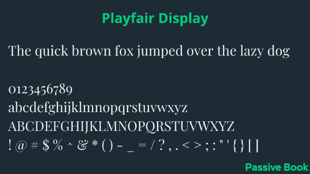
Playfair Display is a serif font that was designed by Louis Oppenheim in the early 20th century. It is an ideal font for headings, titles, and other large-scale text because of its high legibility and strong presence.
33. Inter
- Web Safe: No
- Type: sans-serif
- Font Pairing: Source Sans Pro & Barlow
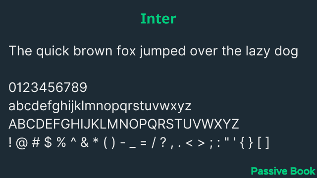
Inter is a sans-serif font that was created in 1957 by the Intertype Corporation. It was designed to be used for headlines and advertising and has a modern look and feel. The font is available in both regular and bold weights and can be downloaded for free from the Google Fonts website.
34. Poppins
- Web Safe: No
- Type: sans-serif
- Font Pairing: Playfair Display, Gotham, and Open Sans
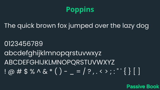
Poppins is a sans-serif typeface that was designed by Laura Pol. It has a very clean and simple design, which makes it perfect for use in headings and titles. The letters are also slightly condensed, which gives them a modern look and feel.
35. Lora
- Web Safe: No
- Type: serif
- Font Pairing: Merriweather, Source Sans Pro, Roboto, Ubuntu, and Nunito.
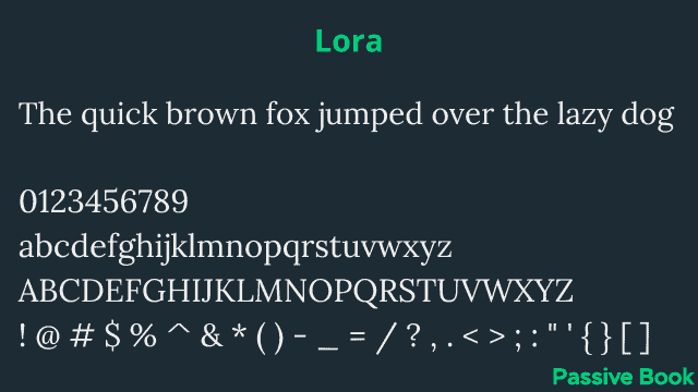
Lora is a sans-serif font that was designed by Jos Buivenga. It’s a very versatile font that can be used for both headings and body text, and it has a very clean, modern look. Lora is available in both regular and italic versions, and it’s free for personal use.
36. Nanum Gothic
- Web Safe: No
- Type: sans-serif
- Font Pairing: Ubuntu, Playfair Display
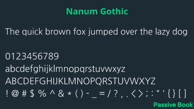
Nanum Gothic is a sans-serif font that was designed by Kim SeungHyun. It has a modern and minimalist design, which makes it perfect for use in headlines and titles. The letters are narrow and tall, making them easy to read when used in large sizes.
37. Fira Sans
- Web Safe: No
- Type: sans-serif
- Font Pairing: Playfair Display and Montserrat
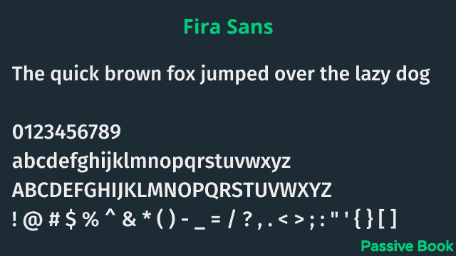
Fira Sans is a sans-serif font that was commissioned by the Mozilla Corporation for use in Firefox OS and is also used in the Firefox web browser. Fira Sans is a modern font that is perfect for headlines and titles. The letters are tall and thin, with sharp angles that give the font a modern feel. The letterforms are designed to be highly readable, making them perfect for use in the body text as well.
38. Barlow
- Web Safe: No
- Type: sans-serif
- Font Pairing: Lato, Barlow Condensed, Fira Sans, and Roboto
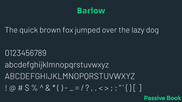
Barlow is a sans-serif font designed by Jeremy Tankard in 2006. It is a humanist typeface with strong calligraphic influences. The letterforms are based on Roman inscriptional capitals but have been subtly reshaped and modernized for a contemporary feel. Barlow is available in six weights with matching italics.
39. Quicksand
- Web Safe: No
- Type: sans-serif
- Font Pairing: Source Sans Pro
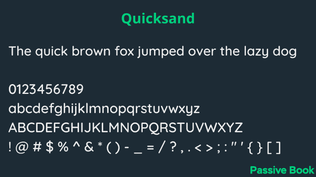
Quicksand is a sans-serif font that was designed by Neil Summerour in 2006. It has a very modern and sleek design, making it perfect for use in headlines and posters. The letters are spaced evenly, which makes it easy to read in small sizes.
Typography Tips
Now that we have covered the different font faces that will work well in your blog, let’s move on to some general typography tips that you should keep in mind to ensure high readability for your blog posts.
What is Typography?
Typography is the art and technique of arranging type to make written language legible, readable, and appealing when displayed. The arrangement of type involves selecting typefaces, font size, content width, line height, and paragraph spacing.
Font Size
The font size you use in your blog posts is extremely important for ensuring readability. A good rule of thumb is to use a font size that is large enough to be easily read by someone sitting at a normal reading distance from a computer screen.
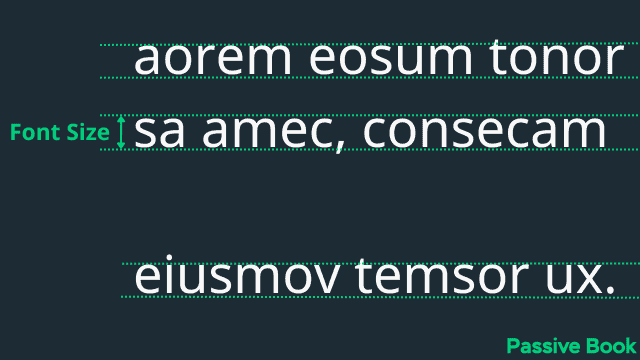
The ideal font size for a blog is between 16px – 20px. If the font size is below 16px, people with near-sightedness will find it difficult to read. If the font size is more than 20px, then the eyes need to move a lot to consume the text slowing down the reader.
Here are the different font size recommendations for different types of text:
- Paragraph Body: 16px to 20px
- H4 Title Tag: 20px to 25px
- H3 Title Tag: 26px to 32px
- H2 Title Tag: 33px to 41px
- H1 Title Tag: 42px to 52px
Content Width
Another important factor to consider when choosing a font size is content width. Content width or line length is the width of a block of text, and it can have a big impact on readability.
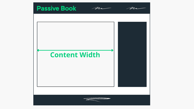
If the content width is too long, then the reader’s eyes will have to move back and forth a lot, which can cause fatigue. On the other hand, if the content width is too short, then it will be difficult for the reader to follow the text.
A good rule of thumb is to keep your content width between 540px to 700px so that there are between 60-80 characters per line. The exact width will depend on your content’s font size.
Line Height
Line height is the space between lines of text. It’s measured in pixels, points, or as a percentage of the font size. When you adjust the line height, you’re actually adjusting the amount of space between all the lines in a block of text, not just adjacent lines. This helps to create an even visual rhythm and prevents text from looking cramped.

Text that is set at a large line height is easier to read than text set at a small line height. This is because there’s more “white space” for your eyes to rest on, making it less tiring to read. Conversely, if you set the line height too large, your text will look like it has too much space around it and will appear disconnected.
The ideal line height is somewhere between 120% to 160% of the font size, which when converted to em is 1.2em to 1.6em. So, if you’re using a 16px font, then 150% or 1.5 EM will be 24 pixels (1.5 * 16) that you must use as the line height.
Paragraph Spacing
Paragraph spacing is the amount of space between paragraphs.
Paragraph spacing is important because it allows the reader to visually separate one paragraph from the next. This makes it easier for the reader to follow the flow of the text, and it also makes the text appear more organized. Just like line height, paragraph spacing helps to create an even visual rhythm and prevents text from looking cramped.

The ideal paragraph spacing is 1.5 to 1.7 times the font size or 1.5em to 1.7em. So if you’re using a 16px font, then the paragraph spacing should be 24px (1.5 * 16).
Use Typography Golden Ratio
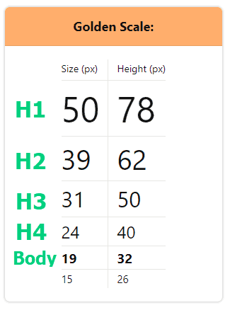
The typography golden ratio is a widely used formula for determining the perfect font size and line height. The formula is based on the Fibonacci sequence, which is a series of numbers where each number is the sum of the two preceding numbers.
You can use the Typography Golden Ratio Calculator to find the right font size, content width, line height, and paragraph spacing. Just select your font and choose the font size leaving the content width blank. You will get recommendations for all the different typography elements.
Hyperlinks
Hyperlinks are text that links to other pages or websites. When you click on a hyperlink, it takes you to the page or website that is linked to.
When choosing a font style for your hyperlinks, you want to ensure that it is easy to read and stands out from the rest of the text. If it blends in, your blog readers are less likely to realize they are links.
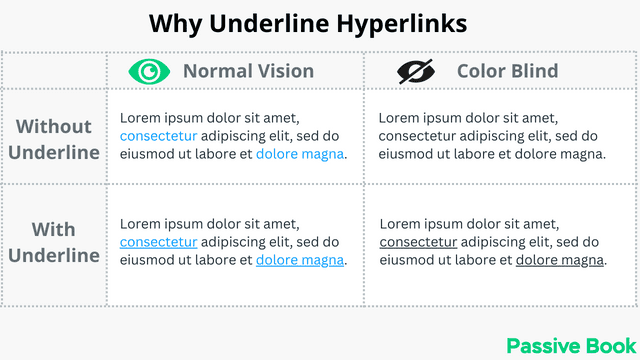
A common way to make the hyperlinks stand out is to underline them. However, underlining text makes it difficult to read because words with a downward stroke overlap with the line.
You can mitigate this issue by adding a space between the text and the line so that they don’t overlap. It can be easily achieved with CSS.
Also, you want your hyperlinks to be in a different color from the rest of your body text. The color used universally for links on the web is blue. However, you can replace it with your brand’s primary color as long as you don’t use it in any other text.
What Next?
Now that you know the basics of typography, take some time to explore different fonts and see which ones you like best.
When it comes to blog design, typography is an important element to consider. By using high-quality fonts and paying attention to typography details, you can create a blog that is not only visually appealing but also easy to read.
The font you choose will determine not only the readability but will also communicate your blog’s persona. The font can make your blog look classic or modern which is why fonts are a vital part of creating a successful blog.
We hope this guide helped improve your blog’s readability.
Which font are you using in your blog? Are you implementing the typography golden ratio?
Let us know in the comments below.
Share this post with your friends & followers:
