If you’re new to blogging or even if you’ve been blogging for a while, your blog design can be easy to get wrong.
In this post, we will show you how to design a blog that not only looks good but also provides a good user experience for your blog readers and target audience.
By the end of this guide, your beautiful blog design will draw readers in, keep them engaged with your content and convert them to subscribers and paying customers.
So what are you waiting for? Let’s get started!
What Is Blog Design?
Blog design is the process of creating a visually appealing and functional blog. The design of your blog should reflect the personality of your brand and provide a good user experience for your readers.
A well-designed blog will make it easy for readers to find the content they’re looking for and navigate around your site.
It will also encourage readers to stay on your site longer and come back frequently.
Why Is Blog Design Important?
Good blog design is important for the following reasons:
- First Impression: Repeat visitors will know what to expect and the content will matter more than the design. But for new visitors, your blog is often the first interaction that people have with your brand. So, it’s important to make sure that your blog design makes a good impression.
- Trust & Authority: A great design will give people the impression that you’re a professional, credible, and trustworthy brand.
- Navigation: Proper design will also make it easy for people to find the information your visitors are looking for on your site, which will keep them coming back.
- Readability & Engagement: Good blog design will help also improve readability and engagement keeping people on your website for longer. Your blog will be optimized for mobile devices, not just the desktop.
- Site Speed: When designed properly, your website will also load faster, and it will help you rank higher in the search engines.
How to Design a Blog
Now that we’ve gone over why blog design is important, let’s take a look at how to design a blog. We will show you how to design a blog step by step below:
1. Select a Customizable Theme
The first step to designing your blog is to choose a theme.
One of the biggest mistakes you can make when it comes to blog design is using a free theme that doesn’t allow for much customization.
Not only will this severely limit what you can do with your design, but it will also likely result in a slow-loading website due to all the extra code that these themes tend to have.
Instead, we recommend using a lightweight WordPress theme that is built for speed and performance. Here are the themes we recommend.
GeneratePress

We recommend using the GeneratePress WordPress theme, which is what we use on this site. It’s a free theme that comes with a premium addon that unlocks all the customization options.
The best part of GeneratePress is its support. If you are ever stuck and need help customizing, you can check out their forum and the chances are someone has already asked a question around the same topic. If not you can raise your own support ticket and you will get help to customize the theme to your liking.
We recommend GeneratePress because it is lightweight meaning your website will load really fast and pass the Core Web Vitals.
Kadence

Kadence is another great option for a WordPress theme. It is very similar to GeneratePress but has a host of additional plugins to improve the functionality. The premium version gives you access to all the customization options. The Kadence team is very helpful and always releases new features and updates frequently. You can use Kadence to create a blog, an online store, or a portfolio.
Astra

Astra is one of the most popular WordPress themes available and for good reason. It’s fast and lightweight. It comes with a host of features that make it perfect for any type of blog.
One of the best things about Astra is that it is highly customizable. You can change the colors, fonts, and layout to suit your brand and style. And if you want to get creative, you can even create your own custom blog design using the Astra Customizer.
2. Choose Your Brand Colors
The next step in how to design a blog is to choose colors that reflect your brand.
Your color scheme should be consistent across all your branding including your website, social media, and any marketing materials.
You have to pick one primary color for your blog. The primary color for our blog PassiveBook is Green and we use it in our logo, headings, links, and images.
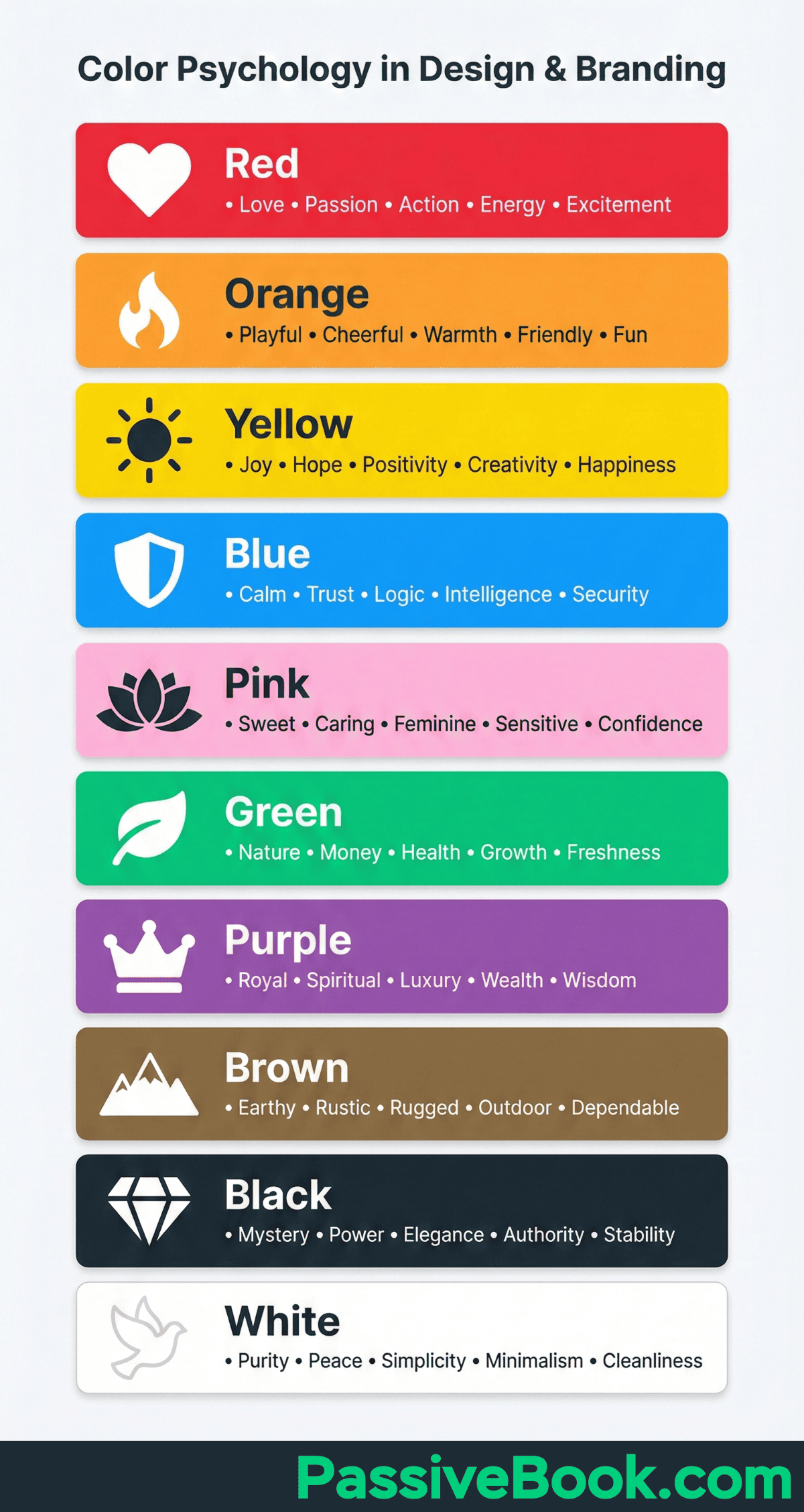
You can use color psychology to choose your primary color. I chose green because our blog helps people make money.
If you have a spiritual or new-age blog, a shade of purple is a better fit. Red is better suited for romance and dating.
Match the niche of your blog with the corresponding color below:
You can also pick a secondary color that compliments the primary color. We use a dark shade of grey in PassiveBook.
Once you have your colors, make sure to add them to your WordPress theme so they are applied across your site. You can have additional colors for other parts of your blog like landing pages.
If you don’t have a brand color scheme, now is the time to create one. You can use a tool like Coolors.co to help you find a selection of colors that work well together.
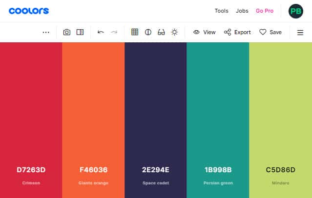
Save the color’s hex codes so that you can use them to brand different parts of your blog.
A blog design example where simple color psychology is used is Reiki Rays. They use purple as their brand color because it is also the color of spirituality.

3. Select Typography
Your blog’s typography will make or break your design.
Typography refers to the font that your blog uses to make the text legible, readable, and appealing when displayed.
The main thing you want to focus on with typography is readability. You want people to be able to read your blog posts easily without straining their eyes. You also want to make sure that your font choice reflects the tone of your blog.
Font Family
Fonts are classified into two broad font families: Serif and Sans-Serif.
Serif fonts are used in print and newspapers. Examples of Serif fonts are Times News Roman and Georgia.
Sans-Serif fonts are more modern and are used in web content and modern typography. These fonts lack the stroke in the end. Examples of these fonts are Arial and Tahoma.
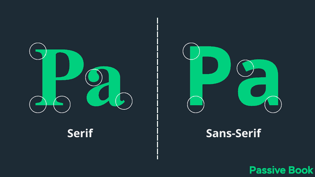
The Sans-Serif font family is extremely common in online content because it improves the readability of the text, especially for screens with lower resolution. They also appear more modern, minimalistic, and progressive.
Google Fonts have good compatibility and readability. But your website will have to download the Google Fonts every time a page loads. This can increase the load time of your website.
An alternative to Google fonts is web-safe fonts. Unlike Google fonts, web-safe fonts need not be downloaded because it is available by default on all computers. So using web-safe fonts will speed up your website load times. Here is the list of web-safe fonts:
- Arial (sans-serif)
- Verdana (sans-serif)
- Tahoma (sans-serif)
- Trebuchet MS (sans-serif)
- Times New Roman (serif)
- Georgia (serif)
- Garamond (serif)
- Courier New (monospace)
- Brush Script MT (cursive)
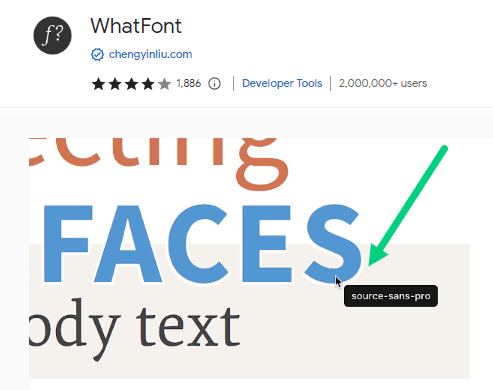
You can find the fonts that are used by websites and blogs that you enjoy reading using a handy Chrome extension called WhatFont. Just enable the extension and click on the font you see on the screen to out find the font type used.
Have no more than two fonts. You can have one font for all your headings and another font for all your body text. In Passive Book, I use a single font for both the heading and body text.
Font Size
Another important element that is important for blog fonts and typography is the font size.
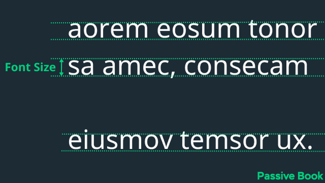
The font size is the size of the text. You want to make sure that the font is big enough so that people can read it without straining their eyes. The font size should be relative to the width of your blog content. You don’t want to use a small font size because it will make the text appear cramped and difficult to read.
A good rule of thumb is to use a font size that is big enough so that people can read it from 18 inches away from the screen. If you want people to be able to read your blog posts easily, make sure the font size is at least 16px. The ideal font size of your main content will be between 16px to 20px.
The font size of your heading should be bigger than the font size of your main content. This will help people quickly scan through your blog post and pick out the important parts.
Heading 1 (H1) font size should be twice as big as the font size of your body text. For example, if your body text is 16px, then your H1 should be between 32px.
Line Height
Line height is the space between above and below each line. Since it is always bigger than the font size, it is usually represented as a proportion. For example, a line height of 1.5em means it is 50% bigger than the font size.
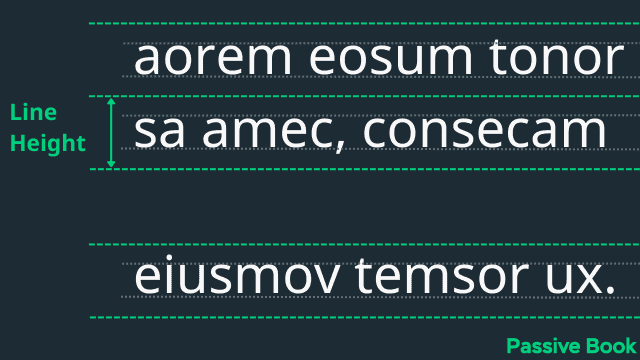
You want to make sure that there is enough space between each line so that people can easily read the text. A good rule of thumb is to use a line height that is 1.5 times the font size for the body text. So if your font size is 16px, then your line height should be 24px.
Just like the body, you want to provide a line height for your headings. This will help people quickly scan through your blog post and pick out the important parts.
Heading (H1) line height should be 1.2 to 1.5 times the font size of your H1 text. Other headings like H2, H3, and H4 can have a line height of 1.2 times the font size of the heading text. Try different line heights and see what looks good.
Paragraph Spacing
Paragraph spacing is the space between each paragraph. You want to make sure that there is enough space between each paragraph so that people can easily read the text.
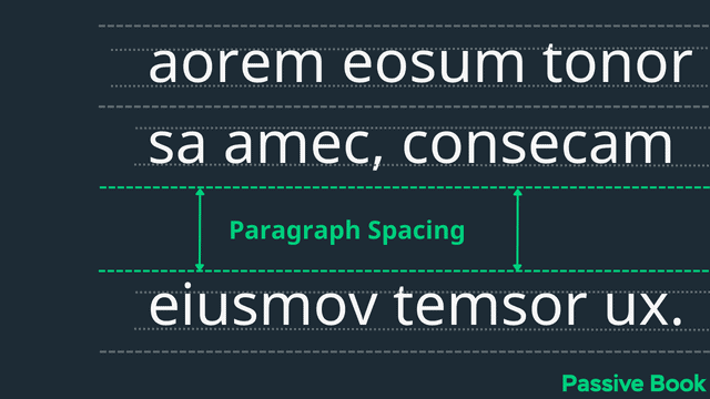
Your paragraph spacing should be greater than your line height so your content is easy to skim and read. Embrace white spaces when it comes to paragraph spacing.
Content Width
The content width is the width of the blog post. It plays an important role in readability.
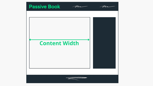
You want to make sure that your content width is not too wide or too narrow. If your content is too wide, people will have a hard time reading it because their eyes will have to travel back and forth too much. On the other hand, if your content is too narrow, then it will look cluttered and difficult to read.
A good rule of thumb is to keep your content width between 600px to 750px.
You can easily change the width of your content by changing the width of your blog’s container.
Just remember, the wider your content, the harder it will be for people to read. So use a narrower width if you want people to read your blog posts.
Golden Ratio for Typography
There are different golden ratios for font size, line height, paragraph spacing, and content width. The exact number depends on the font you use. It is worth learning how to use the tool Golden Ratio Typography Calculator.
Enter your font type, font size, and container width. You can enter what you have right now.
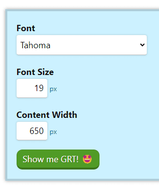
You will be given three different recommendations:
- Given: You will get recommendations based on all three inputs you provided.
- Size: Get the most optimal line height and content width for the font size you provided as the input.
- Width: Get the most optimal font size and line height for the selected font at the current content width
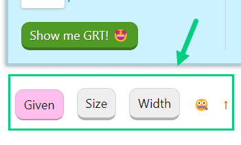
By default, the selection is Given. It will use all the inputs to give you recommendations.
But most of the time you won’t know what is the perfect content width. It will depend on the font size you choose. To get the perfect content width, change the toggle from Given to Size as shown below.
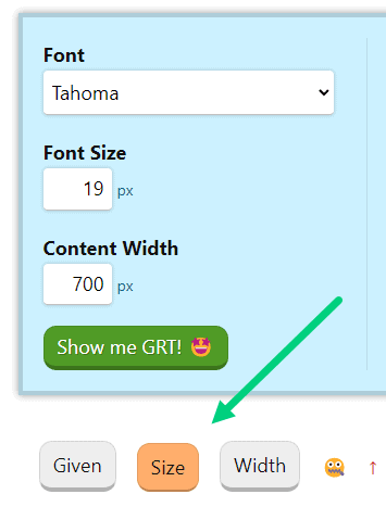
The calculator will ignore the Content Width you provided as the input (700px in the example above). It will instead give you a different recommendation for the content width as shown below (646px in the example below).
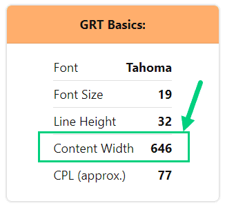
Alternatively, if you want to keep the width fixed and want to find the optimal font size for any given width, just select the Width toggle instead.

You can use the different font sizes and line heights from the golden scale for your headings. Based on the font size for the body text you provide in the input (in this example 19), the other font sizes will be calculated.
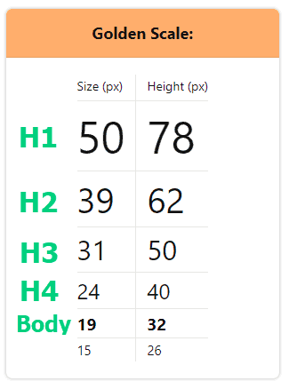
The size and height are in pixels. If your themes want you to provide a ratio instead of pixels for line height just divide the height and size to get the ratio. For example, if you divide height 32 by size 19 you get 1.68 as the ratio which is the line height I use in my blog.
You can use the px to em converter. Put the font size in the “Set a default pixel size:” and the line height in “Convert PX to EM:” and click convert to get the value in em.
You can use the spacing unit recommendations from the GRT Calculator for the paragraph spacing.
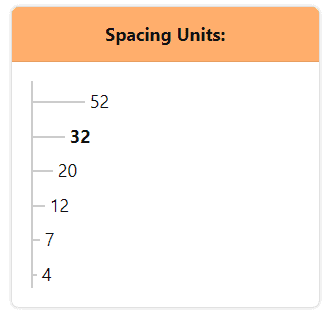
Remember that these are just best practices and guidelines. You don’t have to optimize your content exactly according to the golden ratio. Use the recommendations as a guideline and rely on your eye to decide what looks good.
Hyperlinks
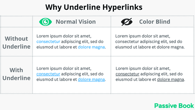
Make sure that your links are easily visible and underlined. People should be able to quickly tell the difference between links and normal text.
Underlining links helps your link stand out from the normal text, especially when someone reading your blog is color blind.
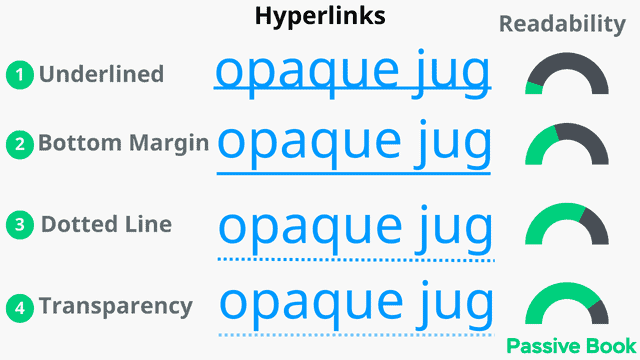
But underlining the links (see ❶ in image) the way it is traditionally done reduces readability because characters like p, g, j, and q that go over the line become less legible.
This readability issue of underlined links can be easily addressed by adding a bottom margin to your links. The margin will add some space separating the text and the line (see ❷ in the image).
You can improve the readability further by adding a dotted line (see ❸ in image) and/or adding some transparency to the line (see ❹ in image). This is how our link looks here in Passive Book.
You can achieve this with the following CSS:
/* Dotted Links */
.entry-content a:not(.nostyle) {
    font-weight: bold;
		text-decoration: none;
		padding-bottom: 3px;
	  border-bottom: dashed 1px;
}

.entry-content a:not(.nostyle):hover
{
    border-bottom: solid 2px;
}
To add custom CSS in WordPress:
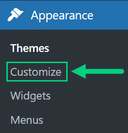
1. Go to Appearance > Customize in the WordPress Dashboard.
2. Click Additional CSS
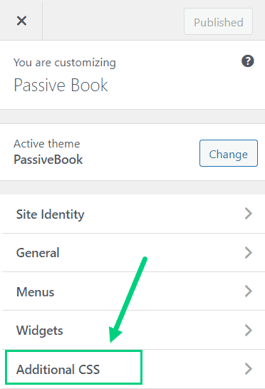
3. Paste the CSS code ❶ and Click Publish ❷.
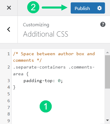
It will change only the links inside your Main Content area. Links in the sidebar and footer will remain unaffected.
If you want to disable the underline for certain links inside your main body, you can use the nostyle CSS.
To use the CSS just add class=”nostyle” inside the <a> tag of the link as shown below:

The recommended color for links is blue because that has been the color that has been used since the early days of the internet.
You can change the color of your links to your brand’s primary color as long as you don’t use it in other places like headings. In Passive Book, we use green as the color of our links.
Font Color & Background
Black text on white background has the highest contrast ratio of 21. So for maximum readability, you should use black text on a white background for your main body text. Using any other color usually reduces readability and makes your blog looks outdated.
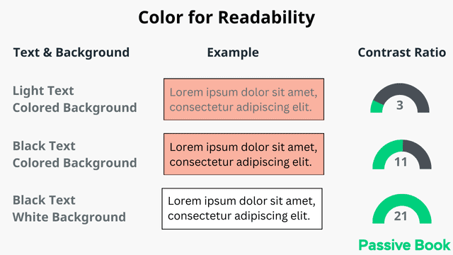
Optionally you can use your main primary color for your heading text and hyperlinks. It helps your headings stand out from the rest of the body.
I prefer to stick with black for all my text including headings. I use PassiveBook’s primary color green just for links.
Remember that 8% of men are color blind. So your headings and links should not solely rely on the color to stand out. You should change the font size and underline your hyperlinks.
4. Use Images
Images are an important part of every blog post. Not only do they make your blog posts more visually appealing, but they can also help to break up large chunks of text and make your content easier to consume.
However, it’s important to use images wisely. Don’t just add images for the sake of it – make sure that each image you use serves a purpose and helps to enhance your content in some way. Below is an example of a fluff image that is completely unconnected to the surrounding text.
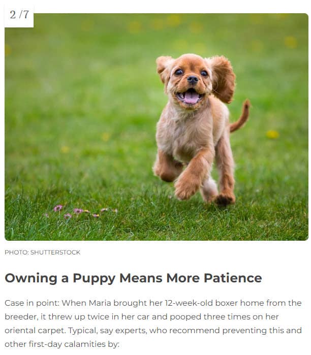
In addition, try to use unique images where possible. People are much more likely to remember your blog if they can associate it with a particular image, so using original photos or illustrations is a great way to make your blog stand out from the crowd.
Finally, be sure to optimize your images for the web before you upload them to your blog. This means saving them in the correct file format usually JPEG or PNG). Use JPEG for photos and PNG for graphics. They have the best quality with the lowest file size.
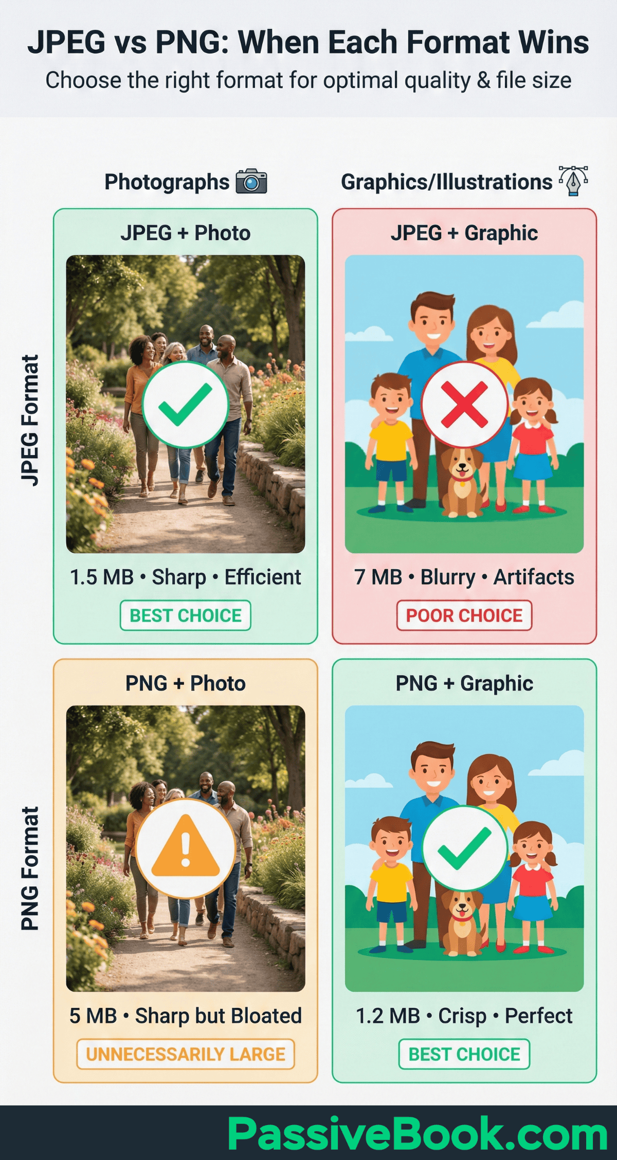
Ensure the images are the right size – too large and they will take forever to load, too small and they will look pixelated and low-quality. You can use the ShortPixel WordPress plugin to automatically compress your images.
5. Customize Blog Header
A header is an element on a web page that contains the logo or name of the website. It’s usually located at the top of the page and is used to identify the site to visitors.
The header is one of the first things that visitors to your blog will see, so it’s important to make sure that it makes a good impression.
Your header should be simple and uncluttered – avoid adding too many elements as this will just make your blog look cluttered and confusing.
Many blogs including ours, don’t have a header separate from the navigation. The primary navigation bar itself is used as the header. This allows readers to quickly jump into the content without the header pushing the content below the fold.
Include your blog name and tagline in your header so that people know what your blog is about at a glance. Here is what LifeHacker’s blog header looks like.

If you have an image logo in your blog header make sure you compress it so that it loads fast. Have your logos in PNG format so that the file size is small.
Design a Blog Logo
The main part of your header is going to be your blog’s logo.
If you want to keep simple, you can just use your blog’s name as your logo. You can design it in Canva using fancy text and export it in PNG format.
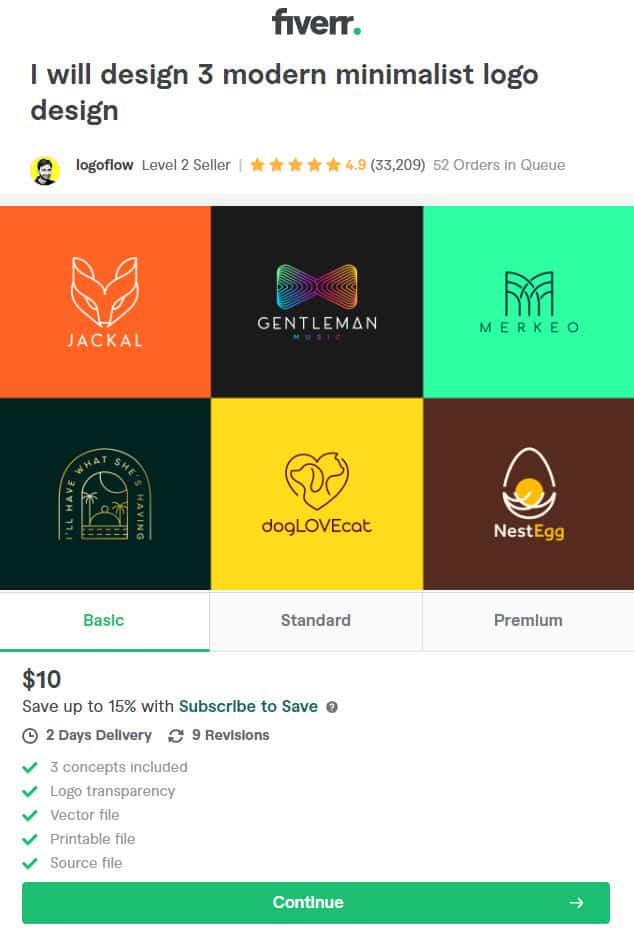
If you know how you want your logo to look but don’t know how to make it yourself, then you can get a bit of professional help do it for you from Fiverr.
You will be able to find many graphic designers who design your logo cheaply on Fiverr but what I have found is that unless you give them a lot of input, the end outcome will not match your expectations.
The best way to design your logo will probably be through 99designs. It is a crowdsourced graphic design platform. You submit a design brief specifying what you’re looking for and then designers from all over the world will submit their designs for you to choose from.
The best thing about using 99designs is that you’ll end up with a high-quality, professional logo that you’re happy with – and all for a very reasonable price.
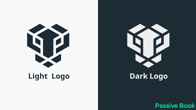
Ensure that your logo looks good on both dark and light backgrounds. It depends on the brand color you use.
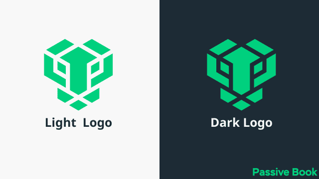
If your brand colors don’t look good in both white and dark backgrounds then you might have to create two versions of your logo for light and dark backgrounds. Most of the time this is just a matter of inverting colors.
6. Setup Navigation Menu
Your blog’s navigation menu is one of the most important elements of your design.
The navigation menu is what allows visitors to move around your blog and find the content they’re looking for.
This is the menu that appears at the top of every page on your blog. It usually contains links to your home page, blog posts, pages, and archives.
If your navigation menu is confusing or difficult to use, then people will quickly become frustrated and leave your blog.
There are a few things you can do to ensure that your navigation menu is effective:
- Make sure it’s easy to find. The navigation menu should be located in the same place on every page of your blog. Most people put it at the top of the page, either above or below the header.
- Use clear and descriptive labels. Don’t use labels like “click here” or “more.” People should be able to guess what they’ll find when they click on a link.
- Use drop-down menus sparingly. Drop-down menus can be confusing and difficult to use on mobile devices, so try to avoid using them if possible. If you do use them, make sure the labels are clear and easy to understand.
- Limit the number of links. If you have too many links in your navigation menu, it will clutter the menu and make it difficult for people to find what they’re looking for. Try to limit yourself to no more than seven links. Less is more.
- Highlight the link to your home page. The home page is the most important page on your blog, so make sure it’s easy to find.
- Include a search bar. A search bar makes it easy for people to find specific content on your blog. If you have a lot of content, then a search bar is essential.
If you have too many items in your navigation menu, one design idea is to have two separate menus. The first menu could contain links to your most important pages, and the second menu could be a more comprehensive list of all the pages on your blog.

Make sure your menu collapses into a hamburger icon on mobile devices. This will help to save space and make your menu more user-friendly on small screens.
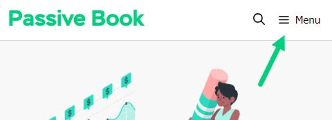
You can also make your menu sticky. This means that it will remain in the same place on the screen even as people scroll down. Since your blog’s name appears in the menu along with the logo, it helps reinforce the brand in the mind of new visitors.
7. Design Body Content
Your body content is the main content of your blog post. This is where you’ll write your blog posts and articles.
There are a few things you can do to ensure that your body content is easy to read and consume:
- Use short paragraphs. Long paragraphs can be daunting, so try to keep them under five lines.
- Use headings and subheadings. Headings help to break up the text and make it easier to scan.
- Write for skimmers. The content you create should be easy to skim. So break your content accordingly.
- Use bullet points. Bullet points are great for lists and step-by-step instructions.
- Highlight important words or phrases. You can use bold or italics to highlight keywords or phrases.
- Use images. Images can help to break up the text and make your blog posts more visually appealing.
- Use infographics. Infographics are a great way to communicate complex information in a visually appealing way.
- Use videos. Videos are a great way to add multimedia content to your blog posts.
Add Post Meta Data
The post metadata is the information about the blog post that appears under your blog post title. It usually contains the author’s name, the date, and sometimes the category and breadcrumbs of the post.
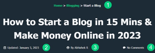
The category breadcrumbs ❶ help people understand what your blog post is about. This is especially helpful if your blog covers a wide range of topics. It’s also shown in the search results.
The date tells readers how old the content is ❷. This is important because some topics (like technology) move quickly and become outdated quickly. If your blog post is more than a few months old, you may want to consider updating it.
Google favors recent content so using your blog post’s last updated date instead of the post published date, will help your content appear new.
The author’s name ❸ and photo help to give your blog posts a personal touch and build trust with your readers. When people see that there’s a real person behind your blog, they’re more likely to trust what you have to say.
You can also show the number of comments ❹ you have in your blog post in the post meta. It will encourage engagement on your blog.
The meta section is also a great place to include social media sharing buttons. This makes it easy for people to share your content on their favorite social media platforms.
Add Opt-in Forms
Opt-in forms are a great way to grow your email list. You can use opt-in forms to offer freebies, like ebooks or checklists, in exchange for people’s email addresses.
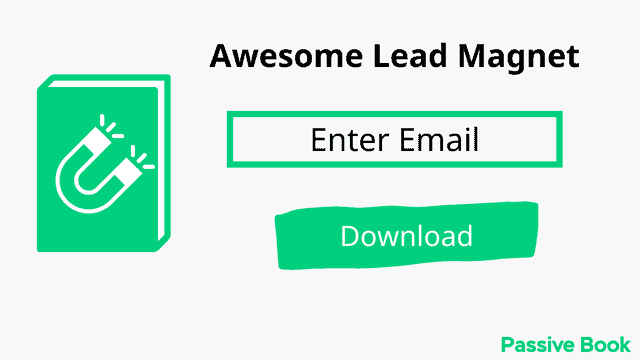
You can also use opt-in forms to give people the option to subscribe to your blog posts. This is a great way to ensure that people don’t miss any of your new content.
You can create high-converting opt-in forms using Thrive Leads. You can pick a template and customize it to match your brand colors.
Add Share Buttons
Add social share buttons to your blog, below or above the blog posts, or as floating buttons on the side. They allow readers to share your content on social media sites like Twitter and Facebook.
Use the Easy Social Share Buttons Plugin to create your social share buttons. The plugin has all the features you need and more to manage social media on your blog.
When choosing social media icons, use the default icons instead of using custom icons. More people will recognize social media platforms by their default icons increasing the likelihood of your blog posts getting shared.
Add Author Bio
An author bio box is a short piece of text that appears at the end of your blog posts. It contains information about the author, like their name, photo, and social media links.
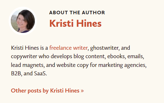
Keep your author bio short. Have a maximum of 3 to 4 lines.
The author bio box helps to build trust with your readers. When people see that there’s a real person behind your blog, they’re more likely to trust what you have to say.
The author bio box is also a great way to promote your other content. You can include links to your social media profiles or other websites.
8. Set Blog Featured Image
The featured image is the main image that appears on your blog post. It’s usually the first thing people see when they land on your blog post.
Make sure your featured images are high-quality and relevant to your blog post. You can set it in the sidebar of your WordPress Editor.
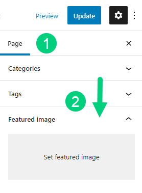
You can create your blog’s featured image using Canva.
Your blog featured image will appear in the related content section if you have one and the blog archives page.
9. Customize Blog Sidebar
A sidebar is a column on a web page that contains additional information and links. Sidebars are usually located on the right side of the main body content.
The sidebar is a bit outdated in the modern web design because it takes away the focus from the main content and doesn’t appear as intended on mobile screens. On mobile screens, the sidebar gets pushed below the main content above the footer.
However, it can be still useful if used wisely.
If you decide to have a sidebar on your blog, make sure it’s not too long. People should be able to skim through it quickly and find what they’re looking for.
Make sure that you keep the sidebar on the right side of the content. Everyone reads from left to right. So when you keep the sidebar on the right side, it will keep the focus of your reader on the main content and won’t distract your readers.
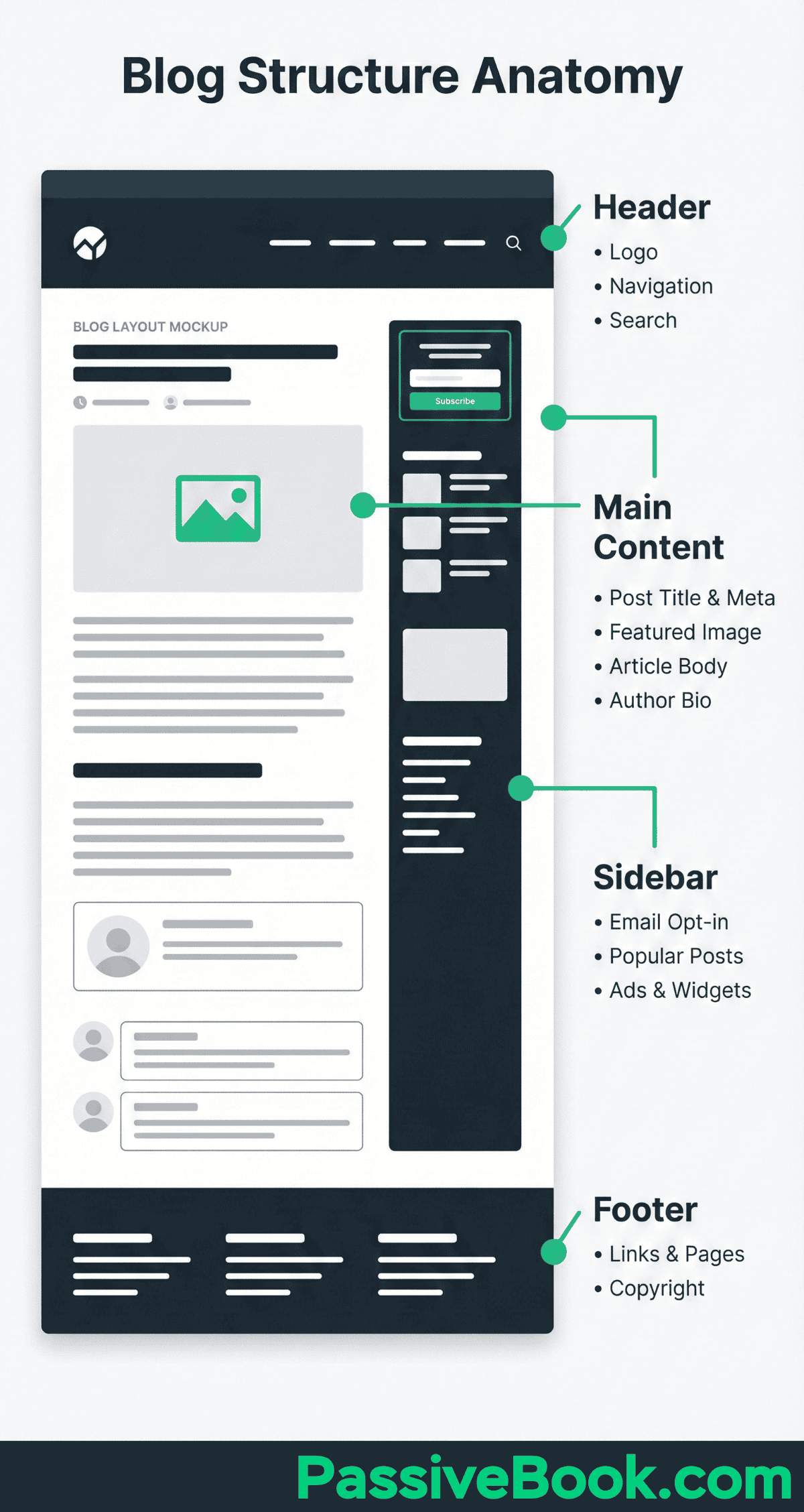
If you put the sidebar on the left, then it will push your main content down on mobile screens which might not be something you want. It is also very likely to distract people reading your blog posts on a desktop screen.
You can add different types of blog widgets on your sidebar. Here are the most common ones:
Search Bar: If you didn’t include a search option in your menu, then you can have a search widget in your sidebar.
Opt-in forms: You can create opt-in forms that you create through Thrive Leads to your sidebar.
Banners: You can add banners of different affiliate products, and your digital products, or have ads shown in your sidebar.
Social Profiles: You can add links to your social profiles in your sidebar.
10. Setup Blog Comments
The comments section appears below the body content. Readers can ask their questions or add their thoughts in the comments section.
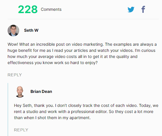
Many bloggers choose to disable their comments because it can be a distraction from the main content. Larger blogs can get a lot of comments that will require dedicated moderation which takes up a lot of time.
But enabling the comments section on your blog helps to create a community around your blog. It also encourages people to interact with you and each other.
Use WordPress’s default commenting system for a clean design. Don’t use Facebook Comments, Disqus, IntenseDebate, or other third-party comment platforms. Not only will it not blend in with your brand colors and design, but it will also slow down your website.
If you want to improve the default WordPress commenting system you can use Thrive Comments. The plugin will gamify comments by adding badges, add social login, upvotes buttons, and other conversion-focused features to comments that drive up engagement.
11. Create a Blog Footer
A footer is an element on a web page that contains copyright information and links to other pages on the site. Footers are located at the bottom of the page.
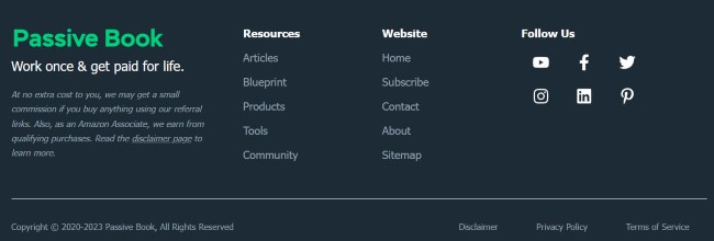
Make sure you link to your privacy policy, terms & conditions in your footer.
The footer can help you declutter your navigation menu. You can add links to pages that you cannot add in the main navigation in your footer.
Here are the different things you can add to your blog’s footer:
- Legal Pages (Privacy Policy, Terms & Conditions)
- Link to Pages (Contact Page, About Page, Affiliate Page, FAQ)
- Account Management (Login, Signup & Subscribe)
- Disclaimers (Affiliate Disclaimer, Earning Disclaimer, etc)
- Social Media Profile Links
- Address & Contact Information
- Map
- Blog Log & Tag Line
- Ecommerce Pages (Shop, Cart, Checkout)
You can have a simple footer with just the privacy policy and terms of conditions and copyright information. This type of simple footer is recommended for landing pages.
You can have multi-column footers containing links to different sections in normal blog posts that are not conversion-focused.
12. Other Elements
Apart from the main elements that we covered there are a few optional elements that you may want to add to your blog.
Related Posts
You can add related posts at the end of your blog post to keep people engaged with your content.
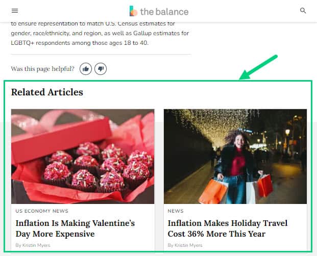
Related posts are a great way to keep people on your site longer and reduce your bounce rate. They also help people discover more content on your blog that they might be interested in.
The related post section will pick your blog’s featured image and display it, so make sure you have set it correctly.
Reading Progress Bar
A reading progress bar is a thin line that appears at the top of your blog post as you scroll down. It shows you how far you have read in the article and how much is left.
Hubspot has an orange reading progress bar on the top:

This element can be useful if you have long articles on your blog. It helps people gauge how much time they need to allocate to reading the article.
Make sure the color of your reading progress bar matches your primary brand color.
Call Out Boxes
A call-out box is a highlight section that you can use to draw attention to something on your blog. It’s usually used to drive people to take action like signing up for your email list or downloading a free resource.
Key Highlights
This is an example of a call-out box that you can use inside of your blog posts.
Do not use call-out boxes excessively as it will make your blog look salesy and spammy. Use it sparingly to highlight important things.
Videos
You can also add videos to your blog posts. This can help break up the text and make your content more engaging.
Videos will keep readers on your blog longer and it will increase time on site which is an SEO metric that Google uses to rank websites.
You may not have your own videos to embed in your blog posts. You can embed videos from YouTube or Vimeo that is relevant to your topic.
If you use a video player like Presto Player you will be able to remove YouTube’s branding and make the player match your own blog’s branding. This will also mean people will watch the video on your blog instead of going to YouTube and watching it there. You will also have a suite of conversion-focused features that will help you capture email addresses or drive sales.
Here is an example of a Presto Player Video:
Social Embeds
Social embeds are a great way to add more content to your blog post and make it more engaging.
You can embed tweets, Facebook posts, Instagram images, or videos in your blog post. This will give your readers a different way to consume your content.
It’s also a great way to show off your social proof and build your brand.
To embed tweets, simply find the tweet you want to embed and click on the “Embed Tweet” button. Then copy and paste the code into your blog post. Here is an example:
For Facebook, you can use their embedding tool to generate the code for the post you want to embed.
For Instagram, open the post you want to embed in your desktop and click on the three dots on the top right, and copy the embed code.
13. Optimize for Mobile
More and more people are using their mobile devices to consume content.
It’s important to make sure your blog is optimized for mobile. This means that your blog should be responsive and load quickly on mobile devices.
You can use Google’s PageSpeed Insights tool to see how your blog fares on mobile.
If your blog is not mobile-friendly, you will be penalized by Google in their search rankings. Use Google’s Mobile-Friendly Test to see if your blog is optimized for mobile.
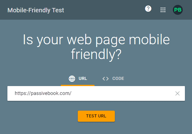
The themes we recommended are automatically optimized for mobile devices and tablets. However, you should open your blog on a mobile device and check if it appears correctly as expected.
14. Select Blog Layout
Your blog layout is important because it will determine how easy it is for people to consume your content.
Here are the common elements of a blog layout we have covered in our blog:
- Header
- Navigation
- Body Content
- Comments Section
- Share Buttons
- Sidebar
- Footer
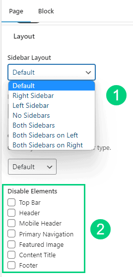
There are many different types of pages on your blog and you may choose to enable or disable certain elements of the layout depending on the page you are in.
For example, if you have a landing page to collect your reader’s email address, you can disable the navigation, comments, share buttons & sidebar. If you have a home page, you may want to disable just the comments section.
The themes we recommended have the option for you to select a layout ❶ and disable certain elements ❷ for certain specific pages of your blog. You will find the option in the WordPress editor.
You can also create different types of headers and footers for different pages. You can for example have a footer that has a minimal design for your landing pages but have a larger footer everywhere else.
You can achieve this in the pro version of various themes we recommended by doing the following:
- GeneratePress: Go to Appearance > Elements
- Kadence: Go to Appearance > Kadence > Elements
- WP Astra: Go to Dashboard > Appearance > Custom Layouts
15. Design Your Home Page
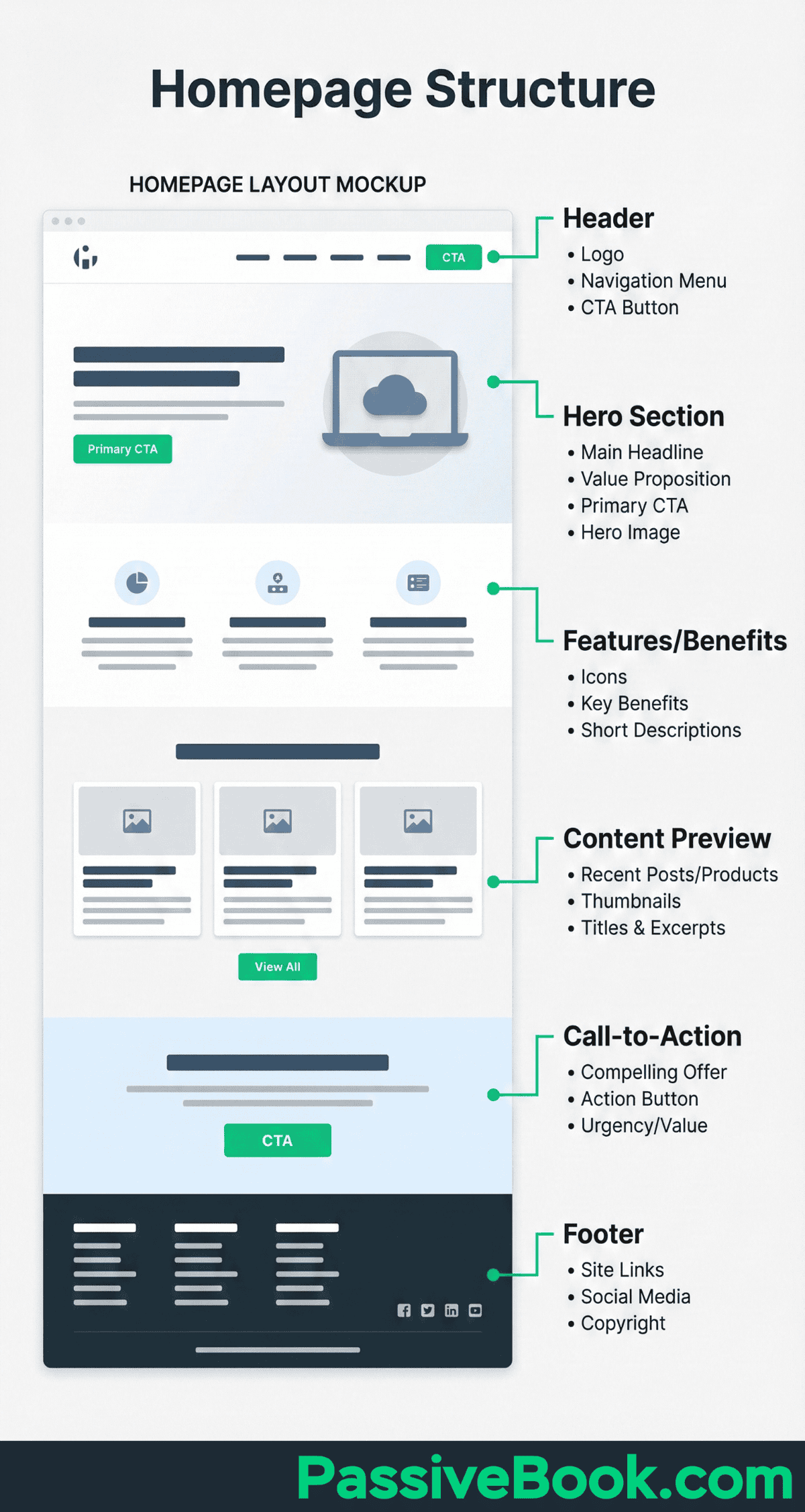
Your home page is the most important page on your blog because it’s the first thing people will see when they land on your blog.
There are many different ways you can design your home page. You can have a blog feed, a static page, or a combination of both.
Some blogs have a blog feed as their home page. You can do this when you are starting and don’t have a lot of content published on your blog. But if you have a large or more established blog, the blog feed home page will make it difficult for your readers to find your older content in your blog.
If you have anything more than 50 posts then you should create a static home page. Make sure the design is simple and clean. You don’t want to overwhelm your visitors with too much information on the home page.
Your goal is to get people to stay on your blog and read your content. So make sure your home page is designed to encourage people to do just that. You can do this by creating and linking to different category pages on your blog from your home page.
Your home page will be the most visited page on your blog. So don’t forget to collect your subscriber’s email address using a lead magnet on your home page.
Include a short version of your about page as a section on your home page with a link to your actual about page.
You have a section for your latest blog posts that can be similar to your blog feed. You can alternatively display your popular blog posts.
If you sell digital products, your blog homepage can be a place where you can list that and link to your courses or shops section.
Finally, you can link to your social media profiles on your home page.
Check out our homepage for design inspiration.
16. Design Your Contact Page
Your contact page is important because it’s how people can reach out to you. It should be designed in a way that makes it easy for visitors to get in touch with you.
The first thing you need is a contact form. If you have a page builder like Thrive Architect you can create a custom page with a contact form without requiring any other plugins.
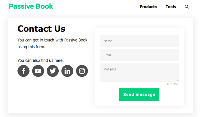
If you don’t have a page builder, then you can use a free contact form plugin like Fluent Forms or Ninja Forms to build your contact form.
Your contact form should have the following fields:
- Name
- Message
You may also want to enable a captcha in your contact forms to prevent spam.
If your blog is for a business, you should include your address optionally with a map and your business phone number and business email address.
Optionally you may want to include links to your social media profiles.
17. Design Your Archive Page
This is the page that displays all your blog posts. The layout will usually have the latest blog post at the top, with the older blog posts appearing in chronological order below it.
You can have all your blog posts listed on your blog page or have specific category pages that display blog posts of a specific category.
You will disable the following elements from your layout on your Archive page:
- Disable Comments
- Disable Share Buttons
- Disable Sidebar (Optional)
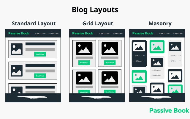
There are three main types of blog layouts:
- Standard
- Grid
- Masonry
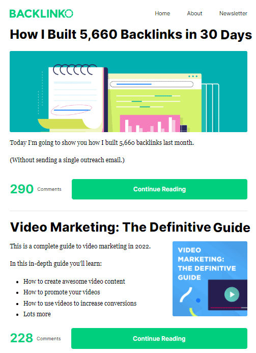
Standard Layout: The standard blog layout is the most common and simplest type of layout. It typically consists of a large body of text with a featured image and a button to read more. Backlinko uses a standard layout for its blog feed.
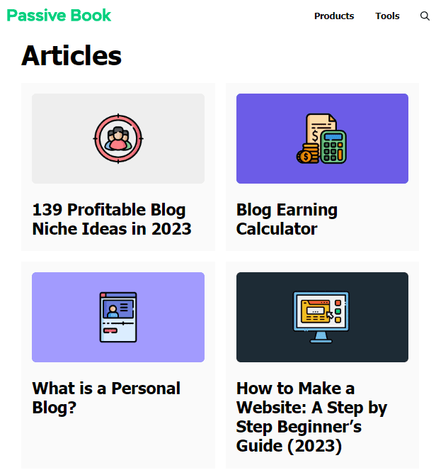
Grid Layout: The grid layout is similar to the standard layout, but it arranges the content in a grid pattern rather than having everything aligned to the left side of the screen. We use a grid layout shown below in our blog feed.
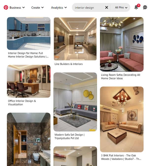
Masonry Layout: The masonry layout is more complex than the other two types of layouts. It arranges content in ‘bricks’ which are different sizes and shapes. The masonry layout can be used to create a more visually interesting blog and is great for blogs that focus on images. Pinterest uses the masonry layout shown below.
Selecting the right blog layout is important because it can have a big impact on the user experience.
For example, if you have a lot of text-heavy content, a standard or grid layout might be best so that people can easily scan through your content and find what they’re looking for.
If you have lots of photos or other visual content, a masonry layout might be a good option as it will allow you to showcase your content in a more visually appealing way.
Think about the type of content you want to publish on your blog and choose a layout that will make that content easy to consume.
19. Design Your Landing Page
A landing page is a stand-alone page that you can use to promote a specific product, or service, or capture your reader’s email address.
For example, if you’re running a special promotion, you might create a landing page to promote it. Or if you’re launching a new product or service, you might create a landing page to promote that.
Product promotion pages are designed to promote a specific product. They typically include information about the product, pricing, and a way to buy the product.
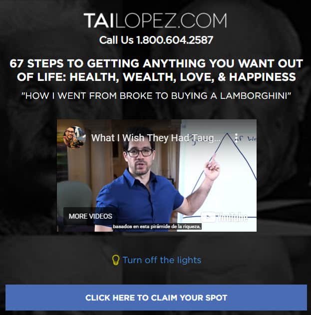
You may want to include a video sales letter or a long-form sales letter to explain the benefits of the product or service.
You can also use a landing page known as a lead capture page to collect your reader’s email addresses so that you can add them to your email list. They typically have a form where people can enter their email addresses in exchange for something valuable like a free ebook or course.
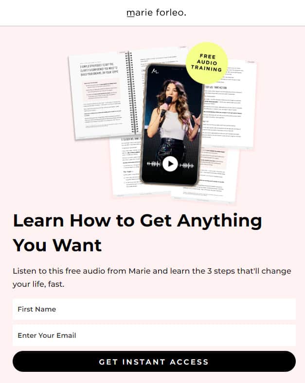
When you design your landing page, you will want a layout to minimize all distractions on your blog’s landing page. This will increase its conversion rate.
You can eliminate distractions in your landing page by disabling the following elements from your layout:
- Disable Primary Navigation
- Disable the Header or minimize its size
- Disable Comments
- Disable Sidebar
- Minimal Footer with only Privacy Policy and Terms & Conditions.
You should have only one call to action or button on your landing page. You should keep all other links in your landing page to the bare minimum to increase conversion.
You can easily create high-converting landing pages that are also visually stunning using a page builder like Thrive Architect. There are a lot of pre-built templates that you can customize if you don’t want to build a landing page from scratch.
Blog Design Tips
Now that you know how to design a blog, here are a few blog design tips to keep in mind:
Optimize Speed & Performance
Your blog’s speed and performance are important for two reasons. First, people are impatient and if your blog takes too long to load, they will likely leave before it even loads. Second, Google uses speed as a ranking factor, so if your blog is slow, it will likely rank lower in search results.
When designing your blog, always ensure that it loads fast and passes core web vitals.
Using the lightweight themes we recommended is a good start. Most other themes will slow down your website.

The second step is to use WP Rocket to cache your website. Caching is the process of storing a copy of a web page or asset so that it can be served faster to subsequent visitors.
When you use WP Rocket, it will cache your entire website including images, CSS, and JavaScript files. This will help make your blog load much faster for your readers. Other caching plugins do not help you pass the core web vitals.
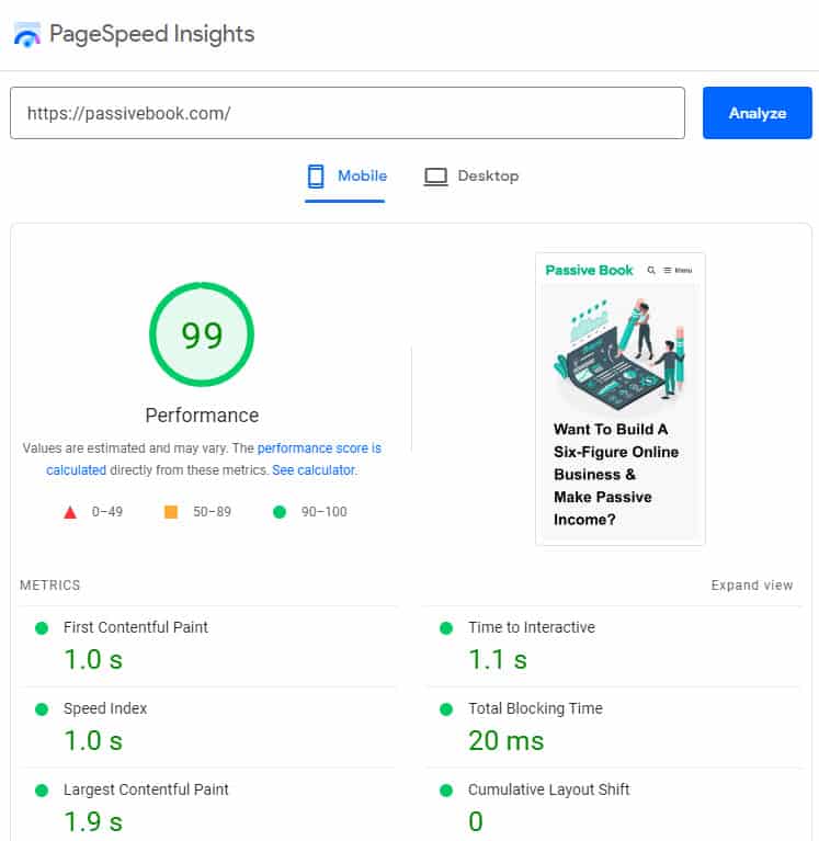
After you create every page in your blog, you can check if passes Core Web Vitals by using Google Page Speed Insights. If your design is not slowing down your blog, you will get a high page speed score.
Avoid Bloated Page Builders
Many page builders like Elementor will bloat your HTML code and slow down your blog. While they make it easy to create custom designs, the trade-off is a slower load time for your blog.
We recommend using a lightweight theme like GeneratePress or Astra with the WordPress Block Editor (Gutenberg). These themes used with the default Gutenberg block builders are much faster than page builders.
The WordPress Block Editor (Gutenberg) is a page builder that comes default with WordPress. While it’s not as feature-rich as some of the other page builders, it will not slow down your blog like the others.
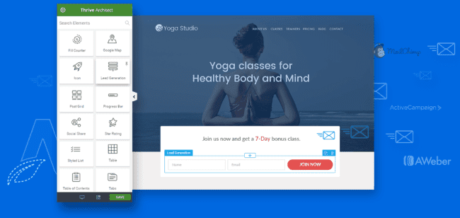
If you want to use a page builder to create a custom landing page, then you can use Thrive Architect because the pages you create with it are optimized for core web vitals and page speed.
Less is More
When it comes to blog design, less is more. A minimalist design that uses fewer elements will help your blog load faster and reduce distractions for your potential readers. Make sure you have a consistent design that has the same look and feel throughout your blog.
Your goal should be to create a design that is simple and easy to use. Use white space or negative space to your advantage and avoid using too many colors or fonts in your design.
The best design is one that removes distractions and all elements that don’t add value to the readers. Don’t have widgets and other bells and whistles that you think look cool but have no utility for the reader. Everything in your blog’s design should have a purpose. If it doesn’t then you should remove it from your blog.
Find Blog Design Inspiration
You will find creative blog design ideas by looking at your competition or another blog in your niche. A lifestyle blog will look very different from a business blog. An interior design blog will look very different from a travel blog or a food blog. So looking at other blog examples in your niche will help you get inspired and design a great blog.
We have compiled a list of the best examples of beautiful blog design. Check out our post on blog design examples to inspire the design for your own blog.
What Next?
Many factors play a role in making a blog successful. But one of the most important elements is the blog design elements. If your current design looks outdated and is difficult to navigate, people will quickly become disengaged.
We looked at some of the design best practices that you can incorporate into your design process to create a stunning blog.
Designing a blog that people will want to read is all about creating a space that is both visually appealing and easy to navigate. By following the simple tips above, you can create a blog that looks great and is enjoyable for your readers to read.
Just remember to keep your design clean and simple, use high-quality images, and make sure your content is easy to find. If you do all of these things, you’ll be well on your way to designing a successful blog that people will want to read again and again.
Which creative design recommendation from this guide are you going to implement first?
Are you going to create your home page or fix your typography?
Let us know in the comments below.
Check out all our guides from the blogging hub to master blogging.
Share this post with your friends & followers: