Are you looking for some inspiration to redesign your blog?
If yes, you’ve come to the right place!
In this post, we’ll share 42 of the best blog design ideas that will help you design a beautiful blog that is also user-friendly.
So, if you’re ready to give your blog a makeover, keep reading!
Objectives of Good Blog Design
Before you can implement the design ideas we have recommended here for your blog, you should understand the objective of good blog web design.
Otherwise, you will make the beginner mistake of using fancy colors, cool typography, and adding interesting widgets that only distract readers, clutter the design and reduce the readability of your blog.
Your blog design should achieve the following three things:
1. Improve Readability
The first objective of your blog’s design is to improve readability.
Blog readability is the ease with which a reader can understand the content of a blog.
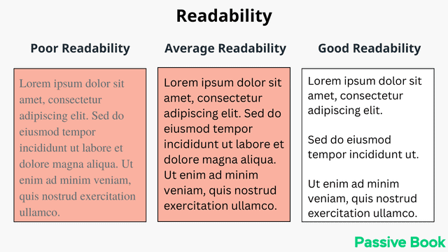
Many factors affect blog readability of a blog like font, line spacing, layout, and color contrast. You should also embrace white space.
If your blog design reduces the readability of the blog, it will only serve to frustrate your audience.
2. Ease Navigation
The second objective of your blog design is to ease navigation.
Your blog’s navigation should be easy and intuitive for your audience.
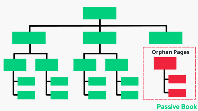
Good navigation should be easy to understand, intuitive and logical.
The goal is to make it as easy as possible for your readers to find the information they are looking for on your site without overwhelming your visitors with too many options. It should be easy and intuitive to navigate to every blog page from the homepage.
3. Optimize for Conversion
The third and final objective of your blog design is to optimize for conversion.
Your blog design should be designed to convert your readers into subscribers or customers.
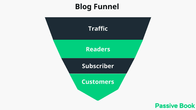
To do this, you need to include strategic calls to action (CTAs) throughout your blog to encourage your readers to take the desired action.
42 Best Blog Design Ideas
Now that you know the objectives of good blog design, let’s take a look at some of the best blog design ideas that you can implement on your own blog to achieve all three design objectives.
1. Use Golden Ratio for Typography
One of the best ways to improve blog readability is by using golden typography.
Golden Ratio typography is the perfect combination of font size, line height, and content width.
The goal is to make your blog‘s content easy to read so that your readers can consume your content.
To find the perfect combination of font size, line height, and content width, use a tool like GRT Calculator.
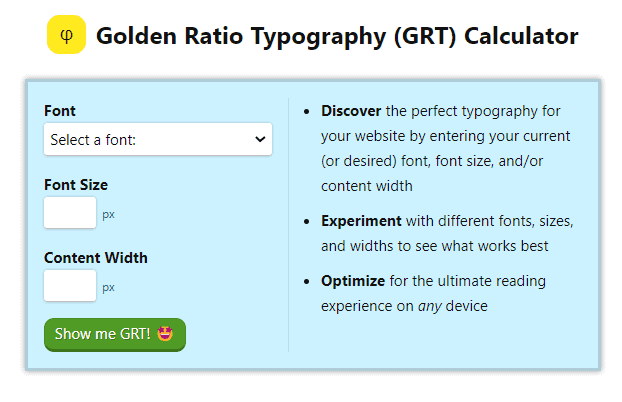
Just specify the font and the font size leaving the content width blank. You will get recommendations for all sizes and spacing including the content width.
Use a font size between 18px to 20px for the best readability.
2. Use Color Psychology To Choose Your Brand Colors
You can use color psychology to improve your blog’s design.
Color psychology is the study of how colors affect human behavior and emotions. Certain colors can have a positive or negative effect on human emotions.
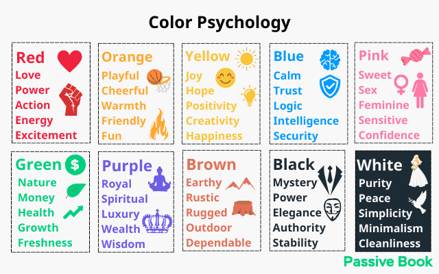
You can use this to your advantage in your blog design by using colors that evoke the desired emotion in your audience.
For example, the color of money is green. But green is also the color of nature and the environment. So ideally green should be your brand color if you have a personal finance or gardening website.
The color of spirituality is purple. That is probably the reason why the spirituality blog Reiki Rays uses a shade of purple as its primary brand color. If you are unsure of the color you must use, look at your competitors for design inspiration.

3. Use a Limited Color Palette
Your color palette should be limited to one or two colors.
You can use a tool like Coolors to create a custom color palette for your blog. Save the hex code and use it everywhere you need to use colors in your blog.
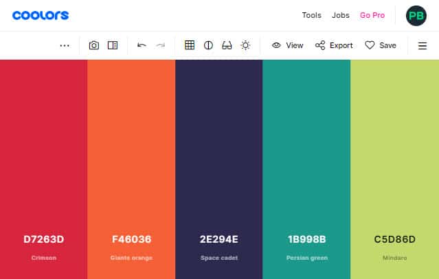
Make sure you use a light background and dark text for the best readability. Preferably black text on white background.
You can use your blog’s primary color for your links and buttons.
If you are creating custom graphics for your blog, you can use your blog’s primary color.
Take our blog as an example. Green is the primary color of the Passive Book. We use it in our logo, links, and CTA buttons. Any graphics we create also uses the same shade of green.
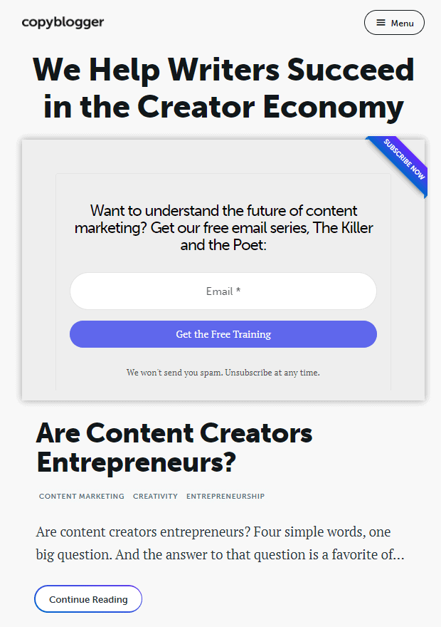
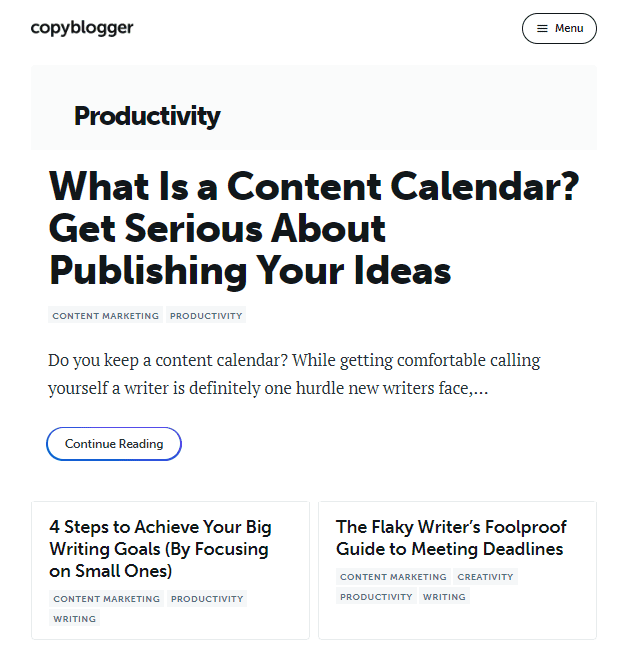
An example of a blog that does this well is Copyblogger. They primarily use two colors: black and white. To provide contrast and make their CTA buttons stand out, they have a third color which is a hue of purple. This third color is used only in the CTA buttons in their opt-in forms.
4. Embrace Negative Spaces
Negative spaces are the empty spaces between the elements in your blog design. It is called white space.
They can be in the form of margins, paddings, and line height.
White space helps to create a visual hierarchy and improve the legibility of your blog’s content.
Have a lot of space between the different elements and the main body content. Also, ensure you have enough space between paragraphs.
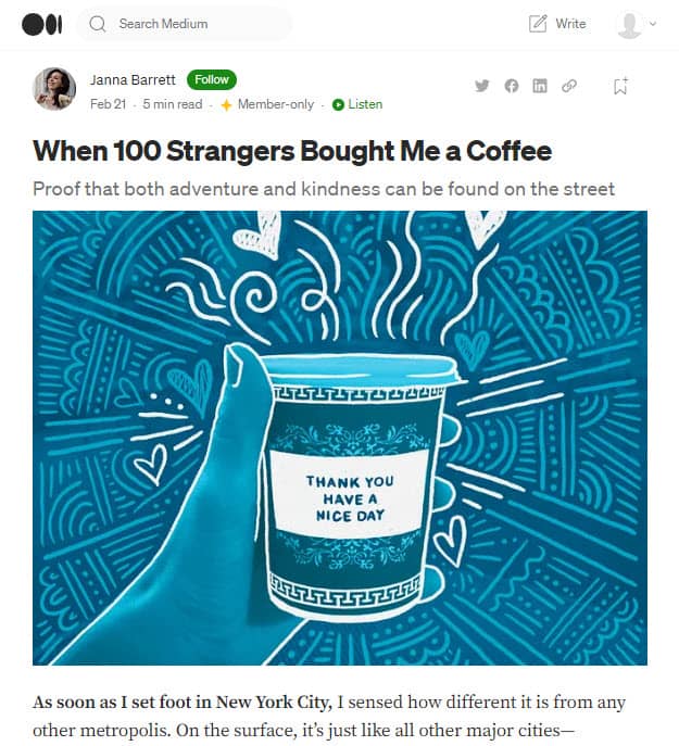
The blogging platform Medium uses negative spaces well. You can see there is nothing distracting the readers from the main content. This keeps the reader focused and reading the content.
5. Use Serif Fonts
Use fonts that are easy to read.
Your blog’s content should be easy to read so that your readers can consume your content without any difficulty.
The best fonts for blogs are sans-serif fonts. These fonts look really good for web content as they do not have extra strokes at the end of each letter.
Some of the best examples of sans-serif fonts for blogs are Arial, Helvetica, Verdana, and Tahoma.
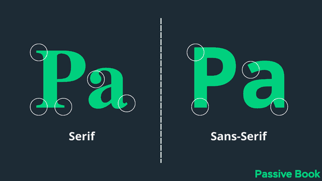
You can also use serif fonts that have a stroke at the end of the letter. These are better suited for print than online content. Georgia is an example of a serif font that you can use.
You can use serif fonts for headings and sans serif fonts for the body content.
Google Fonts is a library of fonts that you can use in your blog’s design for free.
You can select any font from the Google Fonts library and use it in your blog’s design.
6. Use Images & Videos
Images and videos help to break the monotony of text and make your blog posts more visually appealing.
People are more likely to read and share your content if it is accompanied by an image or graphic.
Videos apart from helping you break up the text also increase the time on site.
A website that uses images and videos in its content is Backlinko. Each blog post has a ton of graphics, charts, infographics, and screenshots. Some blog posts have over 100+ images in a single blog post.
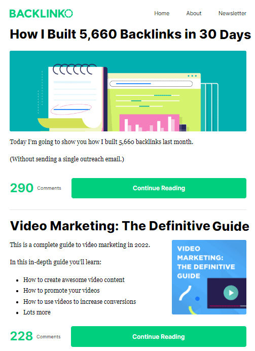
Brian Dean from Backlinko also hires a graphic designer to illustrate the blog post with original graphics. He creates original graphics for each section header.
All this effort makes his blog posts fun and engaging to read even if it is super long. The rich design along with high-quality content makes people link to his content.
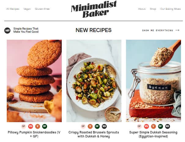
You can also use your camera to take custom photos. Food blogs like Minimalist Baker take stunning food photographs of all their recipes that make them stand out.
7. Embrace Minimalism
Minimalism is a design trend that is here to stay.
It involves using minimal elements in your design. This helps you create a clean and clutter-free design.
A minimalist blog design focuses on the essentials and eliminates anything that is not required.
The goal of a minimalist blog design is to make your content easy to consume and help your readers focus on your content.
Some of the best examples of minimalist blog designs are Zen Habits and Copyblogger.
Unlike Backlinko which uses a lot of images, Zen Habits takes the opposite approach and has no images in the blog post. There are no sidebars on the blog and all the navigation links are placed at the top of the page.
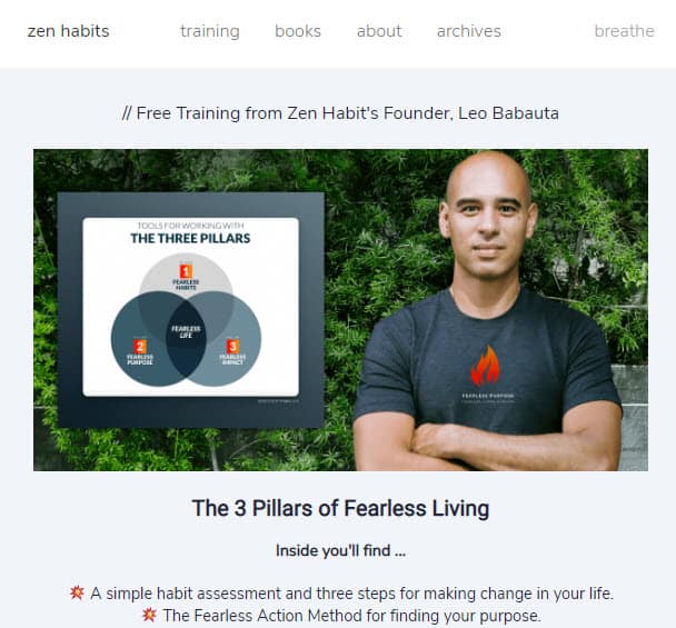
The blog has a very simple and clean design with a focus on content with a lot of negative space. There are no social share buttons on any of the blog posts. The only presence of social is the links to social media profiles (Twitter & Facebook) in the footer.
8. Add Opt-in Forms to the Header
If you want to grow your email list, then you need to make it easy for your readers to sign up for your newsletter.
The best place to add an opt-in form is in the header of your blog. These are places where people will see it without having to scroll down.
Your opt-in form should be placed above the fold so that people can see it when they first land on your blog.
Adding an opt-in form in the header helps you to increase your email subscribers as people can sign up for your newsletter without having to scroll down.
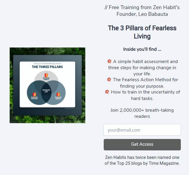
Zen Habits despite being so minimalistic is optimized for conversion because of the opt-in form they have above every single blog post.
9. Finish Your Blog Posts with Opt-In Forms
Adding an opt-in form at the beginning of your blog post is not the only way to grow your email list.
You can also add an opt-in form at the end of your blog post.
The benefit of adding an opt-in form at the end of your blog post is that people who have read your entire blog post are more likely to sign up for your newsletter.
This is because they know what type of content you write and they like it enough to want more of it.
Adding an opt-in form at the end of your blog posts helps you to increase your email subscribers as people can sign up for your newsletter without having to scroll back up.
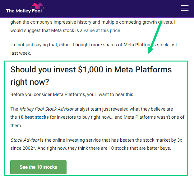
At the end of each blog post of Motley Fool is a call to action that offers a free lead magnet of top stocks for beginners. It builds their email list and generates leads for their paid offers.
10. Choose a Readable Content Background Colour
Most blogs and websites use dark text (usually black) on a light background (usually white).
Black text on a white background has the highest contrast and hence the highest readability. This is the reason why most books and newspapers print black text on white paper.
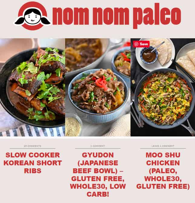
But sometimes blogs make an exception. The background color may not always be white. For example, the blog Nom Nom Paleo uses a Carousel Pink as its background color. Financial newspapers like The Economic Times and The Financial Times use a similar pink paper.
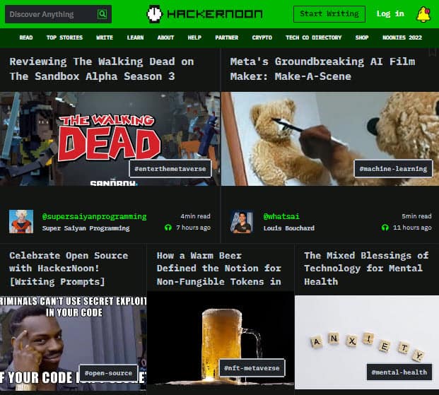
Some blogs use a dark theme that inverts colors. A dark theme is a blog design that uses a dark color scheme.
Dark themes are becoming increasingly popular as they help to reduce eye strain and are easier on the eyes when reading for long periods, especially during the nighttime.
An example of a blog that uses the dark theme is Hacker Noon. The website publishes articles written for programmers. It makes sense for them to use a dark theme because it is really popular among programmers.
11. Use Dark Mode/Light Mode Toggle
Instead of going all dark mode, it is much better to default to light mode and offer a toggle option for dark mode.
Pregnant Chicken is an example of a blog that offers the traditional color scheme of dark text on a light background.
However, they also have an optional dark mode that can be turned on with a switch in the menu ❶.

You can easily replicate this in your blog by installing the WP Dark Mode plugin.
This is a better option than having a fixed dark theme like Hacker Noon because you are giving your audience the option to switch based on their preference.
12. Categorize Your Content
If your blog covers a wide range of topics, then it is important to categorize your content.
This helps to organize your blog and help build navigation in the menu and home page.
Sticking with the example of Pregnant Chicken you will see all the blog posts are neatly categorized into different categories. Each category is displayed in the main navigation menu. The audience can quickly find the topics that are of relevance to them using the categories in the menu.

13. Create Category Pages
Most blogs just list all blog posts in a particular category when someone clicks on a particular category.
If you have a lot of posts in each category then the user has to use the pagination to navigate through the content.
That is where a category page comes in. A category page is a page on your blog that lists all the posts in a particular category. You can use the same template for each category page.
Creating category pages helps you to organize your blog content and makes it easy for your readers to find all the posts on a particular topic.
It also helps with SEO as search engines can easily index your category pages and show them in the search results.
The main benefit of creating category pages is that it helps your readers to find all the posts on a particular topic in one place.
Copyblogger’s category page is something you can model after for your blog if you have a lot of content and want to make it easier for visitors to find it.
14. Add Category Navigation Grid in the Home Page
We already saw how you can link to different blog categories from the navigation menu.
You can do something similar with your home page.
A category navigation grid is a grid of images that link to different categories in your blog.
It helps to improve the discoverability of your content and helps visitors find the topics they are interested in.
The DIY blog Remodelaholic does this well. The home page has different sections for interior design, DIY, and recipes.
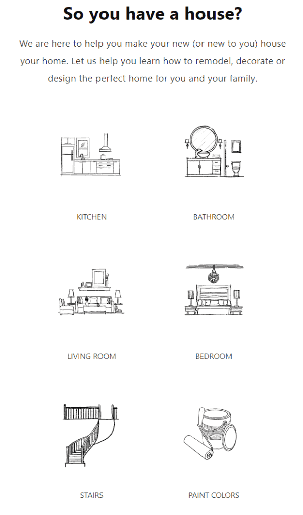
The icons in each section represent different subcategories. The DIY Furniture category, for example, has icons for various sorts of furniture that the blogs help you build.
Clicking on a particular furniture icon will take you to all the blog posts that help you build that furniture.
15. Create a Silo Structure
When you create your pages you can organize them in a silo structure.
A silo is a term used in SEO to describe the structure of a website. In a silo structure, you group all the pages of your website into related groups. Then you nest these groups within one another to create levels within a silo.
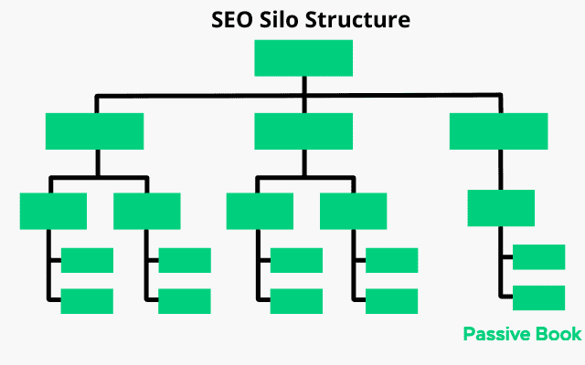
Silos are different from categories because the pages are logically interlinked in a silo, unlike category pages which merely group pages together in a category page.
A blog that uses the silo structure well is Security.org. The home page has three main sections of the website:
- Home Security Systems
- Smart Home & Automation
- Digital Security
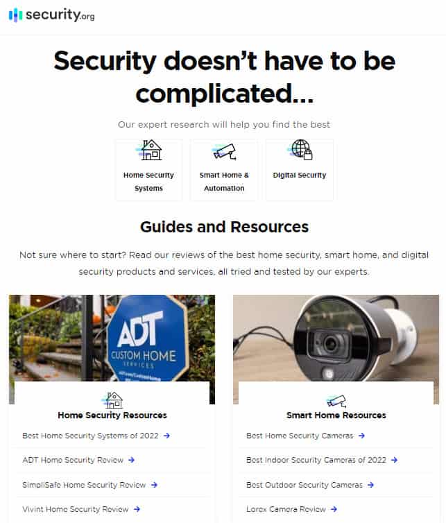
If you click into a particular silo, you will read an article on the topic. But you will also find the navigation for the sub-silo.
Creating a silo structure not only helps with SEO but it also helps your readers navigate and find the inner pages of your website.
16. Make Your Navigation Sticky
Your navigation menu is one of the most important parts of your blog.
The navigation menu helps visitors to find the pages they are looking for and navigate around your website.
You should design your navigation menu in a way that makes it easy for people to find what they are looking for.
A good navigation menu has a clear hierarchy and is easy to use.
It should be designed for your target audience and reflect the overall design of your website.
Consider using a sticky navigation menu. Sticky navigation is a feature where the main navigation menu of your blog sticks to the top of the screen as you scroll down.
The fashion blog Style Caster is an example of a sticky blog used effectively.

It helps visitors quickly navigate to other parts of your blog without having to scroll back up.
Many bloggers use sticky navigation because it improves user experience and makes it easy for visitors to navigate around the blog especially after they are done reading a particular blog post.
17. Use a Short Header
Your header is one of the most important parts of your blog. The header is the first thing visitors see when they come to your website.
It should be designed in a way that reflects the overall design of your website and it should be easy to use.
You should include your blog’s name and logo if you have one. You should also include your blog’s tagline if you have one.
But the most important thing is to keep your header height small so that it doesn’t push your blog’s content below the fold.
You can take it a step further and just use the navigation menu as the header.
If you look at our website Passive Book, the header and the navigation menu are the same.
18. Design an Effective Footer
The footer of your blog is the bottom section of your blog where you typically find links to other parts of your website, social media icons, and a copyright notice.
While the footer is not the most important part of your blog design, it is still an important element that should not be ignored.
Your footer should be designed in a way that complements the overall design of your blog and it should be easy for visitors to find the information they are looking for.
You can have a simple footer that just links to your legal pages. This is an effective footer for your landing pages. Here is an example from the blog Mommy on Purpose:

You can have a more complex footer for other parts of your blog. If you have a lot of elements you can add columns to your footer like Money Crashers shown below:
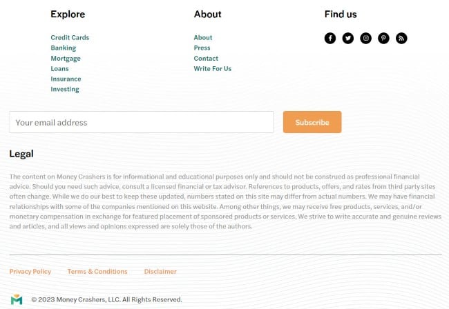
A footer can include the following:
- Links to Privacy Policy & Terms of Service
- Copyright notice
- Links to other parts of your blog
- About Page
- Login/Logout and other pages
- Social media icons
- Disclaimers
- Sign Up Form
19. Use Dropdown Menus
Dropdown menus are a great way to organize your blog’s navigation menu.
They help reduce the clutter on your navigation menu and make it easy for visitors to find the pages they are looking for.
Dropdown menus are commonly used on e-commerce websites but they can also be used on blogs.
You can include category pages and sub-categories in your dropdown, helping your readers find and navigate to different pages of your blog.
The blog Hooked to Books makes its navigation extremely easy by using dropdown menus.
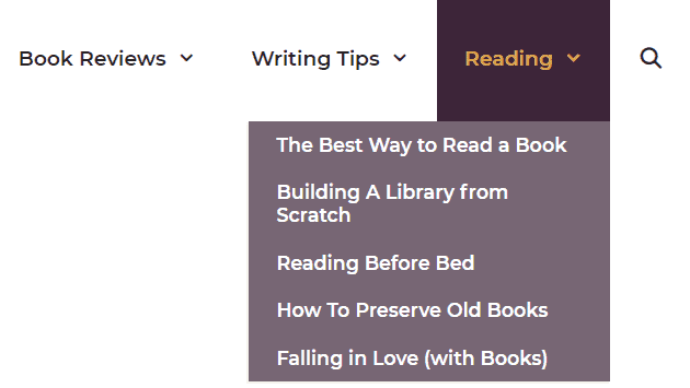
Hovering over the top menu item expands to a new level in the hierarchy. People coming to the website can easily jump to specific areas that are of interest to them.
The menu also has a search button to make it easy for the users of the site to find specific content.
The dropdown menus work on mobile devices as well. The menu collapses into a hamburger icon that can be clicked and expanded to view different content.
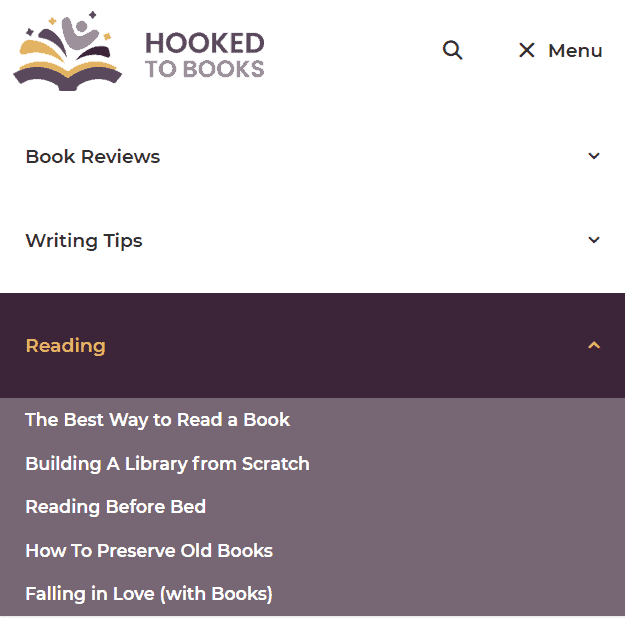
If you have a lot of pages on your blog, then you should consider using dropdown menus to create deep navigation.
20. Use a Secondary Navigation Menu
A secondary navigation menu is a second navigation menu that is typically placed below or above the header of your blog.
The purpose of a secondary navigation menu is to provide visitors with an easy way to navigate to other parts of your blog.
A secondary navigation menu can be used to link to your most popular blog posts, categories, or tags.
You can also use a secondary navigation menu to link to your social media profiles or other websites.
The crafts blog Make It & Love It has two separate menus. The first menu has the logo, search bar, social media links, and the main navigation.

There is also a second menu that links to different blog post categories. Similar to the previous example, this second menu has a dropdown for different subcategories in the blog.
21. Create a Post Header
A post header is a small section at the top of your blog post that typically includes the title of your post, the date it was published, and author information.
The purpose of a post header is to give your readers a quick overview of your blog post.
A post header can also include other information such as the categories or tags your post is in, the number of comments or shares your post has, and social media buttons.
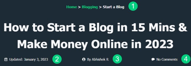
Our blog uses a post header. The post header includes the title of the post. It also includes the breadcrumbs ❶, the date post was updated ❷, the author name ❸, and the number of comments ❹.
You can also include your featured image in your blog post header.
22. Add Breadcrumbs
Breadcrumbs are a type of navigation that helps your readers understand where they are on your blog.
They typically appear above or below the title of your blog post and are part of the post header.
If you create a silo structure, the breadcrumbs show the path that your reader must take from the home page to get to the current page. You can also display your categories as your breadcrumbs.
For example, if a reader is on a blog post about “Blog Design Examples” the breadcrumbs might look like this:
Home > Blogging > Blog Design > Examples
This is an easy way for your readers to navigate and find other pages on your blog.
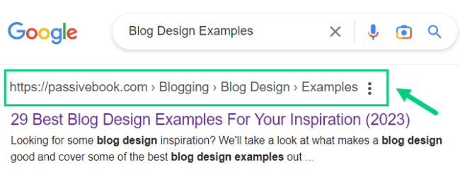
Google has stopped displaying URLs in the search results. Instead, they are now displaying breadcrumbs that display the post hierarchy.
Here is how the breadcrumbs will look in Google SERP:
23. Create a Converting Home Page
Your home page is the most important page on your blog. It’s the first page people will see when they visit your site.
That’s why it’s important to make sure your home page is designed to convert visitors into subscribers or customers.
Many blogs have their blog feed as their home page. This is the default home page generated by most CMS platforms where the blog posts appear in reverse chronological order with the latest blog posts on top.
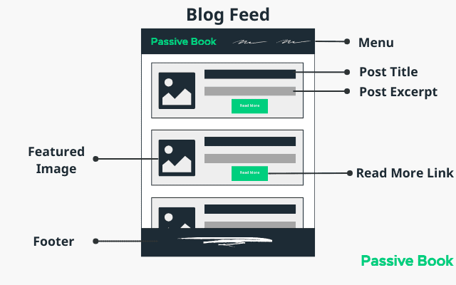
This is not a bad option if your blog only has a few posts and you are just getting started. However, if you have a lot of blog posts, your older content can get buried with this type of navigation.
Instead, it is much better to create a custom home page for your blog.
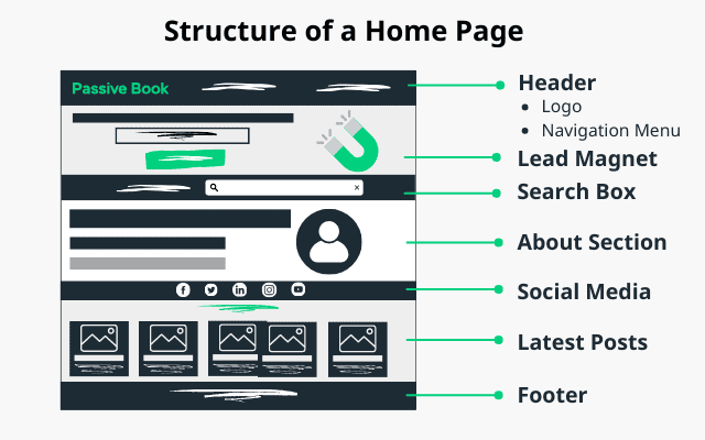
Have an opt-in form on your home page to collect your subscriber’s email address. Include a short about me section. Feature your latest blog posts.
If you have any paid products like books or courses, then you can feature them on your home page.
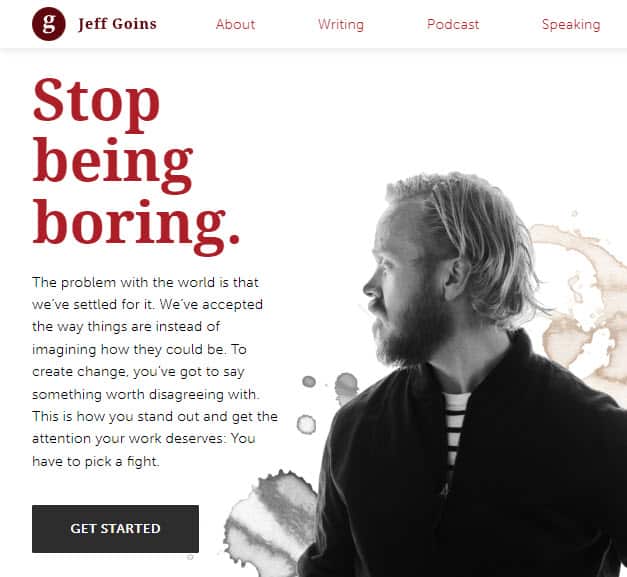
Jeff Goins who is a professional blogger, author, and speaker has created a custom home page for his blog.
24. Add Sidebar Navigation
You can turn your sidebar into a powerful navigation for desktop devices. Just keep in mind that the sidebar is useless in mobile so your blog should not entirely depend on this navigation.
Your sidebar typically includes links to your most popular blog posts, categories, archives, and social media profiles.
But a sidebar is also a great way to encourage people to explore your site and find other content they are interested in.
The Right Hair Style is a blog about hairstyles and hair care that uses its right sidebar to link to different post categories.
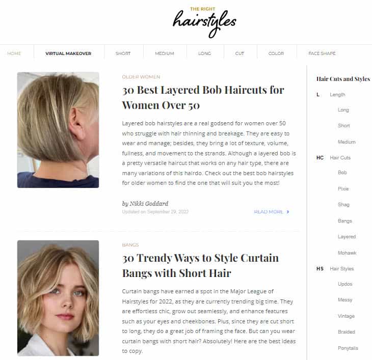
Visitors can quickly find blog posts that are of interest to them and once they are done reading a particular post, they can find additional blog posts in the same or other post categories.
Another example, of a sidebar navigation is Tech Crunch. Usually, you will find a blog’s main navigation bar on the top. However, Tech Crunch has their main navigation on the left sidebar. On the mobile screen, the left sidebar collapses into a hamburger icon.

25. Disable The Sidebar (On Mobile)
A blog’s sidebar cannot be displayed on mobile devices. If you use a responsive design, then the right sidebar will get pushed below your main content and will be displayed above the footer.
Many people consume their content on mobile devices. For this reason, many people argue that a sidebar is no longer useful.
You can choose to go the no-side bar route if you don’t have anything useful to show on your sidebar.
However, if you think having a sidebar is still useful for desktop devices, then you can just disable the sidebar on mobile devices.
This means when the screen size is small like in mobile devices, the sidebar is completely hidden instead of being pushed down below the main content.
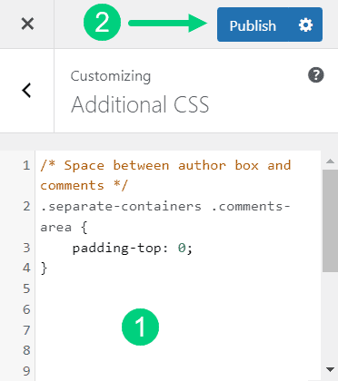
You can do this by adding the custom CSS code shown below to your website:
/* Hide Sidebar on Mobile */
@media (max-width: 768px) {
    .sidebar {
        display: none;
    }
}
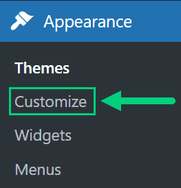
To add custom CSS in WordPress:
1. Go to Appearance > Customize in the WordPress Dashboard.
2. Click Additional CSS
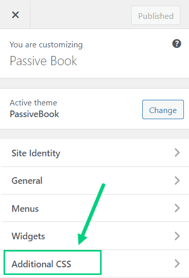
3. Paste the CSS code ❶ and Click Publish ❷.
26. Use a Minimal Logo
Your logo is an important element of your blog’s branding. It should be placed in a prominent position on your site.
However, your logo does not need to be anything fancy. A simple and minimal logo can also look great.
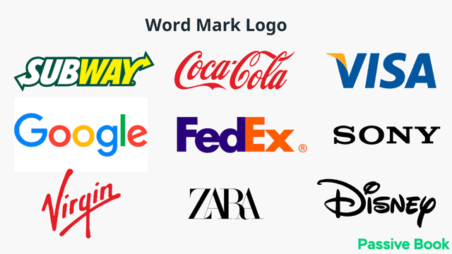
You can just type your blog name in a special font and call it a logo.
An example of a blog that does this is P.S – I Made This.

Copyblogger also has its blog name as the logo.

Big brands that do this include Google, Sony, Visa & Zara.
27. Add a Reading Progress Bar
If you have long blog posts, a reading progress bar can be very useful for your readers.
A reading progress bar is a horizontal line that appears at the top of your content. It shows the reader where they are in the post and how much is left to read.
An example of a blog that uses a reading progress bar is HubSpot.

This feature can be very motivating for some readers as it gives them a sense of progress.
It can also help you reduce your bounce rate and increase time on site as it encourages people to read the entire post.
28. Customize Your Contact Page
Your contact page is one of the most important pages on your blog.
This is where people can reach out to you if they have any questions or want to work with you.
It’s important to make sure your contact page stands out and provides all the information people need when they are trying to contact you.
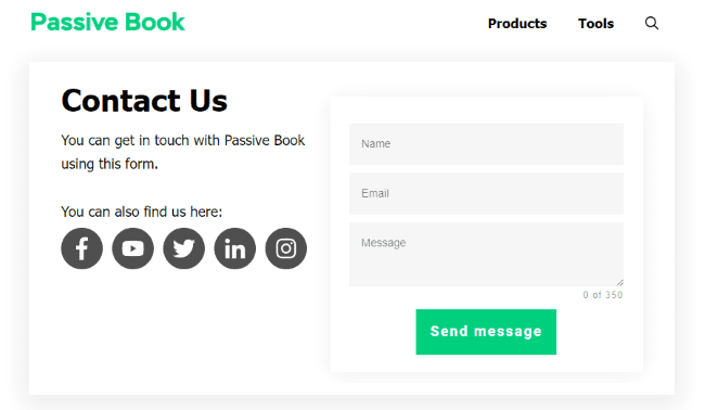
Your contact page should include your email address, social media links, and a contact form.
If you have a blog for physical business, you can also include a phone number and map on your contact page.
29. Minimize Distractions in Landing Pages
If you have landing pages or squeeze pages on your blog, it’s important to minimize distractions.
A landing page is a page where people are taken after clicking on a link.
The purpose of a landing page is to get people to take a specific action such as subscribing to your newsletter or buying a product.
To increase the chances of people taking the desired action, it’s important to remove all distractions from the page.
This includes navigation menus, social media icons, and other elements that could take away from the main call to action.
You can also include a minimal footer or header with only the bare minimum links so that the user has fewer options to get distracted and click away.
A minimal header will just have your blog logo without any other menu item.
A minimal footer will only have links to your privacy policy and terms of service page.
30. Apply Brand Identity in Featured Image
Your blog’s featured image is the image that appears at the top of your blog post. This is usually the first thing people see when they come to your post.
As such, it’s important to make sure your featured images are high quality and represent your brand well. Many bloggers just use generic stock photos for their featured images.
You can make your blog stand out by using branded featured images. This means using images that represent your brand identity and style.
A blog that does this well is Trello Blog. Every article on their blog has a featured image which is an illustration of their blog post in their brand color.
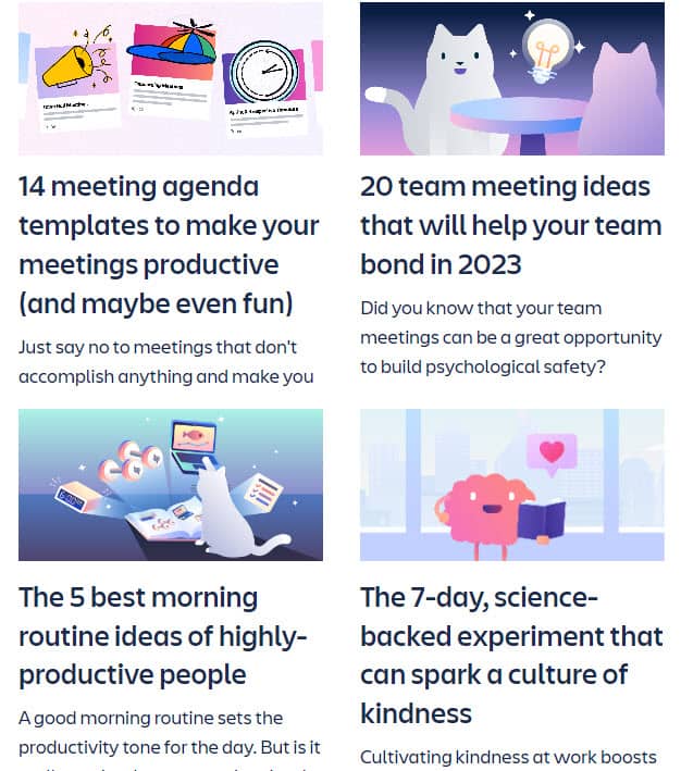
This makes the articles more visually appealing and adds extra personality to the content.
31. Change Link Colors & Underline Links
If you have a primary brand color you can apply that as your link’s color instead of using the traditional blue.
This will make all the links on your blog stand out and help them visually pop.
It’s a small change but it can have a big impact as it makes your blog more visually cohesive with your brand.
An example of a blog that does this is Modern Daily Knitting. Their primary brand color is red and that is used in all their links.
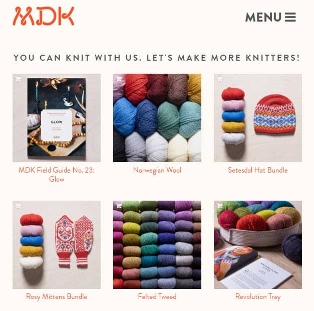
We use the same approach in Passive Book where we use our primary color green for all our links.
But if you do this, you must ensure you don’t use the color of your links in non-hyperlinked text like headings. You want your readers to easily be able to tell the difference between links and normal text.
Some people are color-blind and won’t be able to see the color of your links. So it is a best practice to also underline your links.
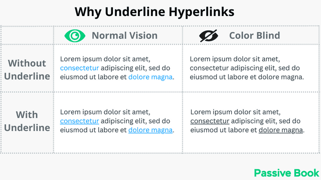
However, underlining too close will reduce the readability of the text. This is because letters with a downward stroke like g, j, and p will run over the line making it harder to read.
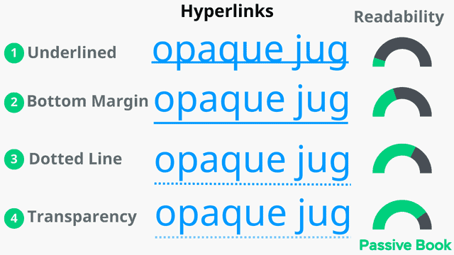
You can overcome this issue by adding some space between the text and the line. You can also decrease the transparency of the line or make it dotted.
You can achieve this by adding the following custom CSS:
/* Dotted Links */
.entry-content a:not(.nostyle) {
    font-weight: bold;
		text-decoration: none;
		padding-bottom: 3px;
	  border-bottom: dashed 1px;
}

.entry-content a:not(.nostyle):hover
{
    border-bottom: solid 2px;
}
If you want to turn off the custom style for certain elements, then just add nostyle CSS class to the element.
To add custom CSS in WordPress:
1. Go to Appearance > Customize in the WordPress Dashboard.

2. Click Additional CSS

3. Paste the CSS code ❶ and Click Publish ❷.

32. Use Different Colors for Margins
To increase the focus on the content area, you can make the content background white and the margin area grey or a different shade other than white.
This will help the content stand out more and make it easier on the eyes.
An example of a blog that does this is AskMen. You can see how the content background is white ❶ but the margins are grey ❷.
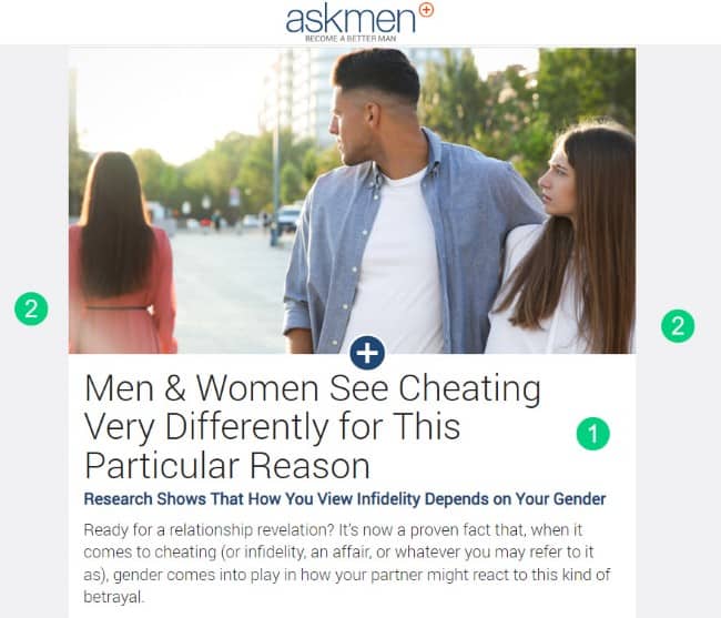
This creates a subtle but effective visual contrast that makes the content area pop increasing readability.
33. Floating Table of Contents
If you have a long blog post, you can add a floating table of contents on the side.
This will help your readers easily navigate to the section they want to read.
An example of a blog that does this is Piano Dreamers. You can see how there is a table of contents on the right side so that you can jump to the different sections of the article.
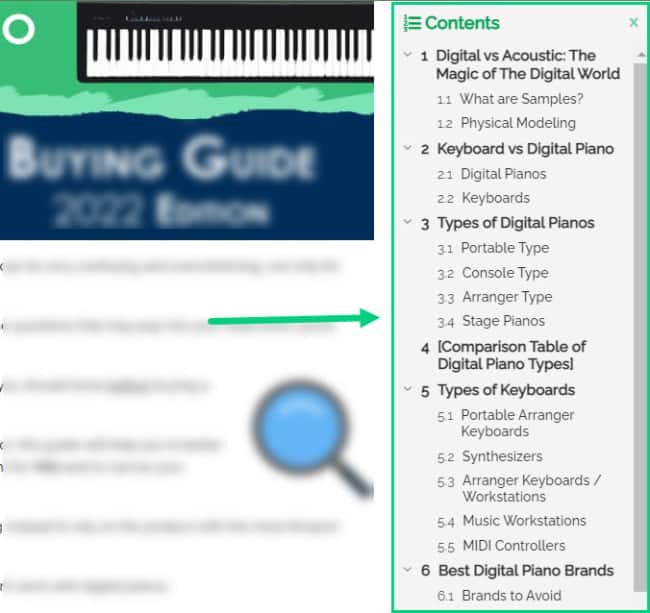
This feature helps improve the navigation feature within the article.
34. Featured Snippet Boxes
If you want to increase the click-through rate of your blog posts from Google, you can add featured snippet boxes in your content.
Feature Snippet is content that appears at the top of the search results and highlights a specific section of your article.
Here is how HubSpot does this:
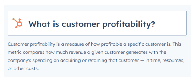
If you want to have sections of your article featured, you can create neat featured snippet boxes to make it easy for the search engines to pull your content and index it.
35. Infinite Scroll
If you have a lot of content on your blog, you can consider using infinite scroll in your blog feed and category pages instead of using pagination.
With infinite scroll, as the user scrolls down, more content is loaded automatically.
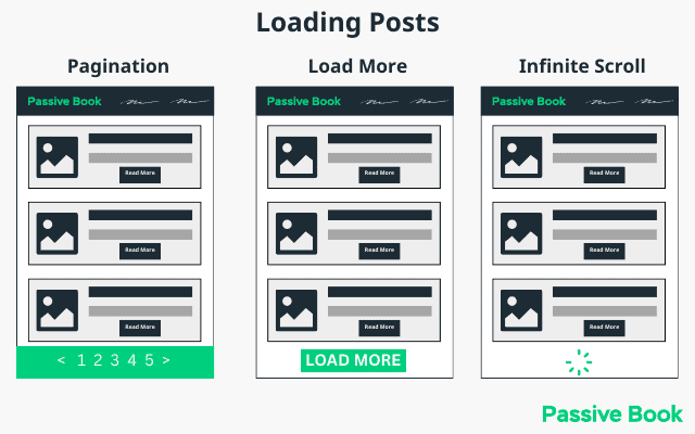
This helps improve the user experience as the reader doesn’t have to click on the next page or load more buttons.
It also helps increase the number of page views as users are more likely to stay on the page longer and consume more content.
36. Use Exit Intent Pop-Ups
Pop-ups can help you grow your email list or promote a product.
However, they can also be annoying to users if used too much.
If you do use pop-ups on your blog, make sure to use them sparingly and give your users the option to close them.
You can also enable popups to show when the visitor is going to leave the page. These are known as exit intent popups.
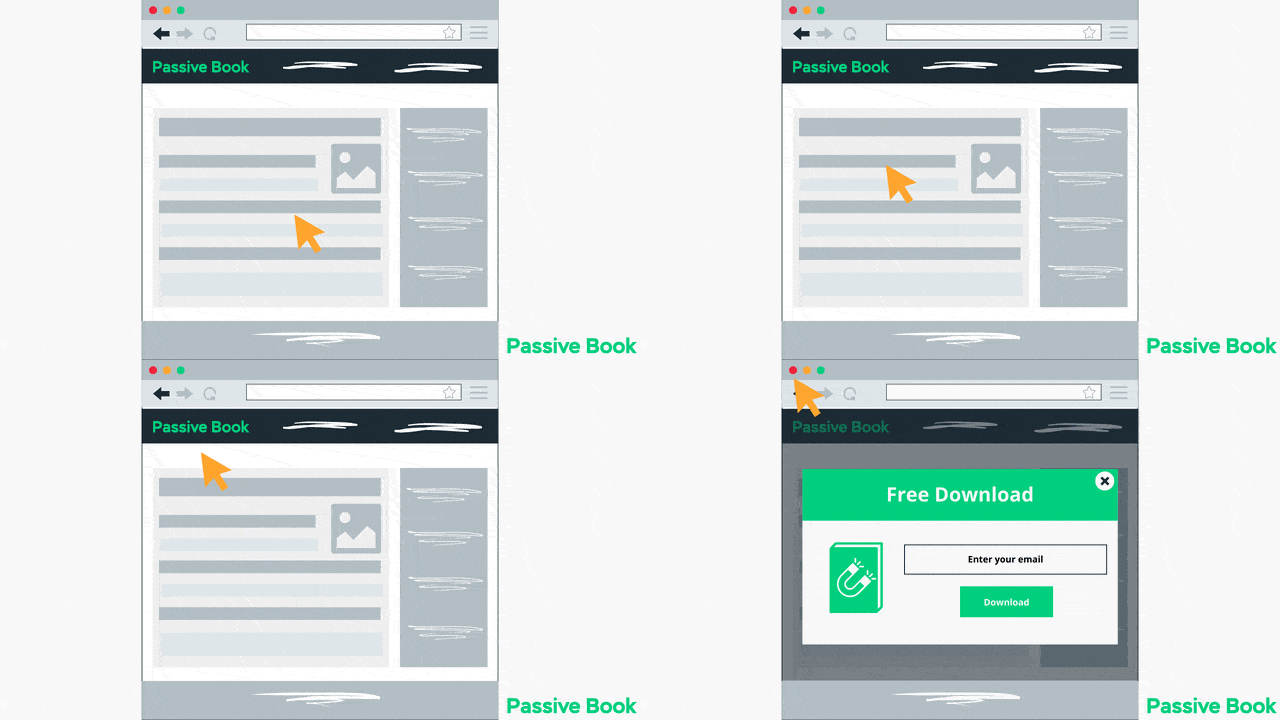
This can be a great way to capture the user’s attention and get them to sign up for your email list or promote a product.
37. Use Gradients in Landing Pages
A gradient is a gradual transition between two colors. It can be used on a landing page to create a visual effect and help the user’s eyes move smoothly across the page.
The gradient can act as a subtle cue for the reader to keep reading and scrolling down.
Check out this CodePen to see an example.
38. Customize The Comments Area
The comments area is a great place for your readers to interact with you and each other.
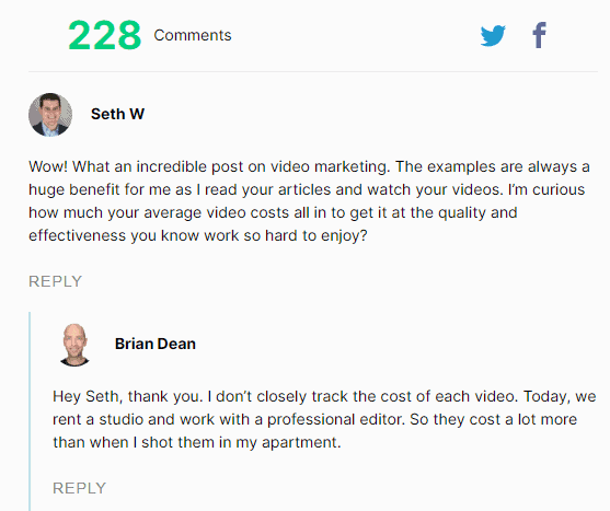
The default WordPress comments area might seem plain but it keeps your website light making it load fast.
If at all you want to improve the WordPress comments area you can install the Thrive Comments plugin.
Thrive Comments introduces a lot of conversion features and gamifies the comments area by introducing badges. This will help you get more engagement in your blog.
39. Related Posts
Related posts thumbnails are a great way to increase the number of pageviews on your blog.
They are also a great way to promote other articles on your blog.
You can add related posts thumbnails at the end of your blog post.
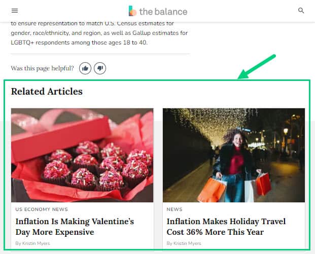
This will help your readers find additional content on your blog once they are done reading your article.
40. Custom Video Player
Embedding videos on your blog post is a good idea because it increases time on the page.
But the problem is when you embed videos from YouTube, your visitors might leave your site and go to YouTube. YouTube’s branding is not going to match with your brand.
If you embed videos using a WordPress Video player plugin like Presto Player then you will not have any of these problems, but you can also make the videos you embed into a conversion powerhouse.
Presto Player can create a custom video player with your brand colors and embed videos from YouTube and Vimeo removing all native branding.
Here is an example of a Presto Player Video:
You can also introduce conversion elements like opt-in forms in the middle of the video and CTA buttons below the video.
You can do all this with any video on YouTube or Vimeo which means you don’t even have to create any video yourself.
41. Instagram Feed Page
Instagram has a big problem. You cannot add links to your individual posts.
The only link you can add is the one link in your bio.
But did you know there is a trick to using Instagram to promote your individual blog posts?
You can do this using an Instagram Feed Page.
This Instagram Feed Page replicates the Instagram Feed on your blog. The main difference is unlike your posts on Instagram, the individual posts on your blog’s Insta Feed Page can be hyperlinked to where you want your readers to go.
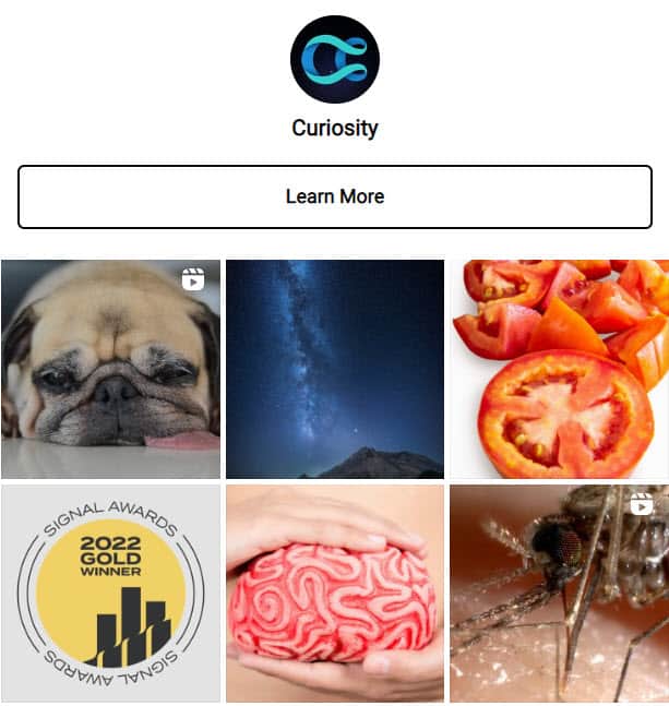
In the actual Instagram Posts, you can ask your followers to visit the link in your bio which takes them to your Instagram Feed Page.
A blog that does this well is CuriosityDotCom.
Every Instagram post asks them to check out the link in the bio to learn more. When they click on the link they see the same feed but with every Instagram post hyperlinked. If you have a lifestyle blog which has an Instagram presence then this is a must-have.
You can do this easily in WordPress using the Smashing Balloon plugin.
42. Embed Social Media Posts
It’s not just videos that you can embed on your blog. You can embed Instagram posts and tweets.
Instead of asking your readers to just follow you on different social media pages, you can showcase your best posts from different social media platforms on your blog by embedding them directly in your blog post.
This is a great way to increase engagement on your blog and also build a social media following.
The best part is that this feature is built-in natively into WordPress.
What Next?
We hope this guide helps you design a blog that not only looks good but is also user-friendly for your readers.
Now it is your turn.
Which blog design idea are you going to implement first?
Are you going to apply the font golden ratio or use the color psychology?
Let us know in the comments section below.
Share this post with your friends & followers: